Presentation of Data: Classification, frequency distribution, Discrete & continuous

  • It is the process of arranging data into homogeneous (similar) groups according to their common characteristics.
  • Raw data cannot be easily understood and it is not fit for further analysis and interpretation. This arrangement of data helps users in comparison and analysis.
  • For example, the Population of town can be grouped according to sex, age, marital status etc.

Classification of data

The method of arranging data into homogeneous classes according to some common features present in the data is called classification.

A planned data analysis system makes fundamental data easy to find and recover. This can be of particular interest for legal discovery, risk management and compliance. Written methods and set of guidelines for data classification should determine what levels and measures the company will use to organise data and define the roles of employees within the business regarding input stewardship. Once a data-classification scheme has been designed, security standards that stipulate proper approaching practices for each division and storage criteria that determine the data’s lifecycle demands should be discussed.

Objectives of Data Classification

The primary objectives of data classification are:

  • To consolidate the volume of data in such a way that similarities and differences can be quickly understood. Figures can consequently be ordered in a few sections holding common traits.
  • To aid comparison.
  • To point out the important characteristics of the data at a flash.
  • To give importance to the prominent data collected while separating the optional elements.
  • To allow a statistical method of the material gathered.
Definition of Classification Given by Prof. Secrist “Classification is the process of arranging data into sequences according to their common characteristics or Separating them into different related parts.”
(a) Meaning of Variable
  • The term variable is derived from the word ‘vary’ which means to differ or change. Hence, variable means the characteristic which varies or differs or changes from person to person, time to time, place to place etc. Or
  • A variable refers to quantity or attribute whose value varies from one investigation to another.
  • For example:

1.     “Price” is a variable as prices of different commodities are different.

2.     “Age” is a variable as age of different students varies.

3.     Some more examples are Height, Weight, Wages, Expenditure, Imports, Production, etc.

(B) Kinds of Variable:
(I) Discrete Variable
  • Variables which are capable of taking an only exact value and not any fractional value are termed as discrete variables.
  • For example, a number of workers or number of students in a class is a discrete variable as they cannot be in fraction. Similarly, a number of children in a family can be 1, 2 or so on, but cannot be 1.5, 2.75.
(II) Continuous Variable
  • Those variables which can take all the possible values (integral as well as fractional) in a given specified range are termed as continuous variables.
  • For example, Temperature, Height, Weight, Marks etc.

Methods of Classification

Following Are the Basis of Classification:
(1) Geographical Classification
  • When data are classified with reference to geographical locations such as countries, states, cities, districts, etc. it is known as Geographical Classification.
  • It is also known as ‘Spatial Classification’.
(2) Chronological Classification
  • When data are grouped according to time, such a classification is known as a Chronological Classification.
  • In such a classification, data are classified either in ascending or in descending order with reference to time such as years, quarters, months, weeks, etc.
  • It is also called ‘Temporal Classification’.
(3) Qualitative Classification
  • Under this classification, data are classified on the basis of some attributes or qualities like honesty, beauty, intelligence, literacy, marital status etc.
  • For example, Population can be divided on the basis of marital status as married or unmarried etc.
(4) Quantitative Classification
  • This type of classification is made on the basis some measurable characteristics like height, weight, age, income, marks of students, etc.

Data Tabulation, Meaning, Definition, Characteristics, Principles, Types, Importance and Limitations

Tabulation of data is the systematic presentation of classified data in the form of rows and columns. It is a method of arranging numerical information in a table to make it simple, concise, and easy to understand. After data has been classified, it is organized into tables so that comparisons, analysis, and interpretation can be carried out efficiently. Tabulation helps condense a large volume of information into a compact form and highlights important facts. It serves as a bridge between data collection and statistical analysis, making statistical information more meaningful and useful.

Definition

According to statistical experts, tabulation is the process of presenting classified data systematically in rows and columns to facilitate comparison, analysis, and interpretation.

Characteristics of Tabulation of Data

  • Systematic Presentation

One of the most important characteristics of tabulation is the systematic presentation of data. Tabulation arranges information in rows and columns according to a logical pattern, making it easy to understand and analyze. Raw data collected from various sources is often scattered and difficult to interpret. Through tabulation, this information is organized into a structured format that highlights important facts. A systematic arrangement enables users to locate specific information quickly and reduces confusion. This characteristic improves the overall efficiency of data handling and provides a clear foundation for statistical analysis and business decision-making.

  • Condenses Large Volumes of Data

Tabulation helps condense a large amount of information into a compact and manageable form. Instead of presenting lengthy descriptions or thousands of observations, data is summarized in tables. This reduction in size makes information easier to read and understand. Managers, researchers, and analysts can quickly grasp the essential facts without examining every individual detail. Condensation does not eliminate important information but presents it more efficiently. This characteristic is particularly useful in business and research where large datasets are common. Thus, tabulation simplifies the presentation of extensive information while retaining its significance.

  • Facilitates Comparison

A significant characteristic of tabulation is its ability to facilitate comparison. Data arranged in rows and columns allows users to compare different categories, groups, regions, or time periods easily. For example, a table showing annual sales figures enables quick comparison of performance across years. Such comparisons help identify differences, similarities, strengths, and weaknesses. They also assist managers in evaluating performance and making informed decisions. Without tabulation, comparing large amounts of raw data would be difficult and time-consuming. Therefore, facilitating comparison is one of the most valuable features of tabulated information.

  • Enhances Clarity and Understanding

Tabulation improves the clarity and understanding of statistical information. Raw data often appears complex and confusing, especially when presented in large quantities. By arranging information systematically, tabulation makes data easier to comprehend. Clear headings, rows, and columns help readers interpret information accurately and quickly. This organized presentation reduces the possibility of misunderstanding and enhances communication. Managers, researchers, and policymakers can understand the information without requiring extensive explanations. Therefore, tabulation serves as an effective tool for presenting data in a clear, concise, and understandable manner.

  • Supports Statistical Analysis

Tabulation provides a suitable foundation for statistical analysis. Before statistical measures such as averages, percentages, ratios, and correlations can be calculated, data must be organized systematically. Tabulated data enables researchers to perform these calculations accurately and efficiently. It also simplifies the identification of patterns and relationships within the data. Statistical techniques become more effective when applied to organized information. As a result, tabulation acts as a bridge between data collection and statistical interpretation. This characteristic makes tabulation an essential component of the statistical process in business and research studies.

  • Saves Time and Space

Another important characteristic of tabulation is that it saves both time and space. Large amounts of information can be presented in a relatively small area through tables. Readers can quickly obtain the required information without reading lengthy reports or descriptions. This efficiency is particularly valuable in business environments where timely decisions are important. Tabulated data reduces the effort required for data presentation and analysis. By summarizing information effectively, tabulation helps organizations communicate key facts more efficiently. Consequently, it contributes to improved productivity and better utilization of resources.

  • Reveals Trends and Relationships

Tabulation helps reveal trends, patterns, and relationships that may not be obvious in raw data. By arranging information in a structured format, it becomes easier to identify changes over time, differences between groups, and associations among variables. For example, a sales table may show a consistent increase in revenue over several years. Such observations support forecasting and strategic planning. Managers can use tabulated information to understand market behavior and business performance. Therefore, the ability to highlight trends and relationships is a key characteristic that enhances the analytical value of tabulation.

  • Improves Accuracy and Reliability

Tabulation contributes to the accuracy and reliability of data presentation. The systematic arrangement of information reduces the likelihood of errors and omissions. Tables allow users to verify figures easily and identify inconsistencies if they occur. Proper tabulation also ensures that data is presented consistently, making interpretation more dependable. Accurate presentation is essential because business decisions often rely on statistical information. Errors in data presentation can lead to incorrect conclusions and poor decisions. Therefore, by promoting organized and precise data presentation, tabulation enhances the reliability and credibility of statistical information.

Principles of Tabulation

1. Principle of Simplicity

A table should be simple and easy to understand. Unnecessary details, complex arrangements, and excessive information should be avoided. The objective of tabulation is to simplify data presentation, not to make it more complicated. Simple tables enable readers to grasp information quickly without confusion. The language used in titles, headings, and notes should also be straightforward. Simplicity improves readability and facilitates analysis. Therefore, while preparing a table, only relevant information should be included, ensuring that the table remains clear, concise, and user-friendly for all readers.

2. Principle of Clarity

Clarity is an essential principle of tabulation. Every table should have a clear title, properly labeled rows and columns, and understandable figures. The information presented should not create ambiguity or confusion. Headings should accurately describe the contents of the table, and abbreviations should be avoided unless they are commonly understood. Clear presentation helps readers interpret the data correctly and draw meaningful conclusions. A table lacking clarity may lead to misunderstandings and incorrect analysis. Therefore, ensuring clarity in design and presentation is crucial for the effectiveness of tabulation.

3. Principle of Accuracy

Accuracy is one of the most important principles of tabulation. All figures included in a table must be correct and verified before presentation. Errors in calculations, classification, or data entry can lead to misleading conclusions and poor decision-making. Statistical tables should be prepared carefully to ensure that totals, percentages, and other numerical values are accurate. Consistency in units and measurements should also be maintained. Accurate tables enhance the reliability of information and increase confidence in the analysis. Thus, accuracy is essential for producing trustworthy and meaningful statistical tables.

4. Principle of Proper Title

Every table should have a suitable and self-explanatory title. The title should clearly indicate the subject matter, scope, and purpose of the table. A good title enables readers to understand the contents of the table without needing additional explanations. It should be brief yet comprehensive enough to convey the necessary information. The title is usually placed at the top of the table and serves as its identity. Proper titles improve communication and make statistical information easier to interpret. Therefore, selecting an appropriate title is a fundamental principle of tabulation.

5. Principle of Logical Arrangement

The data within a table should be arranged logically and systematically. Rows and columns should follow a meaningful order, such as alphabetical, chronological, geographical, or numerical arrangement. Logical organization helps readers locate information quickly and understand relationships among data items. Random placement of figures may create confusion and reduce the usefulness of the table. A logical arrangement enhances readability and facilitates comparison and analysis. Therefore, proper sequencing of data is essential for ensuring that a table effectively communicates statistical information to its users.

6. Principle of Comparability

A good table should facilitate easy comparison among different categories, groups, or periods. Similar items should be placed close to each other, and uniform units of measurement should be used throughout the table. Comparative data helps readers identify similarities, differences, and trends. For example, sales figures for multiple years should be presented in adjacent columns to allow direct comparison. The principle of comparability increases the analytical value of tabulated data and supports informed decision-making. Therefore, tables should be designed in a way that promotes meaningful and convenient comparisons.

7. Principle of Completeness

A table should contain all relevant information necessary for understanding the data. Incomplete tables may create confusion and limit the usefulness of the information presented. Important details such as units of measurement, totals, footnotes, and source references should be included wherever necessary. Completeness ensures that readers have access to all essential information needed for interpretation. However, completeness should not result in overcrowding the table with unnecessary details. A balance should be maintained between providing sufficient information and preserving simplicity. Thus, completeness is an important principle of effective tabulation.

8. Principle of Attractiveness

A table should be neat, well-organized, and visually appealing. Attractive presentation encourages readers to examine and understand the information more easily. Proper spacing, alignment, headings, and formatting contribute to the appearance of a table. A cluttered or poorly designed table may discourage readers and reduce the effectiveness of communication. While accuracy and clarity are essential, visual appeal also plays a role in improving readability. Therefore, statistical tables should be designed in a manner that is both functional and aesthetically pleasing, enhancing their overall usefulness and impact.

Parts of a Table

A statistical table is a sjhuystematic arrangement of data in rows and columns designed to present information clearly and concisely. It helps organize large amounts of data, making comparison, analysis, and interpretation easier. Every statistical table consists of several important parts, each serving a specific purpose. These components ensure that the table is complete, accurate, and easy to understand. Understanding the different parts of a table is essential for preparing and interpreting statistical information effectively.

1. Table Number

The table number is a unique identification number assigned to a table. It helps readers locate and refer to a particular table easily, especially in reports, books, research papers, and statistical publications containing multiple tables. Table numbers are usually placed at the top of the table before the title.

Importance

  • Facilitates easy reference.
  • Helps in indexing and organization.
  • Avoids confusion when multiple tables are used.

Example: Sales Performance of XYZ Company During 2024

2. Title

The title is a brief statement that describes the contents of the table. It should clearly indicate what information is presented, including the subject, place, and time period whenever necessary. A good title should be concise, self-explanatory, and informative.

Importance:

  • Provides an immediate understanding of the table.
  • Defines the scope of the data.
  • Helps readers interpret information correctly.

Example: Sales of Electronic Products in India During 2024

3. Headnote

A headnote is an explanatory note placed below the title and above the main body of the table. It provides additional information about units of measurement, definitions, or special conditions related to the data presented.

Importance:

  • Clarifies the meaning of figures.
  • Specifies units and measurements.
  • Prevents misunderstanding of data.

4. Captions (Column Headings)

Captions are the headings placed at the top of columns. They indicate the nature of the information contained in each column and help readers understand the data presented.

Importance:

  • Identifies column contents.
  • Improves clarity and readability.
  • Facilitates comparison among columns.

Example

Year Sales (₹ Lakhs) Profit (₹ Lakhs)

Here, Year, Sales, and Profit are captions.

5. Stubs (Row Headings)

Stubs are the headings placed at the left side of rows. They describe the categories or items represented in each row of the table.

Importance:

  • Identifies row contents.
  • Organizes data systematically.
  • Makes interpretation easier.

Example

Product Sales
Mobile Phones 500
Laptops 300

Here, Mobile Phones and Laptops are listed under the stub column.

6. Body of the Table

The body is the main part of the table containing the actual statistical data. It consists of numerical values or information arranged at the intersection of rows and columns.

Importance:

  • Contains the core information.
  • Provides the basis for analysis and interpretation.
  • Represents the results of classification and tabulation.

Example

Product Sales (Units)
Mobile Phones 1,500
Laptops 800

The figures 1,500 and 800 form the body of the table.

7. Footnote

A footnote is an explanatory remark placed below the table. It provides additional clarification about specific figures, symbols, abbreviations, or exceptional circumstances related to the data.

Importance:

  • Explains special cases.
  • Clarifies symbols and abbreviations.
  • Enhances understanding of the table.

Example

Note: Sales figures exclude export transactions.

8. Source Note

The source note indicates the origin from which the data has been obtained. It is usually placed below the footnote at the bottom of the table.

Importance:

  • Establishes authenticity and credibility.
  • Enables verification of information.
  • Acknowledges the original source.

Example

Source: Annual Report of XYZ Company, 2024.

Illustrative Table Showing All Parts

Sales Performance of XYZ Company During 2024

(Figures in ₹ Lakhs)

Product Category Sales Profit
Mobile Phones 500 120
Laptops 300 80
Tablets 200 50

Note: Figures exclude export sales.

Source: XYZ Company Annual Report, 2024.

Types of Tabulation with Examples

Tabulation refers to the systematic presentation of classified data in rows and columns. Depending on the number of characteristics used for classification, tabulation can be of different types. The various types of tabulation help researchers present data according to the complexity and objectives of the study. Each type serves a specific purpose and facilitates easy analysis, comparison, and interpretation of information.

1. Simple Tabulation (One-Way Tabulation)

Simple tabulation is the simplest form of tabulation in which data is classified according to only one characteristic or attribute. It presents information regarding a single variable and is easy to construct and understand.

Example: Distribution of Employees by Gender

Gender Number of Employees
Male 120
Female 80
Total 200

Explanation: In this table, employees are classified only on the basis of gender. Since only one characteristic is considered, it is called simple or one-way tabulation.

Uses

  • Basic data presentation.
  • Quick understanding of information.
  • Suitable for simple statistical studies.

2. Double Tabulation (Two-Way Tabulation)

Double tabulation presents data according to two characteristics simultaneously. It helps analyze the relationship between two variables and allows more detailed comparisons.

Example: Distribution of Employees by Gender and Area

Gender Urban Rural Total
Male 70 50 120
Female 40 40 80
Total 110 90 200

Explanation: This table classifies employees according to two characteristics:

  • Gender
  • Area of residence

Therefore, it is known as double or two-way tabulation.

Uses

  • Comparative analysis.
  • Studying relationships between two variables.
  • Business and social research.

3. Triple Tabulation (Three-Way Tabulation)

Triple tabulation presents data according to three characteristics at the same time. It provides more detailed information and helps analyze complex relationships among variables.

Example: Distribution of Employees by Gender, Area, and Educational Qualification

Gender Area Graduate Postgraduate Total
Male Urban 40 30 70
Male Rural 35 15 50
Female Urban 25 15 40
Female Rural 30 10 40
Total 130 70 200

Explanation: This table classifies employees based on:

  • Gender
  • Area
  • Educational Qualification

Hence, it is called triple tabulation.

Uses

  • Detailed statistical analysis.
  • Research studies involving multiple variables.
  • Understanding complex relationships.

4. Complex Tabulation (Manifold Tabulation)

Complex tabulation, also known as manifold tabulation, classifies data according to more than three characteristics simultaneously. It provides comprehensive information but can be more difficult to prepare and interpret.

Example: Distribution of Employees by Gender, Area, Education, and Experience

Gender Area Education Experience (Years) Number
Male Urban Graduate 0–5 25
Male Urban Graduate Above 5 15
Female Rural Postgraduate 0–5 10
Female Rural Postgraduate Above 5 8

Explanation: This table includes four characteristics:

  • Gender
  • Area
  • Education
  • Experience

Since more than three variables are involved, it is known as complex or manifold tabulation.

Uses

  • Advanced business research.
  • Market analysis.
  • Detailed demographic studies.

Comparison of Types of Tabulation

Basis Simple Double Triple Complex
Number of Characteristics One Two Three More than Three
Complexity Very Low Moderate High Very High
Ease of Understanding Easy Easy to Moderate Moderate Difficult
Level of Detail Basic Detailed More Detailed Highly Detailed
Use in Research Limited Common Extensive Advanced

Importance of Tabulation of Data

  • Simplifies Complex Data

One of the greatest importance of tabulation is that it simplifies complex and bulky data. Raw statistical information often consists of a large number of observations that are difficult to understand in their original form. Tabulation organizes such information into rows and columns, making it more systematic and manageable. This arrangement helps readers grasp the essential facts quickly without examining every detail. By condensing large volumes of data into a concise format, tabulation improves readability and understanding. Thus, it transforms complicated information into a form that is convenient for analysis and interpretation.

  • Facilitates Easy Comparison

Tabulation enables easy comparison between different groups, categories, regions, or time periods. When data is arranged systematically in a table, similarities and differences become immediately visible. For example, sales figures for different years can be compared easily when presented side by side in columns. Such comparisons help identify trends, performance levels, and variations. Managers and researchers can use these comparisons to evaluate outcomes and make informed decisions. Therefore, one of the major advantages of tabulation is its ability to provide a clear basis for meaningful and accurate comparisons.

  • Assists Statistical Analysis

Tabulated data serves as the foundation for statistical analysis. Statistical measures such as averages, percentages, ratios, correlation, and regression require organized data for accurate calculation. Tabulation presents information in a structured form that facilitates the application of statistical techniques. Researchers can easily locate figures, perform computations, and interpret results. Without tabulation, statistical analysis would be more difficult and time-consuming. This importance makes tabulation an indispensable step in the statistical process. It bridges the gap between data collection and interpretation, allowing meaningful conclusions to be drawn from the information available.

  • Improves Clarity and Understanding

A significant importance of tabulation is that it improves the clarity and understanding of data. Raw information often appears confusing and difficult to interpret. Through tabulation, data is arranged logically with proper headings, rows, and columns, making it easier to comprehend. Readers can quickly identify important facts and relationships without requiring extensive explanations. Clear presentation reduces misunderstandings and improves communication. This characteristic is especially valuable in business reports and research studies where information must be presented to different audiences. Thus, tabulation enhances the effectiveness of statistical communication.

  • Saves Time and Space

Tabulation helps save both time and space in data presentation. A large amount of information can be summarized within a compact table instead of lengthy textual descriptions. Readers can obtain the required information quickly without going through extensive reports. This efficiency is particularly important in business organizations where decisions often need to be made promptly. The concise nature of tabulated data also reduces storage and presentation space. By organizing information in an economical format, tabulation increases productivity and allows users to focus on analysis rather than searching for relevant information.

  • Reveals Trends and Relationships

Tabulation plays a crucial role in identifying trends, patterns, and relationships within data. When information is arranged systematically, changes over time and differences between categories become more noticeable. For example, a table showing annual profits may reveal a consistent upward or downward trend. Such observations help businesses understand performance and predict future developments. Tabulation also highlights relationships among variables, supporting better analysis and interpretation. Therefore, the ability to reveal hidden patterns and trends makes tabulation an important tool for forecasting, planning, and strategic decision-making.

  • Provides a Basis for Graphical Presentation

Another important role of tabulation is that it provides the basis for graphical and diagrammatic presentation of data. Charts, graphs, histograms, and pie diagrams require organized numerical information, which is obtained through tabulation. A properly prepared table ensures accuracy and consistency in graphical representation. Visual presentations derived from tabulated data make information more attractive and easier to understand. They also help communicate statistical findings effectively to a wider audience. Thus, tabulation serves as an essential preliminary step in transforming numerical data into visual formats for presentation and analysis.

  • Supports Decision-Making

One of the most significant importance of tabulation is its contribution to decision-making. Managers, researchers, and policymakers rely on tabulated information to evaluate situations, compare alternatives, and formulate strategies. Organized data provides a clear picture of business performance, market conditions, and operational outcomes. This enables decision-makers to identify opportunities, address problems, and allocate resources efficiently. Since tabulation presents information in a concise and understandable form, it reduces uncertainty and improves the quality of decisions. Therefore, tabulation is an essential tool for effective planning, control, and management in business organizations.

Limitations of Tabulation of Data

  • Loss of Detailed Information

One of the major limitations of tabulation is that it condenses a large amount of data into a summarized form. While summarization improves understanding, it may result in the loss of important details. Individual observations, unique characteristics, and specific facts may not appear in the table. As a result, readers may miss certain aspects of the data that could be significant for deeper analysis. Tabulation focuses on presenting the overall picture rather than individual cases. Therefore, detailed information may be sacrificed for the sake of simplicity and brevity.

  • Cannot Explain Causes

Tabulation presents statistical facts and figures but does not explain the reasons behind them. A table may show an increase or decrease in sales, profits, or production, but it cannot indicate why such changes occurred. The causes and underlying factors require further analysis and interpretation. Therefore, tabulation serves only as a method of presentation and not as a tool for explanation. Decision-makers must use additional statistical techniques and contextual information to understand the causes of observed trends and relationships. This limitation reduces the explanatory power of tabulated data.

  • Requires Skill and Experience

Preparing an effective statistical table requires knowledge, skill, and experience. The compiler must decide how to classify data, arrange rows and columns, and present information clearly. Poorly designed tables may confuse readers and lead to incorrect interpretations. Inaccurate headings, improper classifications, or calculation errors can reduce the usefulness of the table. Therefore, tabulation is not merely a mechanical process; it requires careful planning and expertise. Organizations may need trained personnel to prepare meaningful tables, making the process more demanding and sometimes costly.

  • Possibility of Misinterpretation

Tabulated data may sometimes be misunderstood or misinterpreted by readers. Individuals who lack statistical knowledge may draw incorrect conclusions from the figures presented. Complex tables containing numerous rows, columns, and classifications can be particularly difficult to understand. If headings, notes, or classifications are unclear, users may interpret the information incorrectly. Such misunderstandings can lead to poor decisions and inaccurate judgments. Therefore, although tabulation improves organization, it does not guarantee correct interpretation. Proper explanation and statistical literacy are often required to understand tabulated information accurately.

  • Not Suitable for Qualitative Information

Tabulation is primarily designed for presenting numerical and measurable information. Certain qualitative data, such as opinions, emotions, attitudes, and experiences, cannot always be effectively represented in tables. Although some qualitative information can be categorized, the richness and complexity of such data may be lost during tabulation. Descriptive information often requires narrative explanations rather than numerical presentation. Consequently, tabulation has limited usefulness when dealing with highly qualitative subjects. This restriction reduces its applicability in studies where non-numerical information plays a major role in analysis.

  • Oversimplification of Data

Another limitation of tabulation is that it may oversimplify complex information. To make data concise and manageable, details are grouped into categories and summarized. However, excessive simplification can hide important variations and relationships within the data. Readers may focus only on summarized figures and overlook significant differences among observations. This can result in incomplete understanding and inaccurate conclusions. While simplification is one of the strengths of tabulation, it can become a weakness when important information is sacrificed. Therefore, a balance must be maintained between simplicity and completeness.

  • Time-Consuming Preparation

Although tabulated data saves time during analysis, the preparation of statistical tables can itself be time-consuming. Data must first be collected, classified, verified, and organized before being arranged into rows and columns. Large datasets may require extensive effort to ensure accuracy and consistency. Complex tables involving multiple variables require careful planning and formatting. The preparation process may also involve calculations, checking totals, and adding explanatory notes. Therefore, creating effective statistical tables can demand considerable time and resources, especially in large-scale business and research projects.

  • Limited Analytical Capability

Tabulation is mainly a method of data presentation and has limited analytical capability. While tables help organize and summarize information, they do not perform statistical analysis by themselves. Additional techniques such as averages, correlation, regression, and graphical analysis are required to derive deeper insights from the data. A table can present facts but cannot automatically reveal relationships, causes, or future trends. Therefore, tabulation should be viewed as a preliminary step in the statistical process rather than a complete analytical tool. Its usefulness depends on subsequent analysis and interpretation.

Frequency Table

An important branch of mathematics that deals with gathering, organizing, estimating and interpreting the vast numerical data for a survey or a research, is known as statistics. There may be one or more numbers of statistical data that are used more than once. The number of times a particular data item is utilized, is known as its frequency.

When the distribution of frequencies is listed in a table OR tabular presentation of frequency distribution, known as frequency table. It is used to list out one or more variables taken in a sample. Each sample contains an individual frequency and each frequency is distributed with an interval between each frequency. It is also of two types that is univariate and joint. Frequency distribution can be defined as a summary presentation of the number of observations of an attribute or values of a variable arranged according to their magnitudes either individually in the case of discrete series or in a range or class interval in the case of both discrete and continuing series.

Frequency Table

Frequency Distribution Table is a way to organize data. A frequency distribution table is an organized tabulation of the number of individual events located in each category. It contains at least two columns, one for the score categories (X) and another for the frequencies (f). Below we have explained briefly for you to understand the concept of frequency table better and workout frequency table example:

Solved Example

Question: Here is the list of marks obtained for the students in the examination. Find the number of students who got more than 85 marks, More than 95, Less than 80 more than 76.

 Score (X)   Frequency (f)
 Below 75        4
 76 – 80       14
 81 – 85        2
 86 – 90        8
 91 – 95        5
 96 – 100        1

Solution:

From the table we can conclude that:

Students who got more than 85 = 8 + 5 + 1 = 14

Students who got more than 95 = 1

Students who got less than 80 more than 76 = 14.

Construction of Frequency Distribution

The following steps are involved in the construction of a frequency distribution.

(1) Find the range of the data: The range is the difference between the largest and the smallest values.

(2) Decide the approximate number of classes in which the data are to be grouped. There are no hard and first rules for number of classes. In most cases we have 5 to 20 classes. H.A. Sturges provides a formula for determining the approximation number of classes.

K=1+3.322logN

where K= Number of classes

and logN = Logarithm of the total number of observations.

Example: If the total number of observations is 50, the number of classes would be

K=1+3.322logN

K=1+3.322log50

K=1+3.322(1.69897)

K=1+5.644

K=6.644

7 classes, approximately.

(3) Determine the approximate class interval size: The size of class interval is obtained by dividing the range of data by the number of classes and is denoted by h class interval size

h = Range Number of Classes

In the case of fractional results, the next higher whole number is taken as the size of the class interval.

(4) Decide the starting point: The lower class limit or class boundary should cover the smallest value in the raw data. It is a multiple of class intervals.

Example: 0,5,10,15,20, etc. are commonly used.

(5) Determine the remaining class limits (boundary): When the lowest class boundary has been decided, by adding the class interval size to the lower class boundary you can compute the upper class boundary. The remaining lower and upper class limits may be determined by adding the class interval size repeatedly till the largest value of the data is observed in the class.

(6) Distribute the data into respective classes: All the observations are divided into respective classes by using the tally bar (tally mark) method, which is suitable for tabulating the observations into respective classes. The number of tally bars is counted to get the frequency against each class. The frequency of all the classes is noted to get the grouped data or frequency distribution of the data. The total of the frequency columns must be equal to the number of observations.

Bar Diagram, Histogram

Data can be presented in the form of organized information, combined in tables or even graphically represented. Imagine seeing a set of data in the written form or in tabular form versus a graph that gives you the same information. Isn’t it simpler and quicker to comprehend data if we can visually see it?

It is for this purpose that data can be organized graphically for interpretation in a single glance in Statistics. The two forms of graphical representation that we shall cover in this lesson are bar diagram and histogram.

Bar Diagram

Also known as a column graph, a bar graph or a bar diagram is a pictorial representation of data. It is shown in the form of rectangles spaced out with equal spaces between them and having equal width. The equal width and equal space criteria are important characteristics of a bar graph.

Note that the height (or length) of each bar corresponds to the frequency of a particular observation. You can draw bar graphs both, vertically or horizontally depending on whether you take the frequency along the vertical or horizontal axes respectively. Let us take an example to understand how a bar graph is drawn.

Sports No. of Students
Basketball 15
Volleyball 25
Football 10
Total 50

The above table depicts the number of students of a class engaged in any one of the three sports given. Note that the number of students is actually the frequency. So, if we take frequency to be represented on the y-axis and the sports on the x-axis, taking each unit on the y-axis to be equal to 5 students, we would get a graph that resembles the one below.

The blue rectangles here are called bars. Note that the bars have equal width and are equally spaced, as mentioned above. This is a simple bar diagram.

Histogram

A bar diagram easy to understand but what is a histogram? Unlike a bar graph that depicts discrete data, histograms depict continuous data. The continuous data takes the form of class intervals. Thus, a histogram is a graphical representation of a frequency distribution with class intervals or attributes as the base and frequency as the height.

The key difference is that histograms have bars without any spaces between them and the rectangles need not be of equal width. So, we will understand histograms using an example.

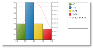
In this case, see that we are considering class intervals such as 0-5, 5-10, 10-15 and 15-20. These are continuous data. In case, the class intervals given to you are not continuous, you must make it continuous first.

Here, you can interpret the histogram using the information that the graph gives. Consider the frequency to be as given on the left vertical axis and ignore the values on the right vertical axis. Thus, for the class interval 0-5, the corresponding frequency is 3. Again, for 5-10, the frequency is 7, and so on.

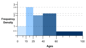
Note that we have taken the simple case of a histogram with bars of equal width. But as mentioned, it might not be the case if the class intervals are not even in size. In that case, you will get a histogram with bars stuck to each other (without any space between them) but with different widths. It could look something like this, but exactly how it will look depends on the data:

Pie chart

A pie chart (or a pie graph) is a circular statistical graphical chart, which is divided into slices in order to explain or illustrate numerical proportions. In a pie chart, centeral angle, area and an arc length of each slice is proportional to the quantity or percentages it represents. Total percentages should be 100 and total of the arc measures should be 360° Following illustration of pie graph depicts the cost of construction of a house.

From this graph, one can compare the sum spent on cement, steel and so on. One can also compute the actual sum spent on each individual expense. Consider an example, where we want to know how much more is the labour cost when compared to cost of steel.

Amount spent on labor =9060×600000=$ 150000

Sum spent on steel =54/360×600000=$ 90000

Excess=150000−90000=$ 60000

Let 60000=x% of 600000

⟹x/100×600000=$ 60000

⟹x=10% of total expense.

Ogives

The word Ogive is a term used in architecture to describe curves or curved shapes. Ogives are graphs that are used to estimate how many numbers lie below or above a particular variable or value in data. To construct an Ogive, firstly, the cumulative frequency of the variables is calculated using a frequency table. It is done by adding the frequencies of all the previous variables in the given data set. The result or the last number in the cumulative frequency table is always equal to the total frequencies of the variables. The most commonly used graphs of the frequency distribution are histogram, frequency polygon, frequency curve, Ogives (cumulative frequency curves).

Ogives

The Ogive is defined as the frequency distribution graph of a series. The Ogive is a graph of a cumulative distribution, which explains data values on the horizontal plane axis and either the cumulative relative frequencies, the cumulative frequencies or cumulative percent frequencies on the vertical axis. Cumulative frequency is defined as the sum of all the previous frequencies up to the current point. To find the popularity of the given data or the likelihood of the data that fall within the certain frequency range, Ogive curve helps in finding those details accurately. Create the Ogive by plotting the point corresponding to the cumulative frequency of each class interval. Most of the Statisticians use Ogive curve, to illustrate the data in the pictorial representation. It helps in estimating the number of observations which are less than or equal to the particular value.

Ogive Graph

The graphs of the frequency distribution are frequency graphs that are used to exhibit the characteristics of discrete and continuous data. Such figures are more appealing to the eye than the tabulated data. It helps us to facilitate the comparative study of two or more frequency distributions. We can relate the shape and pattern of the two frequency distributions. The two methods of Ogives are

  • Less than Ogive
  • Greater than or more than Ogive

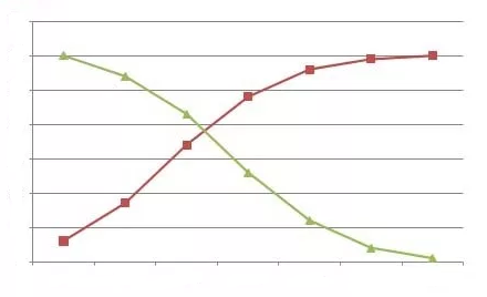
The graph given above represents less than and the greater than Ogive curve. The rising curve (Brown Curve) represents the less than Ogive, and the falling curve (Green Curve) represents the greater than Ogive.

Less than Ogive

The frequencies of all preceding classes are added to the frequency of a class. This series is called the less than cumulative series. It is constructed by adding the first-class frequency to the second-class frequency and then to the third class frequency and so on. The downward cumulation results in the less than cumulative series.

Greater than or More than Ogive

The frequencies of the succeeding classes are added to the frequency of a class. This series is called the more than or greater than cumulative series. It is constructed by subtracting the first class second class frequency from the total, third class frequency from that and so on. The upward cumulation result is greater than or more than the cumulative series.

Ogive Chart

An Ogive Chart is a curve of the cumulative frequency distribution or cumulative relative frequency distribution. For drawing such a curve, the frequencies must be expressed as a percentage of the total frequency. Then, such percentages are cumulated and plotted as in the case of an Ogive. Here, the steps for constructing the less than and greater than Ogive are given.

How to Draw Less Than Ogive Curve?

  • Draw and mark the horizontal and vertical axes.
  • Take the cumulative frequencies along the y-axis (vertical axis) and the upper-class limits on the x-axis (horizontal axis).
  • Against each upper-class limit, plot the cumulative frequencies.
  • Connect the points with a continuous curve.

How to Draw Greater than or More than Ogive Curve?

  • Draw and mark the horizontal and vertical axes.
  • Take the cumulative frequencies along the y-axis (vertical axis) and the lower-class limits on the x-axis (horizontal axis).
  • Against each lower-class limit, plot the cumulative frequencies
  • Connect the points with a continuous curve.

Uses of Ogive Curve

Ogive Graph or the cumulative frequency graphs are used to find the median of the given set of data. If both the less than and the greater than cumulative frequency curve is drawn on the same graph, we can easily find the median value. The point in which both the curve intersects, corresponding to the x-axis gives the median value.  Apart from finding the medians, Ogives are used in computing the percentiles of the data set values.

Mean (AM, Weighted, Combined)

Arithmetic Mean

The arithmetic mean,’ mean or average is calculated by summ­ing all the individual observations or items of a sample and divid­ing this sum by the number of items in the sample. For example, as the result of a gas analysis in a respirometer an investigator obtains the following four readings of oxygen percentages:

14.9
10.8
12.3
23.3
Sum = 61.3

He calculates the mean oxygen percentage as the sum of the four items divided by the number of items here, by four. Thus, the average oxygen percentage is

Mean = 61.3 / 4 =15.325%

Calculating a mean presents us with the opportunity for learning statistical symbolism. An individual observation is symbo­lized by Yi, which stands for the ith observation in the sample. Four observations could be written symbolically as Yi, Y2, Y3, Y4.

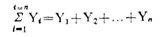
We shall define n, the sample size, as the number of items in a sample. In this particular instance, the sample size n is 4. Thus, in a large sample, we can symbolize the array from the first to the nth item as follows: Y1, Y2…, Yn. When we wish to sum items, we use the following notation:

The capital Greek sigma, Ʃ, simply means the sum of items indica­ted. The i = 1 means that the items should be summed, starting with the first one, and ending with the nth one as indicated by the i = n above the Ʃ. The subscript and superscript are necessary to indicate how many items should be summed. Below are seen increasing simplifications of the complete notation shown at the extreme left:

Properties of Arithmetic Mean:

  1. The sum of deviations of the items from the arithmetic mean is always zero i.e.

∑(X–X) =0.

  1. The Sum of the squared deviations of the items from A.M. is minimum, which is less than the sum of the squared deviations of the items from any other values.
  2. If each item in the series is replaced by the mean, then the sum of these substitutions will be equal to the sum of the individual items.                       

Merits of A.M:

  1. It is simple to understand and easy to calculate.
  2. It is affected by the value of every item in the series.
  3. It is rigidly defined.
  4. It is capable of further algebraic treatment.
  5. It is calculated value and not based on the position in the series.

Demerits of A.M:

  1. It is affected by extreme items i.e., very small and very large items.
  2. It can hardly be located by inspection.
  3. In some cases A.M. does not represent the actual item. For example, average patients admitted in a hospital is 10.7 per day.
  4. M. is not suitable in extremely asymmetrical distributions.

Weighted Mean

In some cases, you might want a number to have more weight. In that case, you’ll want to find the weighted mean. To find the weighted mean:

  1. Multiply the numbers in your data set by the weights.
  2. Add the results up.

For that set of number above with equal weights (1/5 for each number), the math to find the weighted mean would be:
1(*1/5) + 3(*1/5) + 5(*1/5) + 7(*1/5) + 10(*1/5) = 5.2.

Sample problem: You take three 100-point exams in your statistics class and score 80, 80 and 95. The last exam is much easier than the first two, so your professor has given it less weight. The weights for the three exams are:

  • Exam 1: 40 % of your grade. (Note: 40% as a decimal is .4.)
  • Exam 2: 40 % of your grade.
  • Exam 3: 20 % of your grade.

What is your final weighted average for the class?

  1. Multiply the numbers in your data set by the weights:

    .4(80) = 32

    .4(80) = 32

    .2(95) = 19

  2. Add the numbers up. 32 + 32 + 19 = 83.

The percent weight given to each exam is called a weighting factor.

Weighted Mean Formula

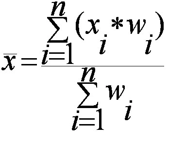
The weighted mean is relatively easy to find. But in some cases the weights might not add up to 1. In those cases, you’ll need to use the weighted mean formula. The only difference between the formula and the steps above is that you divide by the sum of all the weights.

The image above is the technical formula for the weighted mean. In simple terms, the formula can be written as:

Weighted mean = Σwx / Σw

Σ = the sum of (in other words…add them up!).
w = the weights.
x = the value.

To use the formula:

  1. Multiply the numbers in your data set by the weights.
  2. Add the numbers in Step 1 up. Set this number aside for a moment.
  3. Add up all of the weights.
  4. Divide the numbers you found in Step 2 by the number you found in Step 3.

In the sample grades problem above, all of the weights add up to 1 (.4 + .4 + .2) so you would divide your answer (83) by 1:
83 / 1 = 83.

However, let’s say your weighted means added up to 1.2 instead of 1. You’d divide 83 by 1.2 to get:
83 / 1.2 = 69.17.

Combined Mean

A combined mean is a mean of two or more separate groups, and is found by:

  1. Calculating the mean of each group,
  2. Combining the results.

Combined Mean Formula

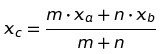
More formally, a combined mean for two sets can be calculated by the formula :

Where:

  • xa = the mean of the first set,
  • m = the number of items in the first set,
  • xb = the mean of the second set,
  • n = the number of items in the second set,
  • xc the combined mean.

A combined mean is simply a weighted mean, where the weights are the size of each group.

Median (Calculation and graphical using ogives)

The median of a set of data values is the middle value of the data set when it has been arranged in ascending order.  That is, from the smallest value to the highest value.

Example:

The marks of nine students in a geography test that had a maximum possible mark of 50 are given below:

47 35 37 32 38 39 36 34 35

Find the median of this set of data values.

Solution:

Arrange the data values in order from the lowest value to the highest value:

32 34 35 35 36 37 38 39 47

The fifth data value, 36, is the middle value in this arrangement.

Merits or Uses of Median:

  1. Median is rigidly defined as in the case of Mean.
  2. Even if the value of extreme item is much different from other values, it is not much affected by these values e.g. Median in case of 4, 7, 12, 18, 19 is 12 and if we add two values equal to 450 10000, new median is 18.
  3. It can also be used for the Quantities; those can’t give A.M; as is in case of intelligence etc. It is possible to arrange in any order and to locate the middle valve. For such cases it is the best measure.
  4. It can be located graphically.
  5. For open end intervals, it is also suitable one. As taking any value of the intervals, value of Median remains the same.
  6. It can be easily calculated and is also easy to understand
  7. Median is also used for other statistical devices such as Mean Deviation and skewness.
  8. It can be located by inspection in some cases.
  9. Extreme items may not be available to get Median. Only if number of terms is known, we can get median e.g.

Find median of the 9 terms, out of which first two and last three terms are missing and middle four terms are 7, 9, 10, 14. Here we can calculate as following let nine terms be

* * 7 9 10 14 * * *

Here out of nine terms middle term is; (n+1/2) Thus 10 is the Median.

Demerits or Limitations of Median:

  1. Even if the value of extreme items is too large, it does not affect too much, but due to this reason, sometimes median does not remain the representative of the series.
  2. It is affected much more by fluctuations of sampling than A.M.
  3. Median cannot be used for further algebraic treatment. Unlike mean we can neither find total of terms as in case of A.M. nor median of some groups when combined.
  4. In a continuous series it has to be interpolated. We can find its true-value only if the frequencies are uniformly spread over the whole class interval in which median lies.
  5. If the number of series is even, we can only make its estimate; as the A.M. of two middle terms is taken as Median.

Graphical Method

Marks Conversion into
exclusive series
No. of students Cumulative Frequency
(x)   (f) (C.M)
410-419 409.5-419.5 14 14
420-429 419.5-429.5 20 34
430-439 429.5-439.5 42 76
440-449 439.5-449.5 54 130
450-459 449.5-459.5 45 175
460-469 459.5-469.5 18 193
470-479 469.5-479.5 7 200

The median value of a series may be determinded through the graphic presentation of data in the form of Ogives.This can be done in 2 ways.

  1. Presenting the data graphically in the form of ‘less than’ ogive or ‘more than’ ogive .
    2. Presenting the data graphically and simultaneously in the form of ‘less than’ and ‘more than’ ogives.The two ogives are drawn together.
  2. Less than Ogive approach
Marks Cumulative Frequency (C.M)
Less than 419.5 14
Less than 429.5 34
Less than 439.5 76
Less than 449.5 130
Less than 459.5 175
Less than 469.5 193
Less than 479.5 200

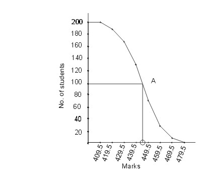
Steps involved in calculating median using less than Ogive approach:
1. Convert the series into a ‘less than ‘ cumulative frequency distribution as shown above.

  1. Let N be the total number of students who’s data is given.N will also be the cumulative frequency of the last interval.Find the (N/2)th item(student) and mark it on the y-axis.In this case the (N/2)th item (student) is 200/2 = 100th student.
  2. Draw a perpendicular from 100 to the right to cut the Ogive curve at point A.
  3. From point A where the Ogive curve is cut, draw a perpendicular on the x-axis. The point at which it touches the x-axis will be the median value of the series as shown in the graph.

More than Ogive approach

Marks Cumulative Frequency (C.M)
More than 409.5 200
More than 419.5 186
More than 429.5 166
More than 439.5 124
More than 449.5 70
More than 459.5 25
More than 469.5 7
More than 479.5 0

Steps involved in calculating median using more than Ogive approach:
1. Convert the series into a ‘more than ‘ cumulative frequency distribution as shown above .
2. Let N be the total number of students who’s data is given.N will also be the cumulative frequency of the last interval.Find the (N/2)th item(student) and mark it on the y-axis.In this case the (N/2)th item (student) is 200/2 = 100th student.
3. Draw a perpendicular from 100 to the right to cut the Ogive curve at point A.
4.From point A where the Ogive curve is cut, draw a perpendicular on the x-axis. The point at which it touches the x-axis will be the median value of the series as shown in the graph.

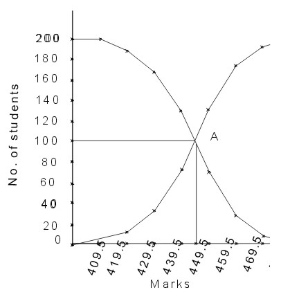
2. Less than and more than Ogive approach

Another way of graphical determination of median is through simultaneous graphic presentation of both the less than and more than Ogives.

1.Mark the point A where the Ogive curves cut each other.
2.Draw a perpendicular from A on the x-axis. The corresponding value on the x-axis would be the median value.

Mode (Calculation and Graphical using Histogram)

Mode is the value which occurs most frequently in a set of observations. Simply put, it is the number which is repeated most, i.e. the number with the highest frequency. In the field of statistics, it is an important tool to interpret data in a relevant manner. Now it is possible for the data set to be multimodal (have more than one mode) which means more than one observation has the same number of frequencies.

Example: Let us find the Mode of the following data

4, 89, 65, 11, 54, 11, 90, 56

Here in these varied observations the most occurring number is 11, hence the Mode = 11

Mode of Grouped Data

As we know that Mode is the most frequently occurring number of a data set. This is easily recognizable in an ungrouped dataset, but if the data set is presented in class intervals, this can get a bit tricky. So how can we calculate Mode of grouped data?

Steps to be followed to calculate the Mode are,

  1. Create a table with two columns
  2. In column 1 write your class intervals
  3. In column 2 write the corresponding frequencies
  4. Locate the maximum frequency denoted by fm
  5. Determine the class corresponding to fm , this will be your Modal class
  6. Calculate the Mode using given formula

Mode = L +fmf1(2fmf1−f2) × h

Where,

L = lower limit of Modal Class

fm = frequency of modal class

h = width of modal class

f1 = frequency of pre modal class

f2 = frequency of post modal class

Relation between Mean, Median, and Mode

There is an inter-relation between the measures of central tendency. Professor Karl Pearson has suggested an empirical relationship between Mean, Median, and Mode. Via this equation, if the values of two measures are known we can find the third measure. The equation is as follows

Mean – Mode = 3 [Mean – Median]

Finding Mode Graphically

Marks
inclusive series
Conversions into
exclusive series
No. of students
(frequency)
(x) (f)
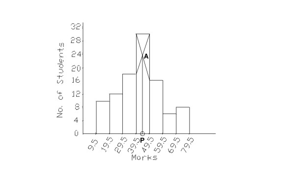
10-19 9.5-19.5 10
20-29 19.5-29.5 12
30-39 29.5-39.5 18
40-49 39.5-49.5 30
50-59 49.5-59.5 16
60-69 59.5-69.5 6
70-79 69.5-79.5 8

The following steps must be followed to find the mode graphically.

  1. Represent the given data in the form of a Histogram.The hight of the rectangles in the histogram is marked by the frequencies of the class interval as shown in the graph .Identify the highest rectangle. This corresponds to the modal class of the series.
  2. Join the top corners of the modal rectangle with the immediately next corners of the adjacent rectangles. The two lines must be cutting each other.This might be difficult to visualise so look at the graph given below.
  3. Let the point where the joining lines cut each other be ‘A’. Draw a perpendicular line from point A onto the x-axis. The point ‘P’ where the perpendicular will meet the x-axis will give the mode.

The Histogram

In this case the value of point P turns out to be 44.12

Comparative analysis of all measures of central Tendency

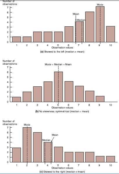
The mean, median, and mode are all useful measures of central tendency, but their value can be limited by unique characteristics of the underlying data. A comparison across alternate measures is useful for determining the extent to which a consistent pattern of central tendency emerges. If the mean, median, and mode all coincide at a single sample observation, the sample data are said to be symmetrical. If the data are perfectly symmetrical, then the distribution of data above the mean is a perfect mirror image of the data distribution below the mean. A perfectly symmetrical distribution is illustrated in Figure. Whereas a symmetrical distribution implies balance in sample dispersion, skewness implies a lack of balance. If the greater bulk of sample observations are found to the left of the sample mean, then the sample is said to be skewed downward or to the left as in Figure. If the greater bulk of sample observations are found to the right of the mean, then the sample is said to be skewed upward or to the right as in Figure). When alternate measures of central tendency converge on a single value or narrow range of values, managers can be confident that an important characteristic of a fairly homogeneous sample of observations has been discovered. When alternate measures of central tendency fail to converge on a single value or range of values, then it is likely that underlying data comprise a heterogeneous sample of observations with important subsample differences. A comparison of alternate measures of central tendency is usually an important first step to determining whether a more detailed analysis of subsample differences is necessary.

The Mean, Median, and Mode

error: Content is protected !!