Scatter Plots, Meaning, Definition, Characteristics, Uses, Types, Steps, Applications, Advantages and Limitations

Scatter Plot is a graphical method used in statistics to study the relationship between two variables. It consists of a set of points plotted on a graph, where one variable is represented on the horizontal axis (X-axis) and the other on the vertical axis (Y-axis). Each point on the graph represents a pair of values.

Scatter plots help identify the direction, strength, and nature of the relationship between variables. They are widely used in business statistics, economics, marketing, finance, and research to analyze correlations and trends.

Definition of Scatter Plot

Scatter plot is a diagram that displays the relationship between two quantitative variables by plotting their paired observations as points on a coordinate plane.

Characteristics of Scatter Plots

  • Displays Relationship Between Two Variables

A scatter plot is primarily used to show the relationship between two quantitative variables. One variable is plotted on the horizontal axis and the other on the vertical axis. Each point represents a pair of values. By observing the arrangement of points, analysts can determine whether a relationship exists between the variables. This characteristic makes scatter plots an effective tool for studying associations, trends, and patterns in business, economics, and research data.

  • Uses Individual Data Points

In a scatter plot, every observation is represented by a separate point on the graph. Unlike grouped charts, scatter plots display individual data values without combining them into categories. This allows analysts to examine the exact distribution of observations. The use of individual points provides a detailed view of the dataset and helps identify variations among observations. Consequently, scatter plots offer a more accurate representation of relationships between variables.

  • Indicates Direction of Correlation

One of the key characteristics of a scatter plot is its ability to show the direction of correlation. If the points move upward from left to right, the correlation is positive. If they move downward, the correlation is negative. When no pattern exists, there is no correlation. This visual representation helps managers and researchers quickly understand how changes in one variable affect another. Therefore, scatter plots are widely used in correlation analysis.

  • Reveals Strength of Relationship

Scatter plots help determine the strength of the relationship between variables. When points are closely clustered around an imaginary line, the relationship is strong. When points are widely scattered, the relationship is weak. This characteristic enables analysts to assess the degree of association without performing complex calculations. By examining the concentration of points, businesses can evaluate the effectiveness of factors such as advertising, pricing, training, or production on desired outcomes.

  • Easy to Construct and Interpret

Scatter plots are simple to create and easy to understand. They require only paired observations and a coordinate system for plotting. The graphical presentation makes relationships visible at a glance, even to individuals with limited statistical knowledge. This simplicity increases their popularity in business reports, presentations, and research studies. Because of their visual appeal and straightforward interpretation, scatter plots are widely used for preliminary data analysis and decision-making.

  • Helps Identify Outliers

Another important characteristic of scatter plots is their ability to identify outliers. Outliers are observations that differ significantly from the general pattern of data. In a scatter plot, such values appear isolated from the majority of points. Detecting outliers is important because they may indicate errors, unusual events, or special circumstances requiring further investigation. This characteristic improves data quality and helps analysts avoid misleading conclusions during statistical analysis.

  • Useful for Trend Analysis

Scatter plots are valuable tools for identifying trends and patterns in data. The overall arrangement of points reveals whether variables move together or in opposite directions. Businesses use scatter plots to analyze sales growth, advertising effectiveness, production efficiency, and customer behavior. Recognizing trends helps managers predict future outcomes and make informed decisions. Therefore, the ability to highlight trends is one of the most practical characteristics of scatter plots in business statistics.

  • Provides Visual Representation of Correlation

Scatter plots offer a clear visual representation of correlation between variables. Instead of relying solely on numerical coefficients, analysts can observe the actual pattern formed by the data points. This graphical approach makes it easier to understand relationships and communicate findings to others. Visual representations are especially useful in business environments where quick interpretation is essential. As a result, scatter plots serve as an effective and widely accepted method for studying and presenting correlations.

Uses of Scatter Plots

  • Studying Correlation Between Variables

One of the primary uses of scatter plots is to study the correlation between two variables. By plotting paired observations on a graph, analysts can determine whether the variables are positively related, negatively related, or unrelated. The pattern of points helps identify the direction and strength of the relationship. In business statistics, this is useful for understanding how one factor influences another. Scatter plots provide a simple and effective visual tool for analyzing correlations before applying more advanced statistical methods.

  • Analyzing Sales and Advertising Relationships

Businesses often use scatter plots to examine the relationship between advertising expenditure and sales revenue. By plotting advertising costs against sales figures, managers can determine whether increased advertising leads to higher sales. The visual representation helps assess the effectiveness of marketing campaigns and promotional activities. If a strong positive relationship exists, the company may decide to invest more in advertising. Thus, scatter plots support marketing decisions and help businesses allocate resources more efficiently.

  • Forecasting Business Trends

Scatter plots are useful for identifying trends that can assist in forecasting future business performance. By analyzing the pattern of data points, managers can estimate how changes in one variable may affect another. For example, a business may study the relationship between customer demand and seasonal factors. Understanding such trends enables organizations to prepare future plans, manage inventory, and allocate resources effectively. Therefore, scatter plots serve as valuable tools for forecasting and strategic business planning.

  • Evaluating Production Efficiency

Manufacturing organizations use scatter plots to evaluate the relationship between production inputs and outputs. For example, labor hours may be plotted against units produced to determine whether increased effort leads to higher productivity. The resulting pattern helps managers identify efficiency levels and potential areas for improvement. By understanding these relationships, businesses can optimize resource utilization and reduce operational costs. Consequently, scatter plots contribute to improved production management and organizational performance.

  • Identifying Outliers and Unusual Observations

Scatter plots are highly effective in detecting outliers and unusual observations within a dataset. Points that appear far from the general pattern indicate exceptional cases that may require further investigation. These outliers may result from measurement errors, unusual business events, or unique circumstances. Identifying such observations is important because they can influence statistical results and business decisions. Therefore, scatter plots help improve data quality and ensure more reliable analysis by highlighting irregularities in the dataset.

  • Supporting Financial Analysis

Financial analysts use scatter plots to study relationships between financial variables such as risk and return, income and expenditure, or investment and profit. The graphical representation helps identify patterns that may influence financial decision-making. Investors can assess whether higher risk is associated with higher returns, while businesses can evaluate the impact of investment strategies. By providing a visual understanding of financial relationships, scatter plots assist in planning, budgeting, and risk management activities.

  • Assisting Market Research

In market research, scatter plots help analyze consumer behavior and purchasing patterns. Businesses can study relationships between factors such as customer income and spending, age and product preference, or price and demand. The resulting patterns provide valuable insights into market trends and customer needs. These insights help organizations design effective marketing strategies, improve product offerings, and target specific customer segments. Therefore, scatter plots are important tools for understanding market dynamics and enhancing business competitiveness.

  • Improving Decision-Making

Scatter plots support managerial decision-making by presenting complex data relationships in a simple visual format. Decision-makers can quickly observe trends, correlations, and unusual patterns without relying solely on numerical calculations. This visual clarity helps managers evaluate alternatives and choose appropriate courses of action. Whether analyzing sales performance, production efficiency, customer behavior, or financial outcomes, scatter plots provide useful information for informed decisions. Consequently, they play an important role in business analysis, planning, and organizational management.

Types of Scatter Plots

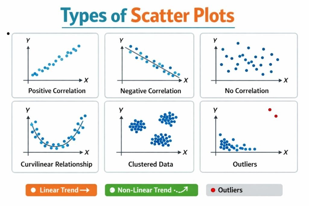
1. Positive Scatter Plot (Positive Correlation)

Positive Scatter Plot shows a positive relationship between two variables. In this type of scatter plot, as the value of one variable increases, the value of the other variable also increases. The plotted points tend to move upward from the lower-left corner to the upper-right corner of the graph. The closer the points are to an imaginary straight line, the stronger the positive correlation. Positive scatter plots are commonly found in business situations where variables move in the same direction. They help managers understand how increases in one factor may lead to increases in another factor.

Example: The relationship between advertising expenditure and sales revenue is usually positive. As advertising expenses increase, sales generally increase.

Characteristics

  • Upward trend of points.
  • Variables move in the same direction.
  • Indicates direct relationship.
  • Can be strong or weak positive correlation.
  • Useful for forecasting growth.

2. Negative Scatter Plot (Negative Correlation)

Negative Scatter Plot shows a negative relationship between two variables. In this type of plot, as one variable increases, the other decreases. The points move downward from the upper-left corner to the lower-right corner of the graph. The closer the points are to a straight descending line, the stronger the negative correlation. Negative scatter plots are useful in identifying inverse relationships between variables. Businesses often use them to study factors that move in opposite directions and to understand the impact of one variable on another.

Example: The relationship between product price and quantity demanded is generally negative. When prices increase, demand usually decreases.

Characteristics

  • Downward trend of points.
  • Variables move in opposite directions.
  • Indicates inverse relationship.
  • May be strong or weak negative correlation.
  • Useful in demand and pricing analysis.

3. Zero Scatter Plot (No Correlation)

Zero Scatter Plot indicates that there is no relationship between the two variables. The points are scattered randomly across the graph without forming any recognizable pattern. Changes in one variable do not systematically affect the other variable. Since there is no correlation, the values of one variable cannot be used to predict the values of the other. This type of scatter plot is important because it helps analysts identify situations where variables are unrelated. Recognizing the absence of a relationship prevents incorrect assumptions and improves the accuracy of business analysis.

Example: There is generally no relationship between a person’s shoe size and intelligence level.

Characteristics

  • Random distribution of points.
  • No upward or downward trend.
  • Variables are unrelated.
  • Correlation is approximately zero.
  • Limited forecasting value.

4. Perfect Positive Scatter Plot

Perfect Positive Scatter Plot occurs when all points lie exactly on a straight line that slopes upward from left to right. This indicates a perfect positive correlation, meaning that every increase in one variable is accompanied by a proportional increase in the other variable. The coefficient of correlation in this case is +1. Although perfect positive relationships are rare in real-life business situations, they provide a theoretical model for understanding strong direct relationships. Such plots demonstrate complete consistency between the variables.

Example: Temperature measured in Celsius and Fahrenheit has a perfect positive relationship.

Characteristics

  • All points lie on a straight upward line.
  • Correlation coefficient = +1.
  • Perfect direct relationship.
  • No deviation from the trend.
  • Rare in practical business data.

5. Perfect Negative Scatter Plot

Perfect Negative Scatter Plot occurs when all points lie exactly on a straight line sloping downward from left to right. This indicates a perfect negative correlation where every increase in one variable results in a proportional decrease in the other variable. The coefficient of correlation is –1. Like perfect positive correlation, perfect negative relationships are uncommon in business data. However, they are important in statistical theory because they represent the strongest possible inverse relationship between variables.

Example: Distance traveled and fuel remaining in a vehicle under constant conditions may show a nearly perfect negative relationship.

Characteristics

  • All points lie on a straight downward line.
  • Correlation coefficient = –1.
  • Perfect inverse relationship.
  • No variation from the trend.
  • Useful for theoretical analysis.

6. Curvilinear Scatter Plot

Curvilinear Scatter Plot shows a relationship between variables that follows a curve rather than a straight line. In this type of scatter plot, the variables are related, but the rate of change is not constant. As one variable changes, the other may increase or decrease at varying rates. Curvilinear relationships are common in economics and business where real-world variables often behave in complex ways. This type of scatter plot helps analysts identify nonlinear relationships that cannot be explained by simple correlation.

Example: The relationship between employee experience and productivity may initially increase rapidly and then level off over time.

Characteristics

  • Points form a curved pattern.
  • Indicates nonlinear relationship.
  • Variables are related but not linearly.
  • Common in economic and business data.
  • Useful for advanced statistical analysis.

Steps in Constructing a Scatter Plot

Step 1. Define the Objective of the Study

The first step in constructing a scatter plot is to clearly define the purpose of the analysis. The researcher must identify the two variables whose relationship is to be studied. Understanding the objective helps in selecting relevant data and interpreting results accurately. For example, a business may want to examine the relationship between advertising expenditure and sales revenue. A clearly defined objective ensures that the scatter plot serves a meaningful analytical purpose and provides useful insights for decision-making and business planning.

Step 2. Collect Paired Data

After defining the objective, the next step is to collect paired observations for the two variables. Each observation must contain corresponding values of both variables. For example, if sales and advertising expenses are being studied, data for both variables should be collected for the same time periods. Accurate and reliable data is essential because the quality of the scatter plot depends on the quality of the information used. Proper data collection ensures meaningful analysis and valid conclusions regarding the relationship between variables.

Step 3. Identify Independent and Dependent Variables

The variables must be classified into independent and dependent variables. The independent variable is the factor that influences or predicts changes, while the dependent variable is the outcome being studied. In business analysis, advertising expenditure is often considered the independent variable, and sales revenue is the dependent variable. Correct identification of variables helps in plotting them appropriately on the graph. This step ensures consistency and improves the interpretation of the scatter plot and the relationship between variables.

Step 4. Draw the Coordinate Axes

The next step is to draw two perpendicular axes on graph paper or using statistical software. The horizontal axis is called the X-axis, while the vertical axis is called the Y-axis. These axes provide the framework for plotting data points. The X-axis generally represents the independent variable, and the Y-axis represents the dependent variable. Properly drawn axes help maintain clarity and accuracy in the graph. This structure serves as the foundation for constructing an effective scatter plot.

Step 5. Choose Suitable Scales

Appropriate scales should be selected for both the X-axis and Y-axis. The scales must accommodate the range of values in the dataset and allow all observations to be displayed clearly. If the scale is too large or too small, the pattern of points may become difficult to interpret. A suitable scale ensures that variations in the data are represented accurately. This step is important because the visual appearance of the scatter plot depends significantly on the scales chosen for both variables.

Step 6. Plot the Data Points

Each pair of observations is then plotted as a point on the graph. The position of each point is determined by the corresponding values of the two variables. For example, if advertising expenditure is ₹10,000 and sales are ₹50,000, the point is plotted at the intersection of these values on the graph. This process is repeated for all observations. The collection of plotted points forms the scatter plot. Accurate plotting is essential because errors at this stage can lead to incorrect interpretations.

Step 7. Observe the Pattern of Points

Once all points have been plotted, the overall pattern formed by the points should be examined carefully. The arrangement may show an upward trend, a downward trend, or no clear pattern. An upward pattern indicates positive correlation, while a downward pattern indicates negative correlation. Random scattering suggests no correlation. Observing the pattern helps analysts understand the nature and strength of the relationship between variables. This step transforms raw data into meaningful visual information for analysis and decision-making.

Step 8. Interpret and Draw Conclusions

The final step is to interpret the scatter plot and draw conclusions based on the observed pattern. Analysts evaluate the direction, strength, and nature of the relationship between variables. They may also identify outliers or unusual observations that require further investigation. The conclusions drawn from the scatter plot can support business decisions, forecasting, market research, and performance evaluation. Proper interpretation ensures that the scatter plot provides practical insights and contributes effectively to statistical analysis and business management.

Applications of Scatter Plots in Business

  • Sales and Advertising Analysis

Scatter plots are widely used to study the relationship between advertising expenditure and sales revenue. By plotting advertising costs on one axis and sales figures on the other, businesses can determine whether increased advertising leads to higher sales. A positive pattern of points indicates that promotional activities are effective. Managers use this information to evaluate marketing campaigns and allocate advertising budgets efficiently. Scatter plots help identify trends, measure the impact of advertising efforts, and support strategic decisions aimed at increasing revenue and improving market performance in competitive business environments.

  • Demand and Pricing Analysis

Businesses use scatter plots to analyze the relationship between product prices and customer demand. By plotting price levels against quantities sold, managers can observe how changes in price affect consumer purchasing behavior. A negative correlation often indicates that higher prices lead to lower demand. This analysis helps companies determine optimal pricing strategies and forecast market responses to price adjustments. Scatter plots provide a clear visual representation of demand patterns, enabling businesses to make informed pricing decisions that maximize profitability while maintaining customer satisfaction and market competitiveness.

  • Production and Efficiency Evaluation

Scatter plots are valuable tools for evaluating production efficiency. Businesses can plot production inputs such as labor hours, machine usage, or raw material consumption against output levels. The resulting pattern helps managers assess whether increased inputs lead to proportional increases in production. This analysis identifies productivity trends and highlights inefficiencies in the production process. By understanding these relationships, organizations can optimize resource allocation, reduce operational costs, and improve overall productivity. Consequently, scatter plots support effective production planning and operational management.

  • Financial Performance Analysis

Financial managers use scatter plots to examine relationships between financial variables such as investment and return, revenue and profit, or risk and reward. The graphical representation helps identify patterns that influence financial performance. For example, a positive relationship between investment and profit may encourage additional investment in profitable projects. Scatter plots also help detect unusual financial observations and trends. This application enables businesses to evaluate financial strategies, improve budgeting decisions, and strengthen long-term financial planning for sustainable growth and profitability.

  • Market Research and Consumer Behavior

Scatter plots are extensively used in market research to study consumer behavior and purchasing patterns. Businesses can analyze relationships between factors such as income and spending, age and product preference, or customer satisfaction and loyalty. The visual pattern of points helps researchers identify market trends and customer segments. These insights assist companies in developing targeted marketing strategies and improving product offerings. By understanding consumer behavior through scatter plots, businesses can better meet customer needs, increase sales, and strengthen their competitive position in the marketplace.

  • Human Resource Management

In human resource management, scatter plots help analyze relationships between employee-related variables. For example, organizations may study the connection between training hours and employee performance or between work experience and productivity. The graphical analysis reveals whether investments in employee development contribute to improved results. Managers can use these findings to design training programs, performance evaluation systems, and workforce planning strategies. Scatter plots provide valuable insights into employee behavior and productivity, helping organizations improve human resource effectiveness and achieve organizational objectives.

  • Quality Control and Process Improvement

Scatter plots play an important role in quality control by identifying relationships between production factors and product quality. Businesses can analyze how variables such as temperature, machine speed, or raw material quality affect the final product. By observing patterns in the scatter plot, quality managers can detect causes of defects and process variations. This information helps organizations implement corrective measures and maintain consistent quality standards. As a result, scatter plots contribute to improved product reliability, reduced waste, and enhanced customer satisfaction.

  • Business Forecasting and Strategic Planning

Scatter plots are useful in forecasting and strategic planning because they help identify trends and relationships that may continue in the future. By analyzing historical data, managers can predict how changes in one variable may influence another. For example, a company may study the relationship between economic growth and product demand. Understanding such patterns supports accurate forecasting and long-term planning. Scatter plots enable businesses to anticipate opportunities and challenges, allocate resources effectively, and make strategic decisions that support sustainable growth and competitive advantage.

Advantages of Scatter Plots

  • Easy to Understand and Interpret

Scatter plots are simple graphical tools that are easy to understand and interpret. The relationship between two variables can be observed directly from the arrangement of points on the graph. Even individuals with limited statistical knowledge can identify trends, patterns, and correlations. This simplicity makes scatter plots popular in business reports, presentations, and research studies. Managers can quickly gain insights without performing complex calculations. As a result, scatter plots provide an effective way to communicate statistical information and support decision-making across different levels of an organization.

  • Clearly Shows Relationships Between Variables

One of the greatest advantages of scatter plots is their ability to display relationships between two variables. By plotting paired observations, analysts can easily determine whether variables are positively related, negatively related, or unrelated. This visual representation helps businesses understand how changes in one factor influence another. For example, the relationship between advertising expenditure and sales can be analyzed effectively. The clear display of relationships allows managers to make informed decisions based on observed patterns and trends in the data.

  • Helps Identify the Direction of Correlation

Scatter plots help identify the direction of correlation between variables. An upward trend of points indicates positive correlation, while a downward trend indicates negative correlation. If the points are scattered randomly, there is little or no correlation. This visual identification is valuable because it provides immediate insight into how variables interact. Businesses use this information to analyze factors such as price and demand, training and productivity, or investment and profit. Understanding the direction of correlation supports better planning and strategic decision-making.

  • Indicates the Strength of Relationship

Another important advantage of scatter plots is their ability to show the strength of a relationship. When points are closely clustered around a line, the relationship is strong. When points are widely scattered, the relationship is weak. This visual assessment helps analysts evaluate the reliability of associations between variables. Businesses can use this information to determine whether certain factors significantly influence outcomes. By understanding relationship strength, managers can focus on the most important variables affecting business performance and operational success.

  • Helps Detect Outliers

Scatter plots make it easy to identify outliers or unusual observations. Outliers appear as points that are far away from the general pattern formed by the majority of data points. Detecting such observations is important because they may represent errors, exceptional events, or unique business situations. By identifying outliers, analysts can investigate their causes and determine whether they should be included in the analysis. This improves data quality and enhances the accuracy of statistical conclusions and business decisions.

  • Useful for Trend Analysis and Forecasting

Scatter plots are valuable tools for identifying trends and supporting forecasting activities. The overall pattern of points can reveal whether variables move together over time and whether future changes are likely. Businesses use scatter plots to analyze sales growth, customer demand, production output, and financial performance. Recognizing trends helps managers predict future outcomes and prepare effective strategies. Therefore, scatter plots contribute significantly to planning, forecasting, and long-term business development by providing a visual understanding of historical relationships.

  • Supports Better Decision-Making

Business decisions often require a clear understanding of relationships between variables. Scatter plots provide visual evidence that helps managers evaluate alternatives and make informed choices. Whether analyzing marketing effectiveness, employee productivity, or financial performance, scatter plots simplify complex data and highlight important patterns. The graphical presentation allows decision-makers to quickly identify opportunities and potential problems. As a result, scatter plots support efficient decision-making and contribute to improved organizational performance and strategic management.

  • Applicable in Various Business Areas

Scatter plots have wide applicability across different business functions. They are used in marketing, finance, production, human resource management, quality control, and market research. Their flexibility allows businesses to study a variety of relationships between variables and gain valuable insights. Because scatter plots can be applied to different types of quantitative data, they serve as versatile analytical tools. This broad usefulness makes them an essential component of business statistics and an important aid in solving practical business problems.

Limitations of Scatter Plots

  • Does Not Provide an Exact Numerical Measure

A scatter plot shows the relationship between variables visually, but it does not provide an exact numerical value of correlation. While analysts can observe whether the relationship appears strong or weak, they cannot determine the precise degree of association without calculating a correlation coefficient. This limitation means that scatter plots often need to be supplemented with statistical measures for accurate analysis. Therefore, they serve mainly as a preliminary tool rather than a complete method for measuring relationships between variables.

  • Interpretation Can Be Subjective

The interpretation of scatter plots often depends on the observer’s judgment. Different individuals may draw different conclusions from the same pattern of points, especially when the relationship is weak or unclear. One analyst may see a positive trend, while another may consider the relationship insignificant. This subjectivity can lead to inconsistent conclusions and decision-making. Therefore, scatter plots should be supported by statistical analysis to ensure objective and reliable interpretation of data relationships.

  • Difficult to Analyze Large Datasets

When a dataset contains a large number of observations, scatter plots can become crowded and difficult to read. Numerous overlapping points may obscure patterns and make it challenging to identify relationships between variables. This problem, known as overplotting, reduces the clarity and usefulness of the graph. In large business datasets involving thousands of observations, additional techniques or software tools may be required. Consequently, scatter plots are more effective for small to medium-sized datasets than for very large collections of data.

  • Limited to Two Variables

A basic scatter plot can generally display the relationship between only two variables at a time. Business situations often involve multiple factors influencing outcomes simultaneously. Since scatter plots cannot effectively show the interaction among several variables, their analytical capability is limited. To study complex relationships, businesses may need advanced statistical methods such as multiple regression analysis. Therefore, scatter plots provide only a simplified view of reality and may not capture all important influences affecting business performance.

  • Cannot Establish Cause-and-Effect Relationships

Scatter plots can reveal whether two variables are associated, but they cannot prove that one variable causes changes in the other. A strong correlation may exist even when no direct causal relationship is present. For example, increased sales and increased advertising may occur together, but other factors could influence both variables. Relying solely on scatter plots may lead to incorrect assumptions about causation. Therefore, additional analysis and evidence are necessary before establishing cause-and-effect relationships in business studies.

  • Sensitive to Outliers

Scatter plots are highly sensitive to outliers or extreme observations. A few unusual data points can distort the visual pattern and create a misleading impression of the relationship between variables. These outliers may result from errors, exceptional events, or rare circumstances. If not identified and examined carefully, they can affect interpretation and decision-making. Therefore, analysts must investigate outliers before drawing conclusions from a scatter plot to ensure that the observed relationship accurately reflects the underlying data.

  • Not Suitable for Qualitative Data

Scatter plots require numerical data because each observation must be represented by coordinates on a graph. They are not suitable for qualitative or categorical variables such as gender, occupation, or product type unless these variables are converted into numerical form. This limitation restricts the application of scatter plots in situations involving non-quantitative data. Businesses often deal with qualitative information, and alternative graphical techniques may be needed to analyze such variables effectively.

  • May Oversimplify Complex Relationships

Real-world business relationships are often complex and nonlinear. Scatter plots may oversimplify these relationships by focusing only on the general arrangement of points. Important factors such as seasonal effects, hidden variables, or changing trends over time may not be visible in a simple scatter plot. As a result, analysts may overlook critical information when relying solely on this graphical method. Therefore, scatter plots should be used alongside other statistical tools to obtain a more comprehensive understanding of business data and relationships.

Business interpretation and Application

Kurtosis helps businesses understand the peakedness and tail behavior of data distributions. A leptokurtic distribution indicates that most observations are concentrated around the mean, but there is a higher probability of extreme outcomes. This suggests greater risk and uncertainty in areas such as stock returns, sales fluctuations, or financial performance. A platykurtic distribution indicates a flatter distribution with fewer extreme values, suggesting more evenly spread observations. A mesokurtic distribution represents a normal and balanced pattern of data.

In business applications, kurtosis is widely used in financial risk analysis, investment management, sales forecasting, quality control, and market research. Financial institutions use kurtosis to assess the likelihood of unexpected gains or losses. Manufacturers apply it to monitor product quality and detect unusual defects. Marketing professionals use kurtosis to study customer purchasing behavior and demand patterns. By identifying the probability of extreme events and understanding data concentration, kurtosis assists managers in decision-making, risk management, strategic planning, and improving overall business performance.

  • Risk Assessment in Financial Markets

Kurtosis is widely used in financial markets to assess risk. A leptokurtic distribution indicates a higher probability of extreme gains or losses than a normal distribution. Investors and financial managers analyze kurtosis to understand the likelihood of unexpected market movements. High kurtosis suggests greater uncertainty and risk, while low kurtosis indicates more stable returns. By evaluating kurtosis, businesses can develop better risk management strategies, diversify investments, and prepare for unusual market conditions. Thus, kurtosis helps organizations make informed financial decisions and minimize potential losses.

  • Investment Portfolio Management

In portfolio management, kurtosis helps investors evaluate the behavior of investment returns. A portfolio with high kurtosis may produce frequent average returns but occasionally experience very large gains or losses. Understanding this characteristic allows investors to balance risk and return according to their objectives. Financial analysts use kurtosis alongside other measures such as variance and skewness to assess portfolio performance. By identifying the possibility of extreme outcomes, businesses and investors can select suitable investment options and improve long-term financial planning.

  • Business Forecasting and Planning

Kurtosis provides valuable information for forecasting and planning. Distributions with high kurtosis suggest a greater chance of unusual events that may affect business operations. Managers can use this information to develop contingency plans and allocate resources effectively. For example, sales forecasts with high kurtosis may indicate occasional spikes or drops in demand. Understanding such patterns helps businesses prepare for uncertainties and improve decision-making. Therefore, kurtosis plays an important role in strategic planning and operational management.

  • Quality Control and Production Management

In manufacturing and production processes, kurtosis helps monitor product quality and process consistency. A leptokurtic distribution may indicate that most products meet quality standards but that occasional extreme defects occur. A platykurtic distribution may suggest greater variability in production output. By analyzing kurtosis, quality control managers can identify process irregularities and take corrective measures. This application improves product reliability, reduces waste, and enhances customer satisfaction. Consequently, kurtosis contributes to maintaining high-quality standards in business operations.

  • Market Research and Consumer Behavior Analysis

Businesses use kurtosis in market research to analyze consumer preferences and purchasing patterns. High kurtosis may indicate that most customers exhibit similar behavior, while a few customers show extreme preferences. Understanding these patterns helps companies design targeted marketing campaigns and customer segmentation strategies. Market researchers can identify niche markets, predict demand fluctuations, and improve product positioning. Therefore, kurtosis provides deeper insights into consumer behavior, enabling businesses to develop more effective marketing and sales strategies.

  • Human Resource Management

Kurtosis can be applied in human resource management to evaluate employee performance and productivity distributions. A leptokurtic distribution may indicate that most employees perform near the average level, while a few exhibit exceptionally high or low performance. This information helps managers identify top performers and employees requiring additional support or training. By understanding performance patterns, organizations can improve workforce planning, reward systems, and employee development programs. Thus, kurtosis assists in creating a more efficient and productive work environment.

  • Insurance and Actuarial Analysis

Insurance companies use kurtosis to assess the likelihood of extreme claims and financial losses. High kurtosis indicates a greater probability of rare but significant claims, which can affect profitability. Actuaries analyze kurtosis to determine premium rates, reserve requirements, and risk exposure. This helps insurance firms maintain financial stability and manage uncertainties effectively. By understanding the distribution of claims, companies can design suitable insurance products and develop strategies to protect against unexpected financial events.

  • Economic and Business Research

Kurtosis is an important tool in economic and business research. Researchers use it to study income distribution, consumer spending, market performance, and economic indicators. It helps determine whether data follows a normal pattern or contains a higher likelihood of extreme observations. This information improves the accuracy of statistical models and research conclusions. By analyzing kurtosis, economists and business researchers gain deeper insights into economic trends and market behavior. Consequently, kurtosis enhances the quality and reliability of business research and policy analysis.

Measures of Dispersion, Meaning, Characteristics, Classifications, Absolute and Relative

Measures of dispersion describe the extent to which data values vary or spread around a central value (like the mean or median). While measures of central tendency provide a single summary value, dispersion tells us how consistent or variable the data is. It helps in understanding the reliability, comparability, and risk associated with data.

Dispersion is important in fields like business, economics, psychology, and engineering to analyze stability, identify outliers, and assess performance.

Suppose you have four datasets of the same size and the mean is also same, say, m. In all the cases the sum of the observations will be the same. Here, the measure of central tendency is not giving a clear and complete idea about the distribution for the four given sets.

Characteristics of Measures of Dispersion:

  • Measures the Spread of Data

Dispersion quantifies how much the data points deviate from a central value like the mean or median. It shows the range or variability within a dataset, helping to understand the consistency or inconsistency in the values. A low dispersion indicates closely grouped values, while a high dispersion reflects widely scattered data. This measurement is essential for interpreting the reliability of averages and making informed statistical comparisons.

  • Complements Measures of Central Tendency

While measures like mean, median, and mode summarize data with a single value, they don’t reveal how much data values vary around that point. Measures of dispersion fill this gap by providing insights into data consistency. For example, two datasets may have the same mean but very different variabilities. Dispersion allows a more comprehensive analysis by highlighting differences that central tendency measures alone may conceal.

  • Sensitive to Outliers and Extreme Values

Some dispersion measures, like the range and standard deviation, are affected by extreme values or outliers in the dataset. This characteristic makes them useful for identifying unusual variations or anomalies. However, it can also distort the understanding of typical spread. Hence, in cases with skewed data, more robust measures like interquartile range or median absolute deviation are preferred, as they offer a clearer picture by minimizing the effect of outliers.

  • Uses All or Part of the Data

Different dispersion measures consider different amounts of data. For instance, the range uses only the highest and lowest values, while standard deviation and variance incorporate all data points. Mean deviation and interquartile range lie somewhere in between. This characteristic determines the level of detail and accuracy each measure provides, with more comprehensive methods offering more reliable insights into the true variability in a dataset.

  • Expressed in Same or Related Units

Measures like range, standard deviation, and mean deviation are expressed in the same units as the original data (e.g., rupees, kilograms, marks). This helps in meaningful interpretation and comparison. However, variance, being the square of standard deviation, is expressed in squared units, which can be difficult to interpret directly. To overcome this, the square root of variance is taken to obtain standard deviation in original units.

  • Helps in Comparison of Consistency

Measures of dispersion, especially the coefficient of variation, allow comparison between datasets even when they differ in units or scale. This characteristic is vital in business, economics, and experiments, where comparing the variability between products, markets, or processes is required. A dataset with lower dispersion is considered more consistent and reliable, making these measures essential for decision-making and performance evaluation.

  • Foundation for Advanced Statistical Analysis

Measures of dispersion form the basis for many complex statistical tools such as correlation, regression, hypothesis testing, and probability distributions. Understanding how data varies is critical in these techniques, as it influences confidence levels, error margins, and risk analysis. Dispersion provides the groundwork for predicting outcomes, understanding relationships among variables, and validating statistical models.

  • Applicable to Both Individual and Grouped Data

Dispersion measures can be applied to raw (individual) data as well as grouped or classified data. Whether dealing with discrete scores or frequency tables, there are specific formulas and methods to compute dispersion accordingly. This adaptability makes them widely usable across various fields, including education, industry, economics, and healthcare, ensuring statistical insights remain relevant regardless of data format.

Classification of Measures of Dispersion:

Measures of dispersion are broadly classified into two categories:

1. Absolute Measures of Dispersion

These are expressed in original units of the data (e.g., kilograms, rupees, marks) and indicate the extent of spread within the dataset only. They do not allow comparison between datasets with different units.

Types of Absolute Measures:

(a) Range

Difference between the highest and lowest values.

Formula:

Range = Maximum Value Minimum Value

(b) Quartile Deviation (Semi-Interquartile Range)

Measures spread of the middle 50% of data.

Formula:

Q.D. = (Q3 Q1) / 2

(c) Mean Deviation (Average Deviation)

Average of the absolute deviations from mean/median.

Formula:

M.D. = ∑∣X A∣ / N

(where AA is the mean or median)

(d) Standard Deviation (SD)

Square root of the average of squared deviations from the mean.

(e) Variance

Square of the standard deviation.

2. Relative Measures of Dispersion

These express variability as a ratio or percentage, allowing for comparison between datasets, even with different units or scales. They are unit-free.

Types of Relative Measures:

(a) Coefficient of Range

Formula:

Coefficient of Range = (Max Min) / (Max + Min)

(b) Coefficient of Quartile Deviation

Formula:

Coefficient of Q.D. = (Q3−Q1) / (Q3+Q1)

(c) Coefficient of Mean Deviation

Formula:

Coefficient of M.D. = M.D. / Mean or Median

(d) Coefficient of Variation (CV)

Formula:

CV = (σ / Xˉ) × 100

Used to compare consistency of two or more datasets.

Absolute Dispersion

Absolute Dispersion refers to the actual spread or variability of data values in a dataset, expressed in the same units as the original data (e.g., kilograms, rupees, centimetres). It quantifies how much values deviate from a central point such as the mean, median, or mode without considering relative size or proportion.

It helps measure the extent of variation in raw terms and is useful when analyzing data within the same unit or scale.

Common Measures of Absolute Dispersion:

1. Range

Formula: Range = Maximum Value Minimum Value 

Explanation: It shows the total spread between the smallest and largest observations. It’s the simplest measure but affected heavily by outliers.

2. Quartile Deviation (Semi-Interquartile Range)

Formula: Q.D. = (Q3 Q1) / 2

Explanation: Measures dispersion of the middle 50% of data. Less affected by extreme values and suitable for skewed distributions.

Characteristics of Absolute Dispersion:

  • Expressed in same unit as the original data.

  • Measures actual variation, not relative to the mean.

  • Useful for descriptive analysis of single datasets.

  • Can’t be used to compare datasets with different units or scales.

Relative Dispersion

Relative Dispersion refers to the ratio or proportion of absolute dispersion (like standard deviation or range) relative to a central tendency such as the mean or median. Unlike absolute dispersion, which is expressed in actual units, relative dispersion is unit-free, allowing for comparison between datasets with different units, magnitudes, or scales.

It is extremely useful for evaluating consistency, reliability, and relative variability across diverse datasets.

Common Measures of Relative Dispersion:

1. Coefficient of Range

Formula: Coefficient of Range = (Maximum−Minimum) / (Maximum+Minimum)

Use: Helps compare range across datasets with different units.

2. Coefficient of Quartile Deviation

Formula: Coefficient of Q.D. = (Q3−Q1) / (Q3+Q1)

Use: Useful when median and interquartile range are more appropriate due to skewed distributions.

3. Coefficient of Mean Deviation

Formula: Coefficient of M.D. = Mean Deviation / Mean (or Median)

Use: Gives the average absolute deviation in proportion to the central value.

4. Coefficient of Standard Deviation (also known as Coefficient of Variation)

Formula: Coefficient of SD = σ / Xˉ,  or as percentage: CV =/ Xˉ) × 100

Most common and powerful relative measure—used to compare variability regardless of units.

Features of Relative Dispersion:

  • Unit-free: Makes cross-comparison possible

  • Proportional: Shows variation relative to central value

  • Normalized: Works even when datasets have different means or scales

  • Useful in benchmarking, risk analysis, and decision-making

Applications of Relative Dispersion:

  • Finance: Compare risk of investments using coefficient of variation.
  • Education: Assess relative performance of students in different subjects.
  • Healthcare: Analyze variability in treatment outcomes across hospitals.
  • Manufacturing: Benchmark machine performance across units or locations.
  • Economics: Study price variation between regions or time periods.

Limitations of Relative Dispersion:

  • Not meaningful if the central tendency (mean) is zero — leads to division by zero or undefined results.

  • Less informative if data is extremely skewed or has many outliers.

  • Interpretation depends on understanding the context of variation.

Coefficient of Dispersion

Whenever we want to compare the variability of the two series which differ widely in their averages. Also, when the unit of measurement is different. We need to calculate the coefficients of dispersion along with the measure of dispersion. The coefficients of dispersion (C.D.) based on different measures of dispersion are

  • Based on Range = (X max – X min) ⁄ (X max + X min).
  • C.D. based on quartile deviation = (Q3 – Q1) ⁄ (Q3 + Q1).
  • Based on mean deviation = Mean deviation/average from which it is calculated.
  • For Standard deviation = S.D. ⁄ Mean

Coefficient of Variation

100 times the coefficient of dispersion based on standard deviation is the coefficient of variation (C.V.).

C.V. = 100 × (S.D. / Mean) = (σ/ȳ ) × 100.

Partition Values, Meaning, Definition, Characteristics and Types

Partition Values are statistical measures that divide a dataset into a number of equal parts. They help in understanding the distribution of data by indicating the position of observations within a dataset. Unlike averages, which provide a central value, partition values show how data is spread across different sections.

Partition values are widely used in Business Statistics to analyze income distribution, employee performance, sales data, examination results, and market research. They are also known as Positional Measures because they depend on the position of observations in an ordered series.

Definition of Partition Values

Partition values are values that divide a series of observations into equal parts after arranging the data in ascending or descending order.

For example:

  • Median divides data into 2 equal parts.
  • Quartiles divide data into 4 equal parts.
  • Deciles divide data into 10 equal parts.
  • Percentiles divide data into 100 equal parts.

Characteristics of Partition Values

  • Positional Measures

Partition values are known as positional measures because they are determined by the position of observations in an ordered dataset. They do not depend primarily on the actual magnitude of every value but on where a value lies within the series. After arranging the data in ascending or descending order, partition values divide the dataset into equal sections. This characteristic makes them useful for identifying the relative standing of observations. Examples include median, quartiles, deciles, and percentiles, all of which are based on position rather than arithmetic calculations.

  • Divide Data into Equal Parts

A key characteristic of partition values is that they divide a dataset into equal parts. The median divides data into two parts, quartiles into four parts, deciles into ten parts, and percentiles into one hundred parts. This division helps researchers understand how observations are distributed throughout the dataset. By creating equal sections, partition values provide detailed information about different portions of the data. This characteristic is particularly useful for analyzing distributions and comparing groups within a population or sample.

  • Require Ordered Data

Partition values can only be calculated after arranging the observations in ascending or descending order. Without proper ordering, the position of observations cannot be identified accurately. This characteristic distinguishes partition values from some other statistical measures that can be calculated directly from raw data. The process of arranging data ensures that the relative positions of observations are clear. Therefore, ordering is an essential prerequisite for calculating median, quartiles, deciles, and percentiles. Accurate arrangement improves the reliability and usefulness of partition values.

  • Less Affected by Extreme Values

Partition values are generally less influenced by extremely high or low observations than arithmetic mean. Since they are based on position rather than magnitude, outliers have little effect on their calculation. This characteristic makes partition values particularly useful when dealing with skewed distributions or datasets containing unusual observations. For example, the median remains relatively stable even if a few observations are exceptionally large or small. Consequently, partition values often provide a more representative measure of distribution in situations where extreme values might distort other statistical measures.

  • Useful for Skewed Distributions

Another important characteristic of partition values is their suitability for skewed distributions. In many real-world situations, data is not distributed symmetrically. Income, wealth, sales, and population data often exhibit skewness. Partition values provide meaningful information in such cases because they are not heavily influenced by extreme observations. They accurately reflect the position of data within the distribution. This characteristic makes them valuable tools in business statistics, economics, and social sciences where skewed datasets are common. They help analysts understand distributions more effectively than some average-based measures.

  • Facilitate Comparison

Partition values make it easier to compare different groups, populations, or datasets. By identifying specific positions within distributions, they allow analysts to evaluate relative performance and standing. For example, quartiles can be used to compare employee productivity, while percentiles can compare student achievement levels. This characteristic is useful in business, education, and research. Since partition values provide standardized positional measures, comparisons become more meaningful and objective. As a result, they are frequently used for benchmarking, ranking, and performance evaluation across various fields.

  • Applicable to Different Types of Data

Partition values can be applied to both individual and grouped data. Whether observations are presented as raw data, frequency distributions, or continuous series, partition values can be calculated effectively. This flexibility increases their usefulness in statistical analysis. Researchers can apply them in a variety of situations without changing the basic concept. Their adaptability makes them suitable for business reports, economic studies, educational assessments, and research projects. Therefore, partition values serve as versatile statistical tools capable of handling different forms of data presentation.

  • Provide Detailed Information About Distribution

Partition values offer detailed insights into the distribution of data. Instead of providing only a central value, they reveal how observations are spread across different sections of the dataset. Quartiles show the distribution in four parts, deciles in ten parts, and percentiles in one hundred parts. This detailed breakdown helps analysts identify concentration, dispersion, and relative positions within the data. Such information is valuable for decision-making, planning, and evaluation. Consequently, partition values are widely used when a deeper understanding of data distribution is required.

Types of Partition Values

1. Median

Median is the most basic partition value and divides a dataset into two equal parts. After arranging the observations in ascending or descending order, the median is the middle value of the series. It indicates that 50% of the observations lie below it and 50% lie above it. The median is particularly useful when data contains extreme values because it is not significantly affected by outliers. In business statistics, the median is used to analyze income levels, wages, sales figures, and customer expenditures. It provides a representative central position of the data and is widely applied in economics, market research, and performance evaluation. The median is also known as the second quartile (Q₂) and serves as the foundation for understanding other partition values.

Example

Data: 10, 20, 30, 40, 50

Median = 30

The dataset is divided into two equal parts.

2. Quartiles

Quartiles are partition values that divide a dataset into four equal parts. There are three quartiles: First Quartile (Q₁), Second Quartile (Q₂), and Third Quartile (Q₃). Q₁ represents the value below which 25% of observations lie, Q₂ is the median representing 50%, and Q₃ indicates that 75% of observations lie below it. Quartiles help in understanding the spread and distribution of data. They are useful for measuring variability and identifying the concentration of observations within different sections of a dataset. In business and economics, quartiles are used for salary analysis, income distribution studies, customer segmentation, and performance assessment. They provide a detailed picture of how data is distributed and help in comparative statistical analysis.

Formula:

Qk = k(n+1) / 4

Where,

k is the quartile position (1, 2, or 3)

n is the number of observations.

There are three quartiles:

  • Q₁ (First Quartile) – 25% of observations lie below it.
  • Q₂ (Second Quartile) – Median (50%).
  • Q₃ (Third Quartile) – 75% of observations lie below it.

Example: Data: 10, 20, 30, 40, 50, 60, 70, 80

  • Q₁ = 25
  • Q₂ = 45
  • Q₃ = 65

3. Deciles

Deciles divide a dataset into ten equal parts, resulting in nine decile values (D₁ to D₉). Each decile represents a specific percentage position within the data. For example, D₁ indicates that 10% of observations lie below it, while D₅ corresponds to the median and represents 50% of the observations. Deciles provide a more detailed analysis of data distribution compared to quartiles because they divide the dataset into smaller sections. In business statistics, deciles are commonly used in marketing research, employee performance evaluation, customer classification, and financial analysis. They help managers identify top-performing and low-performing groups. By offering a more refined breakdown of data, deciles support better decision-making and detailed comparative studies.

Formula:

Dk = k(n+1)10

Where k is the decile position (1 to 9).

There are nine deciles:

  • D₁, D₂, D₃, … D₉

Each decile represents 10% of the observations.

Example: If D₄ = 40, it means 40% of observations lie below that value.

4. Percentiles

Percentiles divide a dataset into one hundred equal parts, creating ninety-nine percentile values (P₁ to P₉₉). Each percentile represents 1% of the observations. For instance, the 25th percentile indicates that 25% of observations are below that value, while the 90th percentile shows that 90% of observations lie below it. Percentiles provide the most detailed measure among partition values and are widely used in education, business, healthcare, and research. They help rank individuals, compare performances, and analyze distributions accurately. In business, percentiles are used for customer segmentation, salary surveys, market research, and risk assessment. Their ability to provide highly detailed positional information makes them extremely valuable for statistical analysis and decision-making.

Formula:

Pk = k(n+1) / 100

Where k is the percentile position (1 to 99).

There are ninety-nine percentiles:

  • P₁, P₂, P₃, … P₉₉

Each percentile represents 1% of the observations.

Example: If P₇₅ = 80, then 75% of observations are below 80.

Measures of Central Tendency, Mean, Median, and Mode

Measure of Central tendency is a summary statistic that represents the center point or typical value of a dataset. These measures indicate where most values in a distribution fall and are also referred to as the central location of a distribution. You can think of it as the tendency of data to cluster around a middle value. In statistics, the three most common measures of central tendency are the mean, median, and mode. Each of these measures calculates the location of the central point using a different method.

The mean, median and mode are all valid measures of central tendency, but under different conditions, some measures of central tendency become more appropriate to use than others. In the following sections, we will look at the mean, mode and median, and learn how to calculate them and under what conditions they are most appropriate to be used.

Mean (Arithmetic)

The mean (or average) is the most popular and well known measure of central tendency. It can be used with both discrete and continuous data, although its use is most often with continuous data (see our Types of Variable guide for data types). The mean is equal to the sum of all the values in the data set divided by the number of values in the data set. So, if we have n values in a data set and they have values x1, x2, …, xn, the sample mean, usually denoted by  (pronounced x bar), is:

MEAN.png

This formula is usually written in a slightly different manner using the Greek capitol letter, , pronounced “sigma”, which means “sum of…”:

4.2.png

You may have noticed that the above formula refers to the sample mean. So, why have we called it a sample mean? This is because, in statistics, samples and populations have very different meanings and these differences are very important, even if, in the case of the mean, they are calculated in the same way. To acknowledge that we are calculating the population mean and not the sample mean, we use the Greek lower case letter “mu”, denoted as µ:

4.3.png

The mean is essentially a model of your data set. It is the value that is most common. You will notice, however, that the mean is not often one of the actual values that you have observed in your data set. However, one of its important properties is that it minimizes error in the prediction of any one value in your data set. That is, it is the value that produces the lowest amount of error from all other values in the data set.

An important property of the mean is that it includes every value in your data set as part of the calculation. In addition, the mean is the only measure of central tendency where the sum of the deviations of each value from the mean is always zero.

Median

Median is the middle score for a set of data that has been arranged in order of magnitude. The median is less affected by outliers and skewed data. In order to calculate the median, suppose we have the data below:

65 55 89 56 35 14 56 55 87 45 92

We first need to rearrange that data into order of magnitude (smallest first):

14 35 45 55 55 56 56 65 87 89 92

Our median mark is the middle mark – in this case, 56 (highlighted in bold). It is the middle mark because there are 5 scores before it and 5 scores after it. This works fine when you have an odd number of scores, but what happens when you have an even number of scores? What if you had only 10 scores? Well, you simply have to take the middle two scores and average the result. So, if we look at the example below:

65 55 89 56 35 14 56 55 87 45

We again rearrange that data into order of magnitude (smallest first):

14 35 45 55 55 56 56 65 87 89

Only now we have to take the 5th and 6th score in our data set and average them to get a median of 55.5.

Mode

The mode is the most frequent score in our data set. On a histogram it represents the highest bar in a bar chart or histogram. You can, therefore, sometimes consider the mode as being the most popular option. An example of a mode is presented below:

topic 4.1.png

Graphical Representation, Meaning, Characteristics, Types

Graphical Representation refers to the visual display of data using charts, diagrams, or graphs to make information easier to understand and interpret. It transforms complex numerical data into visual forms like bar diagrams, pie charts, histograms, frequency polygons, and line graphs. Graphs help identify trends, comparisons, and relationships at a glance, making them essential tools in business statistics. They enhance clarity, simplify large datasets, and make presentations more effective for decision-making. For instance, a sales graph can quickly show growth or decline over time. Graphical representation combines accuracy with visual appeal, enabling both technical and non-technical users to grasp key insights efficiently and support data-driven business analysis.

Characteristics of Graphical Representation

  • Suitable Title

The graph must have a clear and concise title, placed at the top, which immediately informs the viewer about the subject matter and the data being presented. A title like “Quarterly Sales Revenue for Product X (2023)” is specific and instantly understandable. Without a suitable title, the graph is ambiguous, leaving the audience to guess its purpose, which undermines its effectiveness as a communication tool. The title sets the context for everything that follows.

  • Proper Scale and Measurement

The scales on the graph’s axes must be clearly defined, uniform, and appropriately sized to accurately represent the data’s variation. The intervals between units should be consistent (e.g., 0, 10, 20, not 0, 5, 15). A distorted or improperly broken scale can exaggerate or minimize trends, misleading the viewer. A well-chosen scale ensures that the visual proportions correctly reflect the numerical relationships in the data, allowing for an accurate and truthful interpretation.

  • Neat and Attractive

An effective graph is visually clean, uncluttered, and aesthetically pleasing. This involves using clear fonts, sensible colors, and adequate spacing. A neat presentation enhances readability and engages the viewer, making them more likely to study the information. A cluttered, messy, or confusing graph can deter the audience, no matter how valuable the underlying data, defeating its primary purpose of clear communication.

  • Clear Labeling

Both the vertical (Y-axis) and horizontal (X-axis) must be clearly labeled with the name of the variable and the unit of measurement (e.g., “Revenue (in $000s)” or “Time (Quarters)”). Any segments within the graph, such as bars in a histogram or slices in a pie chart, should also be explicitly labeled or accompanied by a legend. Without clear labels, the graph is incomprehensible, as the viewer cannot decipher what the visual elements are intended to represent.

  • Easy to Understand

The prime objective of a graph is to simplify complex data. Therefore, the chosen chart type should present the information in the most straightforward way possible. It should convey the main message—such as a trend, comparison, or composition—at a glance, without requiring complex mental gymnastics from the viewer. Overly complicated or unconventional graphs hinder understanding rather than facilitate it.

  • Accurate and Truthful Representation

The most critical characteristic is that the graph must be an honest and accurate depiction of the data. It should avoid visual distortions that mislead the eye, such as manipulating the axis starting point (not starting at zero in a bar chart) or using 3D effects that skew the perception of values. The graphical representation must maintain the integrity of the original data to be a trustworthy tool for decision-making.

Types of Graphical Representation

  • Bar Diagram

Bar Diagram represents data using rectangular bars of equal width but varying height, where each bar’s height corresponds to the value it represents. It is used for comparing discrete categories like sales by region or production by department. Bar diagrams can be simple, multiple, or component (sub-divided) depending on the data type. The bars can be drawn vertically or horizontally. In business, bar diagrams help in comparing performance, analyzing trends, and visualizing categorical data effectively. They are easy to construct and interpret, making them one of the most common tools for graphical data presentation.

  • Pie Chart

Pie Chart is a circular graph divided into slices, where each slice represents a proportion of the whole. It is mainly used to show percentage or part-to-whole relationships. Each sector’s angle is proportional to the quantity it represents, making it easy to visualize the relative importance of different components. For example, a company can use a pie chart to display the market share of various products or departments. Pie charts are simple, visually appealing, and effective for showing data distribution at a glance. However, they are best suited for a limited number of categories to maintain clarity.

  • Histogram

Histogram is a graphical representation of continuous frequency data using adjacent rectangular bars. Each bar represents a class interval, and its height corresponds to the frequency of observations within that range. Unlike bar diagrams, there are no gaps between bars, indicating data continuity. Histograms are useful for understanding the distribution and spread of data, such as income levels, test scores, or production rates. In business, they help analyze quality control and variation in processes. They also help identify patterns like skewness or symmetry in data. Histograms are widely used in statistical analysis and research interpretation.

  • Frequency Polygon

Frequency Polygon is a line graph formed by joining the midpoints of the tops of histogram bars or by plotting frequencies against class midpoints. It represents the distribution of continuous data and helps visualize trends and comparisons between datasets. The line starts and ends on the x-axis to enclose the graph. Frequency polygons are especially useful when comparing multiple frequency distributions on the same graph. In business, they help analyze patterns such as sales performance or production output over time. Frequency polygons provide a clear picture of data shape, variation, and overall distribution.

  • Line Graph

Line Graph displays data points connected by straight lines, showing changes or trends over time. It is used for time-series data such as monthly sales, annual revenue, or stock prices. The x-axis represents time intervals, while the y-axis represents the values of the variable. Line graphs help identify growth patterns, fluctuations, or seasonal effects quickly. In business, they are essential for performance tracking and forecasting. Multiple lines can be drawn on the same graph to compare different datasets. Line graphs are simple, dynamic, and effective for illustrating continuous changes and long-term business trends.

Business Statistics, Meaning, Scope, Importance and Limitations

Statistics is the science of collecting, organizing, presenting, analyzing, and interpreting numerical data to make meaningful decisions. It helps researchers, businesses, governments, and individuals understand facts and trends by converting raw data into useful information. Statistics provides techniques for summarizing large volumes of data and drawing conclusions from them. It is widely used in business, economics, education, medicine, and social sciences for planning and decision-making.

According to Croxton and Cowden, “Statistics may be defined as the collection, presentation, analysis, and interpretation of numerical data.”

Meaning of Business Statistics

Business Statistics is the branch of statistics that deals with the collection, classification, presentation, analysis, and interpretation of numerical data related to business and economic activities. It provides scientific methods for making business decisions under conditions of uncertainty. Business Statistics helps managers understand market trends, customer behavior, production performance, financial conditions, and business risks.

In the modern business environment, organizations generate large amounts of data. Business Statistics converts this raw data into meaningful information that assists in planning, forecasting, controlling, and decision-making. It is widely used in marketing, finance, production, human resource management, and research.

Definitions of Business Statistics

  • Croxton and Cowden

Business Statistics is the science of collecting, presenting, analyzing, and interpreting numerical data for business decision-making.

  • Bowley

Statistics are numerical statements of facts placed in relation to each other, helping businesses understand and evaluate situations.

  • Ya-Lun Chou

Statistics is a method of decision-making in the face of uncertainty based on data and information.

Characteristics of Business Statistics

  •  Quantitative in Nature

Business Statistics primarily deals with numerical and measurable data. It converts business activities into quantitative form so that they can be analyzed scientifically. Information such as sales revenue, production output, profit margins, employee productivity, and market share can be expressed in numbers and evaluated using statistical methods. Qualitative information, such as customer satisfaction or employee morale, is also transformed into numerical values through surveys and rating scales. This quantitative approach enables businesses to make objective decisions based on facts rather than assumptions. Thus, the numerical nature of Business Statistics makes it a reliable tool for analysis and decision-making.

  • Systematic Collection of Data

A key characteristic of Business Statistics is the systematic collection of data. Information is gathered according to a predefined plan and scientific procedure to ensure accuracy and reliability. Data may be collected through surveys, questionnaires, observations, experiments, or business records. Random or unorganized collection of information can lead to misleading conclusions. Therefore, statistical investigations follow established methods and standards. Systematic collection helps businesses obtain relevant and consistent data for analysis. It also reduces errors and bias in the decision-making process, ensuring that conclusions drawn from statistical studies are dependable and useful.

  • Concerned with Aggregates

Business Statistics studies groups of observations rather than individual cases. It focuses on aggregates of facts that represent a larger population or business activity. For example, a company may analyze the purchasing behavior of thousands of customers rather than examining the actions of a single customer. By studying aggregated data, patterns, trends, and relationships become visible. This characteristic enables businesses to make generalized conclusions and strategic decisions. Statistical methods are not designed to explain individual occurrences but rather to identify overall tendencies within a group, making them valuable for organizational planning and policy formulation.

  • Aids Decision-Making

Business Statistics serves as an important aid in managerial decision-making. Managers use statistical information to evaluate alternatives, predict outcomes, and select the most suitable course of action. Whether deciding on pricing policies, production levels, investment opportunities, or marketing strategies, statistical analysis provides factual support. It reduces uncertainty by presenting data in a meaningful form and identifying trends and patterns. Since business decisions often involve risks, statistical techniques help estimate probabilities and potential consequences. This characteristic makes Business Statistics an essential component of modern management, allowing decisions to be based on evidence rather than intuition.

  • Comparative Study

Another important characteristic of Business Statistics is its ability to facilitate comparisons. Statistical tools help compare business performance across different periods, regions, products, departments, or organizations. For instance, a company can compare sales figures for different years to determine growth trends. Comparative analysis helps identify strengths, weaknesses, opportunities, and threats. Ratios, percentages, averages, and index numbers are commonly used for such comparisons. This characteristic enables managers to evaluate performance effectively and make improvements where necessary. By providing a basis for comparison, Business Statistics contributes significantly to strategic planning and performance measurement.

  • Deals with Uncertainty

Business environments are often characterized by uncertainty and risk. Business Statistics helps organizations deal with such uncertainty by providing techniques for forecasting and probability analysis. Future demand, sales, profits, and market trends cannot be predicted with complete certainty, but statistical methods can estimate likely outcomes. These estimates enable businesses to prepare for future situations and minimize risks. Statistical forecasting models help managers make informed decisions even when complete information is unavailable. Therefore, the ability to handle uncertainty is one of the most valuable characteristics of Business Statistics, particularly in dynamic and competitive markets.

  • Scientific Approach

Business Statistics follows a scientific and logical approach in analyzing data. It relies on established principles, mathematical techniques, and objective methods rather than personal opinions. The statistical process involves defining objectives, collecting data, organizing information, analyzing results, and drawing conclusions systematically. This scientific approach ensures consistency, accuracy, and reliability in business analysis. It also allows results to be verified and replicated. By applying scientific methods to business problems, organizations can obtain more accurate insights and improve the quality of their decisions. This characteristic enhances the credibility and usefulness of statistical findings.

  • Practical Application

Business Statistics is highly practical and directly applicable to real-world business situations. It is not limited to theoretical concepts but provides solutions to everyday business problems. Organizations use statistical techniques for market research, inventory control, quality management, financial planning, employee performance evaluation, and demand forecasting. These applications help improve efficiency, productivity, and profitability. The practical nature of Business Statistics ensures that statistical findings can be translated into actionable business strategies. As a result, it has become an indispensable tool in modern business management, supporting organizations in achieving their objectives effectively and efficiently.

Scope of Business Statistics

  • Marketing

Business Statistics plays a vital role in marketing activities. It helps organizations analyze customer preferences, buying behavior, market trends, and competitor strategies. Statistical tools are used in market surveys, product testing, sales forecasting, and advertising evaluation. Businesses collect and analyze customer data to identify target markets and develop effective marketing strategies. Statistics also assists in measuring customer satisfaction and predicting future demand. Through statistical analysis, companies can make informed decisions regarding pricing, promotion, distribution, and product development. Therefore, marketing is one of the most important areas within the scope of Business Statistics.

  • Finance

The scope of Business Statistics extends significantly into finance. Financial managers use statistical techniques to analyze investment opportunities, assess risks, prepare budgets, and forecast financial performance. Statistical methods help in evaluating stock market trends, interest rate movements, and profitability levels. Businesses use statistical tools to compare financial statements and determine the financial health of an organization. Risk analysis and portfolio management also depend heavily on statistical models. By providing reliable financial information and forecasts, Business Statistics supports sound financial planning and decision-making, ensuring the efficient utilization of organizational resources.

  • Production Management

In production management, Business Statistics helps improve efficiency and productivity. Statistical techniques are used to determine production schedules, manage inventories, and monitor quality standards. Quality control methods such as statistical process control help identify defects and maintain product consistency. Production managers use statistical data to estimate resource requirements and optimize manufacturing processes. Forecasting techniques assist in predicting future production needs and reducing waste. Statistical analysis also supports capacity planning and cost reduction efforts. As a result, Business Statistics contributes significantly to improving operational performance and achieving production objectives.

  • Human Resource Management

Business Statistics has wide applications in human resource management. Organizations use statistical methods to analyze employee performance, recruitment processes, training effectiveness, and workforce productivity. Statistical data helps managers determine wage structures, employee turnover rates, absenteeism levels, and job satisfaction. Surveys and questionnaires are commonly used to collect employee-related information. Statistical analysis enables businesses to make objective decisions regarding promotions, compensation, and workforce planning. By providing measurable insights into employee behavior and organizational performance, Business Statistics helps create a more productive and efficient workforce.

  • Economics

Economics is another major area within the scope of Business Statistics. Economists use statistical techniques to study economic indicators such as national income, inflation, unemployment, and economic growth. Statistical analysis helps businesses understand economic conditions and their impact on operations. Demand forecasting, price analysis, and market trend evaluation rely heavily on statistical data. Governments and policymakers also use statistical information to formulate economic policies and development plans. Business organizations benefit from economic statistics by gaining a better understanding of the external environment and making strategic decisions accordingly.

  • Research and Development

Business Statistics is an essential tool in research and development activities. Researchers use statistical methods to collect, organize, analyze, and interpret data. Statistical techniques help test hypotheses, evaluate research findings, and draw valid conclusions. Businesses conduct research to develop new products, improve existing products, and identify market opportunities. Sampling methods, correlation analysis, and regression techniques are commonly used in business research. Statistics ensures that research results are accurate, reliable, and scientifically valid. Therefore, research and development represents a significant area within the scope of Business Statistics.

  • Banking and Insurance

The banking and insurance sectors rely extensively on Business Statistics for decision-making and risk management. Banks use statistical analysis to evaluate creditworthiness, forecast loan demand, and assess financial risks. Insurance companies apply statistical methods to calculate premiums, estimate claims, and evaluate risk exposure. Actuarial science, which forms the basis of insurance operations, depends heavily on statistical techniques. Statistical data also helps financial institutions monitor performance and comply with regulatory requirements. By enabling accurate predictions and risk assessments, Business Statistics plays a crucial role in the success of banking and insurance organizations.

  • Government and Public Administration

Business Statistics has a broad scope in government and public administration. Governments use statistical information to formulate policies, allocate resources, and evaluate development programs. Census data, employment statistics, health records, and educational surveys provide valuable information for public planning. Statistical analysis helps authorities identify social and economic problems and design appropriate solutions. It is also used to monitor the effectiveness of government schemes and public welfare programs. Through accurate data collection and analysis, Business Statistics supports evidence-based governance and contributes to national development and public welfare.

Importance of Statistics in Business

  • Facilitates Decision-Making

Statistics provides a scientific basis for business decision-making. Managers often face situations involving uncertainty and multiple alternatives. Statistical techniques help analyze data, compare options, and evaluate possible outcomes. By using facts and numerical evidence, businesses can reduce reliance on guesswork and intuition. Decisions related to pricing, production, investments, and expansion become more accurate and reliable. Statistical information enables managers to identify risks and opportunities before taking action. Thus, statistics serves as a valuable tool for making informed and rational business decisions that contribute to organizational success and long-term growth.

  • Assists in Business Planning

Effective planning is essential for achieving business objectives, and statistics plays a significant role in this process. Statistical data provides information about past performance, current conditions, and future possibilities. Businesses use statistical analysis to estimate future sales, production requirements, and resource needs. It helps management prepare budgets, set targets, and allocate resources efficiently. Planning based on statistical evidence reduces uncertainty and improves the chances of achieving desired outcomes. Through accurate forecasting and analysis, statistics ensures that business plans are realistic, practical, and aligned with market conditions and organizational goals.

  • Helps in Forecasting

Forecasting is one of the most important applications of statistics in business. Statistical methods help predict future events based on historical data and current trends. Businesses use forecasting to estimate demand, sales, market growth, consumer preferences, and economic conditions. Accurate forecasts enable organizations to prepare for future opportunities and challenges. They assist in inventory management, production scheduling, and financial planning. Statistical forecasting techniques such as trend analysis and regression analysis provide valuable insights for strategic decision-making. Therefore, statistics helps businesses reduce uncertainty and improve preparedness for future business situations.

  • Supports Market Research

Market research is essential for understanding customer needs and market dynamics. Statistics helps businesses collect, organize, and analyze market information effectively. Through surveys, questionnaires, and sampling techniques, organizations gather data about consumer behavior, preferences, and purchasing patterns. Statistical analysis helps identify target markets and evaluate customer satisfaction levels. It also enables businesses to assess the effectiveness of marketing campaigns and promotional activities. By providing accurate and reliable information about the market environment, statistics helps companies develop products and services that meet customer expectations and gain a competitive advantage.

  • Improves Quality Control

Statistics plays a crucial role in maintaining and improving product quality. Businesses use statistical quality control techniques to monitor production processes and identify defects. Statistical tools help detect variations in manufacturing and ensure that products meet established standards. By analyzing quality-related data, organizations can take corrective actions before problems become severe. Quality control reduces waste, minimizes production costs, and enhances customer satisfaction. Consistent product quality strengthens a company’s reputation and competitiveness in the market. Thus, statistics contributes significantly to achieving operational excellence and maintaining high-quality standards in business operations.

  • Enhances Financial Management

Financial management depends heavily on statistical analysis. Businesses use statistics to analyze revenues, expenses, profits, investments, and financial risks. Statistical techniques help managers evaluate financial performance and identify trends in income and expenditure. Budget preparation, cost control, and investment appraisal become more effective with statistical information. Financial forecasting enables organizations to estimate future cash flows and funding requirements. Statistics also assists in risk assessment and portfolio management. By providing reliable financial insights, statistics helps businesses make sound financial decisions and maintain long-term financial stability and profitability.

  • Measures Business Performance

Statistics helps organizations evaluate and monitor their performance systematically. Managers use statistical measures such as averages, percentages, ratios, and growth rates to assess efficiency and effectiveness. Performance evaluation can be applied to sales, production, employee productivity, customer satisfaction, and profitability. Statistical analysis enables businesses to compare current performance with past results or industry standards. This helps identify strengths and areas requiring improvement. Regular performance measurement supports continuous improvement and strategic planning. Therefore, statistics serves as an important tool for tracking progress and ensuring that business objectives are being achieved successfully.

  • Aids Risk Management

Every business faces various types of risks, including financial, operational, and market risks. Statistics helps identify, measure, and manage these risks effectively. Statistical models estimate the probability of different events and their potential impact on business operations. Risk analysis enables managers to develop strategies for minimizing losses and maximizing opportunities. Businesses use statistical tools to evaluate investment risks, market fluctuations, and customer creditworthiness. By providing quantitative assessments of uncertainty, statistics helps organizations make better decisions under risky conditions. Effective risk management supported by statistical analysis contributes to business stability and long-term success.

Limitations of Statistics in Business

  • Deals Only with Quantitative Data

One of the major limitations of statistics is that it deals primarily with quantitative or numerical data. Many important business factors, such as employee morale, leadership quality, customer emotions, and organizational culture, are qualitative in nature and cannot be measured accurately in numbers. Although some qualitative aspects can be converted into numerical scales, the results may not fully reflect reality. Therefore, statistics cannot provide a complete picture of all business situations. Managers must combine statistical findings with qualitative judgment and practical experience to make balanced and effective business decisions.

  • Cannot Study Individual Cases

Statistics focuses on aggregates and groups rather than individual cases. It analyzes large sets of data to identify trends, averages, and relationships. While such analysis is useful for understanding overall business performance, it may overlook the unique characteristics of individual customers, employees, or transactions. For example, the average salary of employees does not reveal the specific earnings of each worker. As a result, decisions based solely on statistical averages may not be suitable for individual cases. This limitation reduces the usefulness of statistics in situations requiring personalized analysis and decision-making.

  • Results May Be Misleading

Statistical results can sometimes be misleading if data is incomplete, inaccurate, or interpreted incorrectly. A small error in data collection or analysis may lead to wrong conclusions. Statistics can also be manipulated intentionally to support a particular viewpoint. For example, selective presentation of data may create a false impression about business performance. People without statistical knowledge may misunderstand graphs, averages, or percentages. Therefore, statistical findings should be interpreted carefully and objectively. The reliability of conclusions depends on the quality of data and the competence of the person conducting the analysis.

  • Requires Skilled Personnel

The effective use of statistics requires specialized knowledge and technical skills. Data collection, classification, analysis, and interpretation involve various statistical methods and tools that may be difficult for untrained individuals to understand. Incorrect application of statistical techniques can produce inaccurate results and poor business decisions. Organizations often need qualified statisticians, analysts, or trained managers to handle statistical work effectively. This requirement increases the cost of implementation and may create challenges for small businesses with limited resources. Thus, the usefulness of statistics depends largely on the expertise of the people using it.

  • Does Not Reveal the Entire Truth

Statistics provides only an approximate understanding of reality and does not reveal the complete truth. Statistical conclusions are generally based on averages, estimates, and probabilities rather than exact facts. Business situations are often influenced by numerous factors that may not be fully captured in numerical data. Unexpected events, human behavior, and market changes can affect outcomes in ways that statistics cannot predict accurately. Therefore, statistical findings should not be treated as absolute truths. They should be considered as supportive information that helps decision-makers understand situations more effectively.

  • Dependent on Data Quality

The accuracy and reliability of statistical conclusions depend entirely on the quality of the data used. If data is incorrect, incomplete, biased, or outdated, the resulting analysis will also be inaccurate. This principle is often expressed as “Garbage In, Garbage Out.” Poor data collection methods, measurement errors, and respondent bias can significantly affect statistical outcomes. Businesses that rely on inaccurate data may make wrong decisions, leading to financial losses and operational problems. Therefore, ensuring data quality is essential for obtaining meaningful and dependable statistical results in business.

  • Time-Consuming and Costly

Statistical investigations often require substantial time, effort, and financial resources. Collecting data from large populations, conducting surveys, organizing information, and performing analysis can be expensive and time-consuming. Businesses may need specialized software, trained personnel, and technological infrastructure to carry out statistical studies effectively. Small organizations may find these requirements difficult to meet due to budget constraints. Additionally, by the time data is collected and analyzed, business conditions may have changed. This limitation can reduce the practical usefulness of statistical findings in rapidly changing business environments.

  • Cannot Establish Cause-and-Effect Relationships Completely

Statistics can identify associations and relationships between variables, but it cannot always prove cause-and-effect relationships. For example, statistical analysis may show a relationship between advertising expenditure and sales growth, but it may not confirm that advertising alone caused the increase in sales. Other factors such as product quality, market conditions, and customer preferences may also influence the outcome. As a result, business managers should avoid assuming causation based solely on statistical correlation. Additional research and analysis are often necessary to determine the actual causes behind observed business trends and patterns.

Census Technique, Features, Example

Census Technique is a method of data collection in which information is gathered from every unit or individual in the entire population. It provides complete and accurate data, making it highly reliable for statistical analysis. This method is commonly used in large-scale studies like national population censuses, agricultural surveys, or business audits. While it ensures thorough coverage, the census technique is often time-consuming, expensive, and requires significant resources. It is best suited for smaller populations or when precise information is essential. Despite its challenges, the census technique offers comprehensive insights into the characteristics of the whole population.

Features of Census Technique:

  • Complete Enumeration

The most defining feature of the census technique is complete enumeration. In this method, data is collected from every single individual or unit of the entire population without exception. This ensures that no part of the population is left out, which results in data that is highly comprehensive and detailed. It provides the most accurate representation of the population, making it ideal for studies that require in-depth analysis. For example, a national population census attempts to collect demographic, social, and economic data from every resident in the country, leaving no household or person uncounted.

  • High Accuracy and Reliability

Since the census technique covers the entire population, it typically yields highly accurate and reliable data. There is no need for estimates or extrapolation from a sample, which reduces the chance of sampling errors. This makes census data particularly useful for government planning, policymaking, and economic forecasting. However, the accuracy also depends on the quality of data collection procedures and the honesty of the respondents. When properly executed, census results are considered authoritative and serve as benchmarks for various administrative and statistical purposes across sectors.

  • Costly and Time-Consuming

One of the major limitations—but also a key feature—of the census method is that it is very expensive and time-consuming. Conducting a census involves large-scale manpower, extensive planning, and significant financial resources. Gathering data from each unit in the population requires detailed organization, multiple stages of verification, and a long duration for execution. For instance, national population censuses often take years to plan and conduct. This makes the technique impractical for frequent use, especially for businesses or smaller organizations with limited budgets and time constraints.

  • Suitable for Small Populations or Infrequent Studies

While the census technique is difficult to apply for large populations on a regular basis, it is highly suitable for small or finite populations where it is feasible to study every element. It is also ideal for research or government programs that occur at long intervals, such as every ten years. Because of its thoroughness, the method is often reserved for foundational data collection, after which sampling techniques can be used for more regular updates or smaller-scale studies. Thus, its usage is often strategic and context-specific.

  • Detailed and Comprehensive Data

Another significant feature is the depth and comprehensiveness of the information obtained. The census provides a wide variety of data points that can be analyzed by different variables such as age, gender, occupation, education, income, etc. It enables researchers and policymakers to generate cross-tabulations and in-depth studies across various demographic and economic dimensions. For instance, government agencies can use census data to allocate budgets, plan infrastructure projects, or design welfare programs based on population size and characteristics. The richness of the data adds significant value to long-term planning and development.

  • No Sampling or Selection Bias

Unlike sampling techniques, where bias may arise from how the sample is chosen, the census method is free from sampling or selection bias because every individual or unit is included. This makes the census technique especially important in situations where every opinion or data point is crucial, such as elections, public health programs, or legal registries. Since the entire population is surveyed, the results are truly representative and not influenced by the randomness or flaws in sample selection. This feature contributes to the overall trustworthiness and fairness of the data.

Example of Census Technique:

A classic example of the Census Technique is the Population Census conducted by the Government of India every 10 years.

In this process, data is collected from every household and individual across the country regarding age, gender, literacy, occupation, religion, housing conditions, and other demographic factors. Since every person is included, it is a true application of the census method — providing comprehensive, accurate, and reliable data about the entire population.

This data helps in national planning, policy formulation, allocation of resources, and is crucial for socio-economic development initiatives.

Data in Business environment, Importance, Types, Sources

In the business environment, data refers to the raw facts, figures, and statistics collected from various sources, such as transactions, customer interactions, market research, and operational processes. It serves as a critical asset for decision-making, enabling organizations to analyze trends, measure performance, and identify opportunities or risks. When processed and interpreted, data transforms into meaningful insights that drive strategic planning, efficiency, and competitive advantage. Businesses rely on data to optimize operations, enhance customer experiences, and predict future outcomes. With the rise of digital technologies, effective data management and analytics have become essential for sustaining growth, innovation, and adaptability in a dynamic market landscape.

Importance of Data in Decision Making:

  • Enhances Accuracy and Reduces Guesswork

Data provides factual evidence that reduces the reliance on assumptions or intuition. When business leaders use data to make decisions, they base their actions on real-time information, historical patterns, and quantifiable insights. This increases the precision of decisions and minimizes the risks associated with guesswork. For example, analyzing customer purchase trends can help in accurately forecasting demand, thus reducing inventory wastage or stockouts. In a data-driven approach, decisions are more rational and reliable, leading to improved operational outcomes and better resource utilization.

  • Identifies Opportunities and Trends

Using data allows businesses to detect emerging opportunities and market trends well in advance. Whether it’s a change in consumer behavior, industry shifts, or technological advancements, data analytics highlights patterns that may not be obvious at first glance. For instance, a retailer can track which products are gaining popularity in specific regions and adjust their inventory or marketing accordingly. This proactive approach helps businesses to innovate, launch new offerings, or enter untapped markets, giving them a competitive edge by staying ahead of changing customer demands.

  • Improves Customer Understanding and Satisfaction

Data helps businesses understand customer needs, preferences, and pain points more deeply. Customer feedback, browsing history, and purchase records provide a wealth of information that, when analyzed, can reveal key insights. With this knowledge, companies can personalize services, improve product features, or optimize customer service. For example, data can show which channels customers prefer to interact on or which features of a product they value most. This leads to better customer experiences and increased loyalty, as decisions are made with the customer truly in mind.

  • Aids in Resource Optimization

Organizations often face constraints in terms of budget, manpower, or time. Data-driven decision-making helps in allocating resources more efficiently by identifying which areas yield the best returns. For instance, analyzing cost-benefit ratios across different departments or marketing campaigns can help a business channel its budget where it has the most impact. Likewise, tracking employee performance data can help optimize workforce deployment. In this way, data ensures that investments and efforts are not wasted, leading to cost savings and greater operational effectiveness.

  • Supports Strategic and Long-Term Planning

Strategic decisions require a long-term view and a deep understanding of internal and external environments. Data plays a vital role in guiding these decisions by offering insights into market dynamics, financial trends, competitor movements, and internal capabilities. It enables businesses to set realistic goals, evaluate risks, and forecast future outcomes. For example, a company looking to expand internationally would rely on demographic, economic, and market data from target countries to make informed choices. In this way, data ensures that strategic decisions are evidence-based and aligned with organizational goals.

Types of Business Data:

  • Quantitative Data:

This includes numerical data such as sales figures, profit margins, production costs, and employee performance metrics. It is measurable and can be analyzed statistically.

  • Qualitative Data:

This refers to descriptive data such as customer reviews, employee feedback, and brand perception. Though not numerical, it provides deep insights into behaviors, attitudes, and motivations.

Sources of Business Data:

  • Internal Sources:

These include financial records, employee data, customer databases, and operational logs. Such data is usually accurate and tailored to the organization’s needs.

  • External Sources:

These involve market research reports, government publications, competitor analysis, trade journals, and online data. External data helps companies understand the market environment and industry trends.

Distrust of Statistics

Statistics is a powerful tool used in economics, business, social sciences, and policymaking to understand and interpret data. Despite its usefulness, statistics is often viewed with skepticism and distrust. This distrust arises not from the subject itself but from the misuse, misinterpretation, or manipulation of statistical data. The famous saying “There are three kinds of lies: lies, damned lies, and statistics” reflects this sentiment. Below are key reasons that explain the growing distrust of statistics.

  • Misuse and Manipulation of Data

One major cause of distrust is the intentional misuse of statistics to serve specific agendas. People or institutions may selectively present data that supports their argument while ignoring data that contradicts it. For example, a political party might show only favorable statistics to highlight its success, hiding negative indicators. This biased use creates a false picture of reality. Statistics can also be distorted using improper methods of data collection, selective sampling, or misleading graphical presentations to influence public opinion.

  • Incomplete or Inaccurate Data

Another reason for distrust is the use of incomplete or inaccurate data. If the data collected is outdated, incorrect, or lacks essential details, the resulting statistical analysis will be flawed. For instance, a survey that does not represent all age groups, regions, or income levels cannot yield reliable conclusions. Improper sampling, non-response errors, and data entry mistakes often go unnoticed by general users, which leads to wrong interpretations and a loss of trust in the reliability of statistics.

  • Complexity and Misunderstanding

Statistics often involves mathematical and technical language, which is not easily understood by everyone. Many people lack statistical literacy and are not familiar with concepts like averages, standard deviation, regression, or probability. This makes them vulnerable to misunderstanding or misinterpreting statistical results. A statement like “the average income is ₹30,000” may mislead people if they don’t understand the difference between mean and median. This gap in understanding increases confusion and suspicion about the authenticity of statistical findings.

  • Conflicting Statistical Reports

Often, different studies on the same issue provide contradictory statistics, leading to confusion and skepticism. For example, one survey might show that unemployment is declining, while another might report a rise. These conflicting results may arise due to differences in methodology, definitions, sample size, or time frame. However, the general public may not be aware of these differences, and the inconsistency damages their confidence in statistical evidence.

  • Lack of Transparency

Sometimes, the methods of data collection, analysis, and reporting are not disclosed clearly. If the audience does not know how the statistics were produced, it becomes difficult to trust the results. Without transparency, there is always a doubt about whether the data has been manipulated. Transparency and clarity in the statistical process are essential to build credibility and public confidence.

error: Content is protected !!