Bar Diagram, Histogram

Data can be presented in the form of organized information, combined in tables or even graphically represented. Imagine seeing a set of data in the written form or in tabular form versus a graph that gives you the same information. Isn’t it simpler and quicker to comprehend data if we can visually see it?

It is for this purpose that data can be organized graphically for interpretation in a single glance in Statistics. The two forms of graphical representation that we shall cover in this lesson are bar diagram and histogram.

Bar Diagram

Also known as a column graph, a bar graph or a bar diagram is a pictorial representation of data. It is shown in the form of rectangles spaced out with equal spaces between them and having equal width. The equal width and equal space criteria are important characteristics of a bar graph.

Note that the height (or length) of each bar corresponds to the frequency of a particular observation. You can draw bar graphs both, vertically or horizontally depending on whether you take the frequency along the vertical or horizontal axes respectively. Let us take an example to understand how a bar graph is drawn.

Sports No. of Students
Basketball 15
Volleyball 25
Football 10
Total 50

The above table depicts the number of students of a class engaged in any one of the three sports given. Note that the number of students is actually the frequency. So, if we take frequency to be represented on the y-axis and the sports on the x-axis, taking each unit on the y-axis to be equal to 5 students, we would get a graph that resembles the one below.

The blue rectangles here are called bars. Note that the bars have equal width and are equally spaced, as mentioned above. This is a simple bar diagram.

Histogram

A bar diagram easy to understand but what is a histogram? Unlike a bar graph that depicts discrete data, histograms depict continuous data. The continuous data takes the form of class intervals. Thus, a histogram is a graphical representation of a frequency distribution with class intervals or attributes as the base and frequency as the height.

The key difference is that histograms have bars without any spaces between them and the rectangles need not be of equal width. So, we will understand histograms using an example.

In this case, see that we are considering class intervals such as 0-5, 5-10, 10-15 and 15-20. These are continuous data. In case, the class intervals given to you are not continuous, you must make it continuous first.

Here, you can interpret the histogram using the information that the graph gives. Consider the frequency to be as given on the left vertical axis and ignore the values on the right vertical axis. Thus, for the class interval 0-5, the corresponding frequency is 3. Again, for 5-10, the frequency is 7, and so on.

Note that we have taken the simple case of a histogram with bars of equal width. But as mentioned, it might not be the case if the class intervals are not even in size. In that case, you will get a histogram with bars stuck to each other (without any space between them) but with different widths. It could look something like this, but exactly how it will look depends on the data:

Pie chart

A pie chart (or a pie graph) is a circular statistical graphical chart, which is divided into slices in order to explain or illustrate numerical proportions. In a pie chart, centeral angle, area and an arc length of each slice is proportional to the quantity or percentages it represents. Total percentages should be 100 and total of the arc measures should be 360° Following illustration of pie graph depicts the cost of construction of a house.

From this graph, one can compare the sum spent on cement, steel and so on. One can also compute the actual sum spent on each individual expense. Consider an example, where we want to know how much more is the labour cost when compared to cost of steel.

Amount spent on labor =9060×600000=$ 150000

Sum spent on steel =54/360×600000=$ 90000

Excess=150000−90000=$ 60000

Let 60000=x% of 600000

⟹x/100×600000=$ 60000

⟹x=10% of total expense.

Ogives

The word Ogive is a term used in architecture to describe curves or curved shapes. Ogives are graphs that are used to estimate how many numbers lie below or above a particular variable or value in data. To construct an Ogive, firstly, the cumulative frequency of the variables is calculated using a frequency table. It is done by adding the frequencies of all the previous variables in the given data set. The result or the last number in the cumulative frequency table is always equal to the total frequencies of the variables. The most commonly used graphs of the frequency distribution are histogram, frequency polygon, frequency curve, Ogives (cumulative frequency curves).

Ogives

The Ogive is defined as the frequency distribution graph of a series. The Ogive is a graph of a cumulative distribution, which explains data values on the horizontal plane axis and either the cumulative relative frequencies, the cumulative frequencies or cumulative percent frequencies on the vertical axis. Cumulative frequency is defined as the sum of all the previous frequencies up to the current point. To find the popularity of the given data or the likelihood of the data that fall within the certain frequency range, Ogive curve helps in finding those details accurately. Create the Ogive by plotting the point corresponding to the cumulative frequency of each class interval. Most of the Statisticians use Ogive curve, to illustrate the data in the pictorial representation. It helps in estimating the number of observations which are less than or equal to the particular value.

Ogive Graph

The graphs of the frequency distribution are frequency graphs that are used to exhibit the characteristics of discrete and continuous data. Such figures are more appealing to the eye than the tabulated data. It helps us to facilitate the comparative study of two or more frequency distributions. We can relate the shape and pattern of the two frequency distributions. The two methods of Ogives are

  • Less than Ogive
  • Greater than or more than Ogive

The graph given above represents less than and the greater than Ogive curve. The rising curve (Brown Curve) represents the less than Ogive, and the falling curve (Green Curve) represents the greater than Ogive.

Less than Ogive

The frequencies of all preceding classes are added to the frequency of a class. This series is called the less than cumulative series. It is constructed by adding the first-class frequency to the second-class frequency and then to the third class frequency and so on. The downward cumulation results in the less than cumulative series.

Greater than or More than Ogive

The frequencies of the succeeding classes are added to the frequency of a class. This series is called the more than or greater than cumulative series. It is constructed by subtracting the first class second class frequency from the total, third class frequency from that and so on. The upward cumulation result is greater than or more than the cumulative series.

Ogive Chart

An Ogive Chart is a curve of the cumulative frequency distribution or cumulative relative frequency distribution. For drawing such a curve, the frequencies must be expressed as a percentage of the total frequency. Then, such percentages are cumulated and plotted as in the case of an Ogive. Here, the steps for constructing the less than and greater than Ogive are given.

How to Draw Less Than Ogive Curve?

  • Draw and mark the horizontal and vertical axes.
  • Take the cumulative frequencies along the y-axis (vertical axis) and the upper-class limits on the x-axis (horizontal axis).
  • Against each upper-class limit, plot the cumulative frequencies.
  • Connect the points with a continuous curve.

How to Draw Greater than or More than Ogive Curve?

  • Draw and mark the horizontal and vertical axes.
  • Take the cumulative frequencies along the y-axis (vertical axis) and the lower-class limits on the x-axis (horizontal axis).
  • Against each lower-class limit, plot the cumulative frequencies
  • Connect the points with a continuous curve.

Uses of Ogive Curve

Ogive Graph or the cumulative frequency graphs are used to find the median of the given set of data. If both the less than and the greater than cumulative frequency curve is drawn on the same graph, we can easily find the median value. The point in which both the curve intersects, corresponding to the x-axis gives the median value.  Apart from finding the medians, Ogives are used in computing the percentiles of the data set values.

Mean (AM, Weighted, Combined)

Arithmetic Mean

The arithmetic mean,’ mean or average is calculated by summ­ing all the individual observations or items of a sample and divid­ing this sum by the number of items in the sample. For example, as the result of a gas analysis in a respirometer an investigator obtains the following four readings of oxygen percentages:

14.9
10.8
12.3
23.3
Sum = 61.3

He calculates the mean oxygen percentage as the sum of the four items divided by the number of items here, by four. Thus, the average oxygen percentage is

Mean = 61.3 / 4 =15.325%

Calculating a mean presents us with the opportunity for learning statistical symbolism. An individual observation is symbo­lized by Yi, which stands for the ith observation in the sample. Four observations could be written symbolically as Yi, Y2, Y3, Y4.

We shall define n, the sample size, as the number of items in a sample. In this particular instance, the sample size n is 4. Thus, in a large sample, we can symbolize the array from the first to the nth item as follows: Y1, Y2…, Yn. When we wish to sum items, we use the following notation:

The capital Greek sigma, Ʃ, simply means the sum of items indica­ted. The i = 1 means that the items should be summed, starting with the first one, and ending with the nth one as indicated by the i = n above the Ʃ. The subscript and superscript are necessary to indicate how many items should be summed. Below are seen increasing simplifications of the complete notation shown at the extreme left:

Properties of Arithmetic Mean:

  1. The sum of deviations of the items from the arithmetic mean is always zero i.e.

∑(X–X) =0.

  1. The Sum of the squared deviations of the items from A.M. is minimum, which is less than the sum of the squared deviations of the items from any other values.
  2. If each item in the series is replaced by the mean, then the sum of these substitutions will be equal to the sum of the individual items.                       

Merits of A.M:

  1. It is simple to understand and easy to calculate.
  2. It is affected by the value of every item in the series.
  3. It is rigidly defined.
  4. It is capable of further algebraic treatment.
  5. It is calculated value and not based on the position in the series.

Demerits of A.M:

  1. It is affected by extreme items i.e., very small and very large items.
  2. It can hardly be located by inspection.
  3. In some cases A.M. does not represent the actual item. For example, average patients admitted in a hospital is 10.7 per day.
  4. M. is not suitable in extremely asymmetrical distributions.

Weighted Mean

In some cases, you might want a number to have more weight. In that case, you’ll want to find the weighted mean. To find the weighted mean:

  1. Multiply the numbers in your data set by the weights.
  2. Add the results up.

For that set of number above with equal weights (1/5 for each number), the math to find the weighted mean would be:
1(*1/5) + 3(*1/5) + 5(*1/5) + 7(*1/5) + 10(*1/5) = 5.2.

Sample problem: You take three 100-point exams in your statistics class and score 80, 80 and 95. The last exam is much easier than the first two, so your professor has given it less weight. The weights for the three exams are:

  • Exam 1: 40 % of your grade. (Note: 40% as a decimal is .4.)
  • Exam 2: 40 % of your grade.
  • Exam 3: 20 % of your grade.

What is your final weighted average for the class?

  1. Multiply the numbers in your data set by the weights:

    .4(80) = 32

    .4(80) = 32

    .2(95) = 19

  2. Add the numbers up. 32 + 32 + 19 = 83.

The percent weight given to each exam is called a weighting factor.

Weighted Mean Formula

The weighted mean is relatively easy to find. But in some cases the weights might not add up to 1. In those cases, you’ll need to use the weighted mean formula. The only difference between the formula and the steps above is that you divide by the sum of all the weights.

The image above is the technical formula for the weighted mean. In simple terms, the formula can be written as:

Weighted mean = Σwx / Σw

Σ = the sum of (in other words…add them up!).
w = the weights.
x = the value.

To use the formula:

  1. Multiply the numbers in your data set by the weights.
  2. Add the numbers in Step 1 up. Set this number aside for a moment.
  3. Add up all of the weights.
  4. Divide the numbers you found in Step 2 by the number you found in Step 3.

In the sample grades problem above, all of the weights add up to 1 (.4 + .4 + .2) so you would divide your answer (83) by 1:
83 / 1 = 83.

However, let’s say your weighted means added up to 1.2 instead of 1. You’d divide 83 by 1.2 to get:
83 / 1.2 = 69.17.

Combined Mean

A combined mean is a mean of two or more separate groups, and is found by:

  1. Calculating the mean of each group,
  2. Combining the results.

Combined Mean Formula

More formally, a combined mean for two sets can be calculated by the formula :

Where:

  • xa = the mean of the first set,
  • m = the number of items in the first set,
  • xb = the mean of the second set,
  • n = the number of items in the second set,
  • xc the combined mean.

A combined mean is simply a weighted mean, where the weights are the size of each group.

Median (Calculation and graphical using ogives)

The median of a set of data values is the middle value of the data set when it has been arranged in ascending order.  That is, from the smallest value to the highest value.

Example:

The marks of nine students in a geography test that had a maximum possible mark of 50 are given below:

47 35 37 32 38 39 36 34 35

Find the median of this set of data values.

Solution:

Arrange the data values in order from the lowest value to the highest value:

32 34 35 35 36 37 38 39 47

The fifth data value, 36, is the middle value in this arrangement.

Merits or Uses of Median:

  1. Median is rigidly defined as in the case of Mean.
  2. Even if the value of extreme item is much different from other values, it is not much affected by these values e.g. Median in case of 4, 7, 12, 18, 19 is 12 and if we add two values equal to 450 10000, new median is 18.
  3. It can also be used for the Quantities; those can’t give A.M; as is in case of intelligence etc. It is possible to arrange in any order and to locate the middle valve. For such cases it is the best measure.
  4. It can be located graphically.
  5. For open end intervals, it is also suitable one. As taking any value of the intervals, value of Median remains the same.
  6. It can be easily calculated and is also easy to understand
  7. Median is also used for other statistical devices such as Mean Deviation and skewness.
  8. It can be located by inspection in some cases.
  9. Extreme items may not be available to get Median. Only if number of terms is known, we can get median e.g.

Find median of the 9 terms, out of which first two and last three terms are missing and middle four terms are 7, 9, 10, 14. Here we can calculate as following let nine terms be

* * 7 9 10 14 * * *

Here out of nine terms middle term is; (n+1/2) Thus 10 is the Median.

Demerits or Limitations of Median:

  1. Even if the value of extreme items is too large, it does not affect too much, but due to this reason, sometimes median does not remain the representative of the series.
  2. It is affected much more by fluctuations of sampling than A.M.
  3. Median cannot be used for further algebraic treatment. Unlike mean we can neither find total of terms as in case of A.M. nor median of some groups when combined.
  4. In a continuous series it has to be interpolated. We can find its true-value only if the frequencies are uniformly spread over the whole class interval in which median lies.
  5. If the number of series is even, we can only make its estimate; as the A.M. of two middle terms is taken as Median.

Graphical Method

Marks Conversion into
exclusive series
No. of students Cumulative Frequency
(x)   (f) (C.M)
410-419 409.5-419.5 14 14
420-429 419.5-429.5 20 34
430-439 429.5-439.5 42 76
440-449 439.5-449.5 54 130
450-459 449.5-459.5 45 175
460-469 459.5-469.5 18 193
470-479 469.5-479.5 7 200

The median value of a series may be determinded through the graphic presentation of data in the form of Ogives.This can be done in 2 ways.

  1. Presenting the data graphically in the form of ‘less than’ ogive or ‘more than’ ogive .
    2. Presenting the data graphically and simultaneously in the form of ‘less than’ and ‘more than’ ogives.The two ogives are drawn together.
  2. Less than Ogive approach
Marks Cumulative Frequency (C.M)
Less than 419.5 14
Less than 429.5 34
Less than 439.5 76
Less than 449.5 130
Less than 459.5 175
Less than 469.5 193
Less than 479.5 200

Steps involved in calculating median using less than Ogive approach:
1. Convert the series into a ‘less than ‘ cumulative frequency distribution as shown above.

  1. Let N be the total number of students who’s data is given.N will also be the cumulative frequency of the last interval.Find the (N/2)th item(student) and mark it on the y-axis.In this case the (N/2)th item (student) is 200/2 = 100th student.
  2. Draw a perpendicular from 100 to the right to cut the Ogive curve at point A.
  3. From point A where the Ogive curve is cut, draw a perpendicular on the x-axis. The point at which it touches the x-axis will be the median value of the series as shown in the graph.

More than Ogive approach

Marks Cumulative Frequency (C.M)
More than 409.5 200
More than 419.5 186
More than 429.5 166
More than 439.5 124
More than 449.5 70
More than 459.5 25
More than 469.5 7
More than 479.5 0

Steps involved in calculating median using more than Ogive approach:
1. Convert the series into a ‘more than ‘ cumulative frequency distribution as shown above .
2. Let N be the total number of students who’s data is given.N will also be the cumulative frequency of the last interval.Find the (N/2)th item(student) and mark it on the y-axis.In this case the (N/2)th item (student) is 200/2 = 100th student.
3. Draw a perpendicular from 100 to the right to cut the Ogive curve at point A.
4.From point A where the Ogive curve is cut, draw a perpendicular on the x-axis. The point at which it touches the x-axis will be the median value of the series as shown in the graph.

2. Less than and more than Ogive approach

Another way of graphical determination of median is through simultaneous graphic presentation of both the less than and more than Ogives.

1.Mark the point A where the Ogive curves cut each other.
2.Draw a perpendicular from A on the x-axis. The corresponding value on the x-axis would be the median value.

Mode (Calculation and Graphical using Histogram)

Mode is the value which occurs most frequently in a set of observations. Simply put, it is the number which is repeated most, i.e. the number with the highest frequency. In the field of statistics, it is an important tool to interpret data in a relevant manner. Now it is possible for the data set to be multimodal (have more than one mode) which means more than one observation has the same number of frequencies.

Example: Let us find the Mode of the following data

4, 89, 65, 11, 54, 11, 90, 56

Here in these varied observations the most occurring number is 11, hence the Mode = 11

Mode of Grouped Data

As we know that Mode is the most frequently occurring number of a data set. This is easily recognizable in an ungrouped dataset, but if the data set is presented in class intervals, this can get a bit tricky. So how can we calculate Mode of grouped data?

Steps to be followed to calculate the Mode are,

  1. Create a table with two columns
  2. In column 1 write your class intervals
  3. In column 2 write the corresponding frequencies
  4. Locate the maximum frequency denoted by fm
  5. Determine the class corresponding to fm , this will be your Modal class
  6. Calculate the Mode using given formula

Mode = L +fmf1(2fmf1−f2) × h

Where,

L = lower limit of Modal Class

fm = frequency of modal class

h = width of modal class

f1 = frequency of pre modal class

f2 = frequency of post modal class

Relation between Mean, Median, and Mode

There is an inter-relation between the measures of central tendency. Professor Karl Pearson has suggested an empirical relationship between Mean, Median, and Mode. Via this equation, if the values of two measures are known we can find the third measure. The equation is as follows

Mean – Mode = 3 [Mean – Median]

Finding Mode Graphically

Marks
inclusive series
Conversions into
exclusive series
No. of students
(frequency)
(x) (f)
10-19 9.5-19.5 10
20-29 19.5-29.5 12
30-39 29.5-39.5 18
40-49 39.5-49.5 30
50-59 49.5-59.5 16
60-69 59.5-69.5 6
70-79 69.5-79.5 8

The following steps must be followed to find the mode graphically.

  1. Represent the given data in the form of a Histogram.The hight of the rectangles in the histogram is marked by the frequencies of the class interval as shown in the graph .Identify the highest rectangle. This corresponds to the modal class of the series.
  2. Join the top corners of the modal rectangle with the immediately next corners of the adjacent rectangles. The two lines must be cutting each other.This might be difficult to visualise so look at the graph given below.
  3. Let the point where the joining lines cut each other be ‘A’. Draw a perpendicular line from point A onto the x-axis. The point ‘P’ where the perpendicular will meet the x-axis will give the mode.

The Histogram

In this case the value of point P turns out to be 44.12

Comparative analysis of all measures of central Tendency

The mean, median, and mode are all useful measures of central tendency, but their value can be limited by unique characteristics of the underlying data. A comparison across alternate measures is useful for determining the extent to which a consistent pattern of central tendency emerges. If the mean, median, and mode all coincide at a single sample observation, the sample data are said to be symmetrical. If the data are perfectly symmetrical, then the distribution of data above the mean is a perfect mirror image of the data distribution below the mean. A perfectly symmetrical distribution is illustrated in Figure. Whereas a symmetrical distribution implies balance in sample dispersion, skewness implies a lack of balance. If the greater bulk of sample observations are found to the left of the sample mean, then the sample is said to be skewed downward or to the left as in Figure. If the greater bulk of sample observations are found to the right of the mean, then the sample is said to be skewed upward or to the right as in Figure). When alternate measures of central tendency converge on a single value or narrow range of values, managers can be confident that an important characteristic of a fairly homogeneous sample of observations has been discovered. When alternate measures of central tendency fail to converge on a single value or range of values, then it is likely that underlying data comprise a heterogeneous sample of observations with important subsample differences. A comparison of alternate measures of central tendency is usually an important first step to determining whether a more detailed analysis of subsample differences is necessary.

The Mean, Median, and Mode

Short Run Analysis with Law of Variable Proportion

Law of Variable Proportions occupies an important place in economic theory. This law is also known as Law of Proportionality.

Keeping other factors fixed, the law explains the production function with one factor variable. In the short run when output of a commodity is sought to be increased, the law of variable proportions comes into operation.

Therefore, when the number of one factor is increased or decreased, while other factors are constant, the proportion between the factors is altered. For instance, there are two factors of production viz., land and labour.

Land is a fixed factor whereas labour is a variable factor. Now, suppose we have a land measuring 5 hectares. We grow wheat on it with the help of variable factor i.e., labour. Accordingly, the proportion between land and labour will be 1: 5. If the number of laborers is increased to 2, the new proportion between labour and land will be 2: 5. Due to change in the proportion of factors there will also emerge a change in total output at different rates. This tendency in the theory of production called the Law of Variable Proportion.

Definitions

“As the proportion of the factor in a combination of factors is increased after a point, first the marginal and then the average product of that factor will diminish.” – Benham

“An increase in some inputs relative to other fixed inputs will in a given state of technology cause output to increase, but after a point the extra output resulting from the same additions of extra inputs will become less and less.” – Samuelson

“The law of variable proportion states that if the inputs of one resource is increased by equal increment per unit of time while the inputs of other resources are held constant, total output will increase, but beyond some point the resulting output increases will become smaller and smaller.” – Leftwitch

Assumptions

Law of variable proportions is based on following assumptions:

(i) Constant Technology

The state of technology is assumed to be given and constant. If there is an improvement in technology the production function will move upward.

(ii) Factor Proportions are Variable

The law assumes that factor proportions are variable. If factors of production are to be combined in a fixed proportion, the law has no validity.

(iii) Homogeneous Factor Units

The units of variable factor are homogeneous. Each unit is identical in quality and amount with every other unit.

(iv) Short-Run

The law operates in the short-run when it is not possible to vary all factor inputs.

Explanation of the Law

In order to understand the law of variable proportions we take the example of agriculture. Suppose land and labour are the only two factors of production.

By keeping land as a fixed factor, the production of variable factor i.e., labour can be shown with the help of the following table:

From the table 1 it is clear that there are three stages of the law of variable proportion. In the first stage average production increases as there are more and more doses of labour and capital employed with fixed factors (land). We see that total product, average product, and marginal product increases but average product and marginal product increases up to 40 units. Later on, both start decreasing because proportion of workers to land was sufficient and land is not properly used. This is the end of the first stage.

The second stage starts from where the first stage ends or where AP=MP. In this stage, average product and marginal product start falling. We should note that marginal product falls at a faster rate than the average product. Here, total product increases at a diminishing rate. It is also maximum at 70 units of labour where marginal product becomes zero while average product is never zero or negative.

The third stage begins where second stage ends. This starts from 8th unit. Here, marginal product is negative and total product falls but average product is still positive. At this stage, any additional dose leads to positive nuisance because additional dose leads to negative marginal product.

Graphic Presentation

In fig. 1, on OX axis, we have measured number of labourers while quantity of product is shown on OY axis. TP is total product curve. Up to point ‘E’, total product is increasing at increasing rate. Between points E and G it is increasing at the decreasing rate. Here marginal product has started falling. At point ‘G’ i.e., when 7 units of labourers are employed, total product is maximum while, marginal product is zero. Thereafter, it begins to diminish corresponding to negative marginal product. In the lower part of the figure MP is marginal product curve.

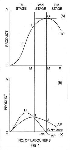
Up to point ‘H’ marginal product increases. At point ‘H’, i.e., when 3 units of labourers are employed, it is maximum. After that, marginal product begins to decrease. Before point ‘I’ marginal product becomes zero at point C and it turns negative. AP curve represents average product. Before point ‘I’, average product is less than marginal product. At point ‘I’ average product is maximum. Up to point T, average product increases but after that it starts to diminish.

Three Stages of the Law

  1. First Stage

First stage starts from point ‘O’ and ends up to point F. At point F average product is maximum and is equal to marginal product. In this stage, total product increases initially at increasing rate up to point E. between ‘E’ and ‘F’ it increases at diminishing rate. Similarly marginal product also increases initially and reaches its maximum at point ‘H’. Later on, it begins to diminish and becomes equal to average product at point T. In this stage, marginal product exceeds average product (MP > AP).

  1. Second Stage

It begins from the point F. In this stage, total product increases at diminishing rate and is at its maximum at point ‘G’ correspondingly marginal product diminishes rapidly and becomes ‘zero’ at point ‘C’. Average product is maximum at point ‘I’ and thereafter it begins to decrease. In this stage, marginal product is less than average product (MP < AP).

  1. Third Stage

This stage begins beyond point ‘G’. Here total product starts diminishing. Average product also declines. Marginal product turns negative. Law of diminishing returns firmly manifests itself. In this stage, no firm will produce anything. This happens because marginal product of the labour becomes negative. The employer will suffer losses by employing more units of labourers. However, of the three stages, a firm will like to produce up to any given point in the second stage only.

In Which Stage Rational Decision is Possible

To make the things simple, let us suppose that, a is variable factor and b is the fixed factor. And a1, a2 , a3….are units of a and b1 b2b3…… are unit of b.

Stage I is characterized by increasing AP, so that the total product must also be increasing. This means that the efficiency of the variable factor of production is increasing i.e., output per unit of a is increasing. The efficiency of b, the fixed factor, is also increasing, since the total product with b1 is increasing.

The stage II is characterized by decreasing AP and a decreasing MP, but with MP not negative. Thus, the efficiency of the variable factor is falling, while the efficiency of b, the fixed factor, is increasing, since the TP with b1 continues to increase.

Finally, stage III is characterized by falling AP and MP, and further by negative MP. Thus, the efficiency of both the fixed and variable factor is decreasing.

Rational Decision

Stage II becomes the relevant and important stage of production. Production will not take place in either of the other two stages. It means production will not take place in stage III and stage I. Thus, a rational producer will operate in stage II.

Suppose b were a free resource; i.e., it commanded no price. An entrepreneur would want to achieve the greatest efficiency possible from the factor for which he is paying, i.e., from factor a. Thus, he would want to produce where AP is maximum or at the boundary between stage I and II.

If on the other hand, a were the free resource, then he would want to employ b to its most efficient point; this is the boundary between stage II and III.

Obviously, if both resources commanded a price, he would produce somewhere in stage II. At what place in this stage production takes place would depend upon the relative prices of a and b.

Condition or Causes of Applicability

There are many causes which are responsible for the application of the law of variable proportions.

They are as follows:

  1. Under Utilization of Fixed Factor

In initial stage of production, fixed factors of production like land or machine, is under-utilized. More units of variable factor, like labour, are needed for its proper utilization. As a result of employment of additional units of variable factors there is proper utilization of fixed factor. In short, increasing returns to a factor begins to manifest itself in the first stage.

  1. Fixed Factors of Production

The foremost cause of the operation of this law is that some of the factors of production are fixed during the short period. When the fixed factor is used with variable factor, then its ratio compared to variable factor falls. Production is the result of the co-operation of all factors. When an additional unit of a variable factor has to produce with the help of relatively fixed factor, then the marginal return of variable factor begins to decline.

  1. Optimum Production

After making the optimum use of a fixed factor, then the marginal return of such variable factor begins to diminish. The simple reason is that after the optimum use, the ratio of fixed and variable factors become defective. Let us suppose a machine is a fixed factor of production. It is put to optimum use when 4 labourers are employed on it. If 5 labourers are put on it, then total production increases very little and the marginal product diminishes.

  1. Imperfect Substitutes

Mrs. Joan Robinson has put the argument that imperfect substitution of factors is mainly responsible for the operation of the law of diminishing returns. One factor cannot be used in place of the other factor. After optimum use of fixed factors, variable factors are increased and the amount of fixed factor could be increased by its substitutes.

Such a substitution would increase the production in the same proportion as earlier. But in real practice factors are imperfect substitutes. However, after the optimum use of a fixed factor, it cannot be substituted by another factor.

Applicability of the Law of Variable Proportions:

The law of variable proportions is universal as it applies to all fields of production. This law applies to any field of production where some factors are fixed and others are variable. That is why it is called the law of universal application.

The main cause of application of this law is the fixity of any one factor. Land, mines, fisheries, and house building etc. are not the only examples of fixed factors. Machines, raw materials may also become fixed in the short period. Therefore, this law holds good in all activities of production etc. agriculture, mining, manufacturing industries.

  1. Application to Agriculture

With a view of raising agricultural production, labour and capital can be increased to any extent but not the land, being fixed factor. Thus when more and more units of variable factors like labour and capital are applied to a fixed factor then their marginal product starts to diminish and this law becomes operative.

  1. Application to Industries

In order to increase production of manufactured goods, factors of production has to be increased. It can be increased as desired for a long period, being variable factors. Thus, law of increasing returns operates in industries for a long period. But, this situation arises when additional units of labour, capital and enterprise are of inferior quality or are available at higher cost.

As a result, after a point, marginal product increases less proportionately than increase in the units of labour and capital. In this way, the law is equally valid in industries.

Postponement of the Law

The postponement of the law of variable proportions is possible under following conditions:

(i) Improvement in Technique of Production

The operation of the law can be postponed in case variable factors techniques of production are improved.

(ii) Perfect Substitute

The law of variable proportion can also be postponed in case factors of production are made perfect substitutes i.e., when one factor can be substituted for the other.

Short Run Production Function with Two Variable Inputs

For the analysis of production function with two variable factors we make use of the concept called isoquants or iso-product curves which are similar to indifference curves of the theory of demand. Therefore, before we explain the production function with two variable factors and returns to scale, we shall explain the concept of isoquants (that is, equal product curves) and their properties.

Isoquants

Isoquants, which are also called equal product curves, are similar to the indifference curves of the theory of consumer’s behaviour. An isoquant represents all those factor combinations which are capable of producing the same level of output.

The isoquants are thus contour lines which trace the loci of equal outputs. Since an isoquant represents those combinations of inputs which will be ca­pable of producing an equal quantity of output, the producer would be indifferent between them. Therefore, isoquants are also often called equal product curves production-indifference curves.

Table 1. Factor Combinations to Produce a Given or Level of Output:

The concept of isoquant can be easily understood from Table 1. It is presumed that two factors labour and capital are being employed to produce a product. Each of the factor combinations A. B, C, D and E produces the same level of output, say 100 units. To start with, factor combination A consisting of 1 unit of labour and 12 units of capital produces the given 100 units of output.

Similarly, combination B consisting of 2 units of labour and 8 units of capital, combination C con­sisting of 3 units of labour and 5 units of capital, combination D consisting of 4 units of labour and 3 units of capital, combination E consisting of 5 units of labour and 2 units of capital are capable of producing the same amount of output, i.e., 100 units. In Fig. 1 we have plotted all these combinations and by joining them we obtain an isoquant showing that every combination repre­sented on it can produce 100 units of output.

Isoquants Though isoquants are similar to be indifference curves of the theory of consumer’s behaviour, there is one important difference between the two. An indifference curve represents all those combi­nations of two goods which provide the same satisfaction or utility to a consumer but no attempt is made to specify the level of utility in exact quantitative terms it stands for.

This is so because the cardinal measurement of satisfaction or utility in unambiguous thermos is not possible. That is why we usually label indifference curves by ordinal numbers as I, II, III etc. indicating that a higher indiffer­ence curve represents a higher level of satisfaction than a lower one, but the information as to how much one level of satisfaction is greater than another is not provided.

On the other hand, we can label isoquants in the physical units of output without any difficulty. Production of a good being a physical phenomenon lends itself easily to absolute measurement in physical units. Since each isoquant represents a specified level of production, it is possible to say by how much one isoquant indicates greater or less production than another.

In Fig. 2 we have drawn an isoquant-map or equal- product map with a set of four isoquants which represent 100 units, 120 units, 140 units and 160 units of output respectively. Then, from this set of isoquants it is very easy to judge by how much production level on one isoquant curve is greater or less than on another.

Ridge Lines

The marginal product of a particular factor may be negative if the quantity used is too large. For example, if too much labour is used there may be congestion and the efficiency of all the labourers may be affected. An isoquant will include points denoting such factor quantities, because it includes all factor combinations producing the same output.

But, a rational producer will not operate on this part of the isoquant. The area of rational operation may be shown by drawing two lines from the ori­gin enclosing only those parts of the isoquants where each factor has a positive marginal product. Such lines are called ridge lines. Negative marginal products appear in that part of the isoquant which has a posi­tive slope.

Ridge lines exclude these parts. This can be seen in Fig. 3. Let us focus our atten­tion on isoquant Q1 over the interval from point A to point E. We now know that as we substitute labour for capital and move from A toward E, the marginal productivity of labour diminishes.

But, look what happens if we move beyond E, continuing to use more labour. The isoquant Q1 turns upward, indicating that if we use more labour and still want to produce Q1 units, we must now also use more capital. Why? Because beyond E, the marginal product of labour has become negative, and so to compensate for using more labour, we must add to the amount of capital used as well.

If we follow Q2, Q3 or Q4 from left to right, we see that a similar result occurs. Beyond points F, G and H turn up. That is, the slopes of the isoquants become positive due to the negative marginal productivity of labour.

The line (R’) connecting all points, such as £, F, G and H, is called a ridge line; it marks off the boundary between stage II and stage III of production. No one would want to produce in stage III, since the same level of production could be obtained with fewer of both inputs by moving to the left along the appropriate isoquant until stage II was reached.

We can now apply this same line of reasoning to rule out stage I. Again let us concentrate attention on isoquant Q1. This time, suppose we move up and to the left toward point A. As we do so, substituting capital for labour, the marginal productivity of capital diminishes and becomes negative if we go beyond A. Thus, if we add more capital above A while maintaining output at the Q1 level, we must use more labour.

This does not make much sense from a managerial perspective. Points B, C and D are analogous to point A for their respective isoquants. Beyond these points, the marginal productivity of capital is negative and so we would not wish to operate in that region, which we refer to as stage I.

The ridge line R marks the boundary between stage I and stage II just as R’ marks the boundary between stages II and III. We see that neither stage I nor stage III is desirable for production, since the marginal productivity of at least one input is negative in those stages. We can then conclude that the only relevant region for production is stage II, which is bounded by the two ridge lines, R1 and R2. This region is called the economic region of produc­tion.

Least Cost Combination of Inputs

The firm may produce a particular quantity of its product at each of the alternative input combinations that lies on the IQ for that quantity. Since the firm’s goal is to maximize profit, the optimum input combination for producing a particular quantity of its product would be one that would produce the output at the minimum possible cost.

The optimum input combination in this case is known as the least cost combination of inputs. In order to explain the firm’s selection of the least cost combination of inputs, let us suppose that some of the firm’s isoquants (IQs) and iso-cost lines (ICLs) are given in Fig. 1.

Let us now suppose that the firm intends to produce a particular quantity q = q3 of its product, and the isoquant for this particular quantity is IQ3. In other words, if the firm uses any of the input combinations lying on IQ3, it would be able to produce the output quantity q = q3.

But, since the different points on IQ3, viz., S1, S2, S3, S4, S5, etc. lie on different ICLs, they produce the same output, viz., q = but at different levels of cost, For we know that a higher (or a lower) ICL represents a higher (or a lower) level of cost.

Therefore, in order to produce the output of q3 at the least possible cost, the firm would have to select that point on IQ3 that would lie on the lowest possible ICL. In Fig. 8.12, we see that the point S3 on IQlies on the lowest possible ICL, viz., L3M3. Any other point on IQ3 lies on a higher ICL or a higher level of cost than L3M3.

Therefore, at an output of q3, the least cost combination of inputs is S3(x̅, y̅). In other words, if the firm is to produce an output of q3, it would buy and use the quantity x of input X and the quantity y of input Y. Here it is very important for us to observe that the least cost combination of inputs is the point of tangency (here S3) between the particular isoquant (here IQ3) and an iso-cost line (here L3M3).

Similarly, for producing a particular quantity of output, if the firm is to remain on IQ2, then the least cost combination of inputs would be given by the point T2, because this point is the point of tangency between IQ2 and an ICL (i.e., L2M2).

Maximum Output Combination of Inputs

In iso-cost lines (ICLs), we have seen that if the prices (rX and rY) of the inputs (X and Y) are given and constant, then by spending a particular amount of money the firm can buy any one of a large number of input combinations that lie on the corresponding ICL.

Since the firm’s goal is to maximize the level of profit, the optimum input combination in this case would be one that would produce the maximum possible output. Therefore, this input combination is called the maximum- output combination of inputs.

We shall now see with the help of Fig. 8.12, how the maximum output-input combination can be obtained by the firm. Let us suppose that the firm has decided to spend a particular amount of money, TVC3, (TVC stands for total variable cost) for the two variable inputs (X and Y), and the ICL for this expenditure is L3M3.

That is, if the firm is to spend the amount of money TVC3, then it would have to buy some combination that lie on the iso-cost line, L3M3.

Now the points like V1, V2 S3, V4, V5 lying on L3M3 are situated on different isoquants. That is, at different points on the line L3M3, the cost of the firm is the same (= TVC3), but the quantities produced are different.

Since a higher IQ represents a higher level of output, of all the points on L3M3, the profit-maximizing firm would select that one as optimum which lies on the highest possible IQ, i.e., which produces the highest possible level of output. This point is S(x̅, y̅) on, IQ3—this point is the maximum-output Combination of inputs subject to the cost constraint of TVC = TVC3.

We have to note here that the maximum-output combination of inputs subject to the cost constraint (here S3) is the point of tangency between the ICL corresponding to the given cost level (here TVC3) and an IQ (here IQ3).

Similarly, if the given ICL of the firm is L4M4, then the maximum-output combination of inputs would be the point R4, because this point is the point of tangency between the line L4M4 and an IQ which is here IQ4.

error: Content is protected !!