 by
by Graphic presentation represents a highly developed body of techniques for elucidating, interpreting, and analyzing numerical facts by means of points, lines, areas, and other geometric forms and symbols. Graphic techniques are especially valuable in presenting quantitative data in a simple, clear, and effective manner, as well as facilitating comparisons of values, trends, and relationships. They have the additional advantages of succinctness and popular appeal; the comprehensive pictures they provide can bring out hidden facts and relationships and contribute to a more balanced understanding of a problem.
The choice of a particular graphic technique to present a given set of data is a difficult one, and no hard and fast rules can be made to cover all circumstances. There are, however, certain general goals that should always be kept in mind. These include completeness, clarity, and honesty; but there is often conflict between the goals. For instance, completeness demands that all data points be included in a chart, but often this can be done only at some sacrifice of clarity. Such problems can be mitigated by the practice (highly desirable on other grounds as well) of indicating the source of the data from which the chart was constructed so that the reader himself can investigate further. Another problem occurs when it is necessary to break an axis in order to fit all the data in a reasonable space; clarity is then served, but honesty demands that attention be strongly called to the break.
On the basis of form, charts and graphs may be classified as:
(1) Rectilinear coordinate graphs
(2) Semilogarithmic charts
(3) Bar and column charts
(4) Frequency graphs and related charts
(5) Maps
(6) Miscellaneous charts, including pie diagrams, scattergrams, fan charts, ranking charts, etc.
(7) Pictorial charts
(8) Three-dimensional projection charts.
General Rules for Graphical Representation of Data
There are certain rules to effectively present the information in the graphical representation. They are:
- Suitable Title: Make sure that the appropriate title is given to the graph which indicates the subject of the presentation.
- Measurement Unit: Mention the measurement unit in the graph.
- Proper Scale: To represent the data in an accurate manner, choose a proper scale.
- Index: Index the appropriate colours, shades, lines, design in the graphs for better understanding.
- Data Sources: Include the source of information wherever it is necessary at the bottom of the graph.
- Keep it Simple: Construct a graph in an easy way that everyone can understand.
- Neat: Choose the correct size, fonts, colours etc. in such a way that the graph should be a visual aid for the presentation of information.
Construction of a Graph
The graphic presentation of data and information offers a quick and simple way of understanding the features and drawing comparisons. Further, it is an effective analytical tool and a graph can help us in finding the mode, median, etc.
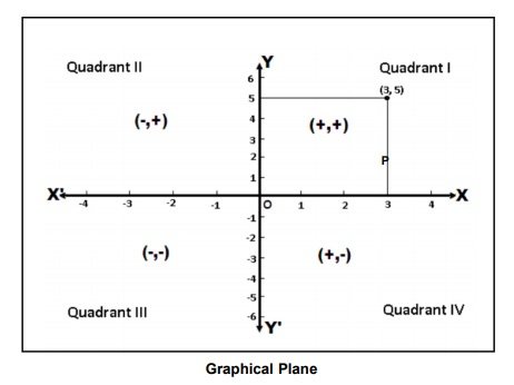
One can locate a point in a plane using two mutually perpendicular lines – the X-axis (the horizontal line) and the Y-axis (the vertical line). Their point of intersection is the Origin.
One can locate the position of a point in terms of its distance from both these axes. For example, if a point P is 3 units away from the Y-axis and 5 units away from the X-axis, then its location is as follows:
Key Points
- We measure the distance of the point from the Y-axis along the X-axis. Similarly, we measure the distance of the point from the X-axis along the Y-axis. Therefore, to measure 3 units from the Y-axis, we move 3 units along the X-axis and likewise for the other coordinate.
- We then draw perpendicular lines from these two points.
- The point where the perpendiculars intersect is the position of the point P.
- We denote it as follows (3,5) or (abscissa, ordinate). Together, they are the coordinates of the point P.
- The four parts of the plane are Quadrants.
- Also, we can plot different points for a different pair of values.
3 thoughts on “Graphic presentation: Technique of Construction of Graphs”