 by
by Frequency distribution, in statistics, a graph or data set organized to show the frequency of occurrence of each possible outcome of a repeatable event observed many times. Simple examples are election returns and test scores listed by percentile. A frequency distribution can be graphed as a histogram or pie chart. For large data sets, the stepped graph of a histogram is often approximated by the smooth curve of a distribution function (called a density function when normalized so that the area under the curve.
In statistics, a frequency distribution is a list, table or graph that displays the frequency of various outcomes in a sample. Each entry in the table contains the frequency or count of the occurrences of values within a particular group or interval.
The famed bell curve, or normal distribution, is the graph of one such function. Frequency distributions are particularly useful in summarizing large data sets and assigning probabilities.
Applications
Managing and operating on frequency tabulated data is much simpler than operation on raw data. There are simple algorithms to calculate median, mean, standard deviation etc. from these tables.
Statistical hypothesis testing is founded on the assessment of differences and similarities between frequency distributions. This assessment involves measures of central tendency or averages, such as the mean and median, and measures of variability or statistical dispersion, such as the standard deviation or variance.
A frequency distribution is said to be skewed when its mean and median are significantly different, or more generally when it is asymmetric. The kurtosis of a frequency distribution is a measure of the proportion of extreme values (outliers), which appear at either end of the histogram. If the distribution is more outlier-prone than the normal distribution it is said to be leptokurtic; if less outlier-prone it is said to be platykurtic.
Letter frequency distributions are also used in frequency analysis to crack ciphers, and are used to compare the relative frequencies of letters in different languages and other languages are often used like Greek, Latin, etc.
Types of Frequency Distribution
- Grouped frequency distribution.
- Ungrouped frequency distribution.
- Cumulative frequency distribution.
- Relative frequency distribution.
- Relative cumulative frequency distribution.
Grouped Data
At certain times to ensure that we are making correct and relevant observations from the data set, we may need to group the data into class intervals. This ensures that the frequency distribution best represents the data. Let us make a grouped frequency data table of the same example above of the height of students.
| Class Interval | Frequency |
| 130-140 | 4 |
| 140-150 | 5 |
| 150-160 | 3 |
From the above table, you can see that the value of 150 is put in the class interval of 150-160 and not 140-150.
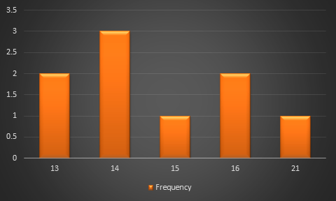
Example
Frequency Distribution Table
13,14,16,13,16,14,21,14,15
| Height | Frequency |
| 13 | 2 |
| 14 | 3 |
| 15 | 1 |
| 16 | 2 |
| 21 | 1 |
One thought on “Graphs of Frequency Distribution”