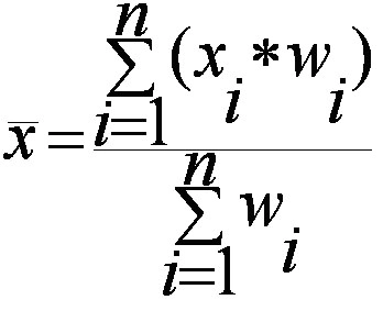
Range and co-efficient of Range

The range is a measure of dispersion that represents the difference between the highest and lowest values in a dataset. It provides a simple way to understand the spread of data. While easy to calculate, the range is sensitive to outliers and does not provide information about the distribution of values between the extremes.

Range of a distribution gives a measure of the width (or the spread) of the data values of the corresponding random variable. For example, if there are two random variables X and Y such that X corresponds to the age of human beings and Y corresponds to the age of turtles, we know from our general knowledge that the variable corresponding to the age of turtles should be larger.

Since the average age of humans is 50-60 years, while that of turtles is about 150-200 years; the values taken by the random variable Y are indeed spread out from 0 to at least 250 and above; while those of X will have a smaller range. Thus, qualitatively you’ve already understood what the Range of a distribution means. The mathematical formula for the same is given as:

Range = L – S

where

L: The Largets/maximum value attained by the random variable under consideration

S: The smallest/minimum value.

Properties

  • The Range of a given distribution has the same units as the data points.
  • If a random variable is transformed into a new random variable by a change of scale and a shift of origin as:

Y = aX + b

where

Y: the new random variable

X: the original random variable

a,b: constants.

Then the ranges of X and Y can be related as:

RY = |a|RX

Clearly, the shift in origin doesn’t affect the shape of the distribution, and therefore its spread (or the width) remains unchanged. Only the scaling factor is important.

  • For a grouped class distribution, the Range is defined as the difference between the two extreme class boundaries.
  • A better measure of the spread of a distribution is the Coefficient of Range, given by:

Coefficient of Range (expressed as a percentage) = L – SL + S × 100

Clearly, we need to take the ratio between the Range and the total (combined) extent of the distribution. Besides, since it is a ratio, it is dimensionless, and can, therefore, one can use it to compare the spreads of two or more different distributions as well.

  • The range is an absolute measure of Dispersion of a distribution while the Coefficient of Range is a relative measure of dispersion.

Due to the consideration of only the end-points of a distribution, the Range never gives us any information about the shape of the distribution curve between the extreme points. Thus, we must move on to better measures of dispersion. One such quantity is Mean Deviation which is we are going to discuss now.

Interquartile range (IQR)

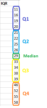
The interquartile range is the middle half of the data. To visualize it, think about the median value that splits the dataset in half. Similarly, you can divide the data into quarters. Statisticians refer to these quarters as quartiles and denote them from low to high as Q1, Q2, Q3, and Q4. The lowest quartile (Q1) contains the quarter of the dataset with the smallest values. The upper quartile (Q4) contains the quarter of the dataset with the highest values. The interquartile range is the middle half of the data that is in between the upper and lower quartiles. In other words, the interquartile range includes the 50% of data points that fall in Q2 and

The IQR is the red area in the graph below.

The interquartile range is a robust measure of variability in a similar manner that the median is a robust measure of central tendency. Neither measure is influenced dramatically by outliers because they don’t depend on every value. Additionally, the interquartile range is excellent for skewed distributions, just like the median. As you’ll learn, when you have a normal distribution, the standard deviation tells you the percentage of observations that fall specific distances from the mean. However, this doesn’t work for skewed distributions, and the IQR is a great alternative.

I’ve divided the dataset below into quartiles. The interquartile range (IQR) extends from the low end of Q2 to the upper limit of Q3. For this dataset, the range is 21 – 39.

Karl Pearson and Rank co-relation

Karl Pearson Coefficient of Correlation (also called the Pearson correlation coefficient or Pearson’s r) is a measure of the strength and direction of the linear relationship between two variables. It ranges from -1 to +1, where +1 indicates a perfect positive linear relationship, -1 indicates a perfect negative linear relationship, and 0 indicates no linear relationship. The formula for Pearson’s r is calculated by dividing the covariance of the two variables by the product of their standard deviations. It is widely used in statistics to analyze the degree of correlation between paired data.

The following are the main properties of correlation.

  1. Coefficient of Correlation lies between -1 and +1:

The coefficient of correlation cannot take value less than -1 or more than one +1. Symbolically,

-1<=r<= + 1 or | r | <1.

  1. Coefficients of Correlation are independent of Change of Origin:

This property reveals that if we subtract any constant from all the values of X and Y, it will not affect the coefficient of correlation.

  1. Coefficients of Correlation possess the property of symmetry:

The degree of relationship between two variables is symmetric as shown below:

  1. Coefficient of Correlation is independent of Change of Scale:

This property reveals that if we divide or multiply all the values of X and Y, it will not affect the coefficient of correlation.

  1. Co-efficient of correlation measures only linear correlation between X and Y.
  2. If two variables X and Y are independent, coefficient of correlation between them will be zero.

Karl Pearson’s Coefficient of Correlation is widely used mathematical method wherein the numerical expression is used to calculate the degree and direction of the relationship between linear related variables.

Pearson’s method, popularly known as a Pearsonian Coefficient of Correlation, is the most extensively used quantitative methods in practice. The coefficient of correlation is denoted by “r”.

If the relationship between two variables X and Y is to be ascertained, then the following formula is used:

Properties of Coefficient of Correlation

  • The value of the coefficient of correlation (r) always lies between±1. Such as:

    r=+1, perfect positive correlation

    r=-1, perfect negative correlation

    r=0, no correlation

  • The coefficient of correlation is independent of the origin and scale.By origin, it means subtracting any non-zero constant from the given value of X and Y the vale of “r” remains unchanged. By scale it means, there is no effect on the value of “r” if the value of X and Y is divided or multiplied by any constant.
  • The coefficient of correlation is a geometric mean of two regression coefficient. Symbolically it is represented as:
  • The coefficient of correlation is “ zero” when the variables X and Y are independent. But, however, the converse is not true.

Assumptions of Karl Pearson’s Coefficient of Correlation

  1. The relationship between the variables is “Linear”, which means when the two variables are plotted, a straight line is formed by the points plotted.
  2. There are a large number of independent causes that affect the variables under study so as to form a Normal Distribution. Such as, variables like price, demand, supply, etc. are affected by such factors that the normal distribution is formed.
  3. The variables are independent of each other.                                     

Note: The coefficient of correlation measures not only the magnitude of correlation but also tells the direction. Such as, r = -0.67, which shows correlation is negative because the sign is “-“ and the magnitude is 0.67.

Spearman Rank Correlation

Spearman rank correlation is a non-parametric test that is used to measure the degree of association between two variables.  The Spearman rank correlation test does not carry any assumptions about the distribution of the data and is the appropriate correlation analysis when the variables are measured on a scale that is at least ordinal.

The Spearman correlation between two variables is equal to the Pearson correlation between the rank values of those two variables; while Pearson’s correlation assesses linear relationships, Spearman’s correlation assesses monotonic relationships (whether linear or not). If there are no repeated data values, a perfect Spearman correlation of +1 or −1 occurs when each of the variables is a perfect monotone function of the other.

Intuitively, the Spearman correlation between two variables will be high when observations have a similar (or identical for a correlation of 1) rank (i.e. relative position label of the observations within the variable: 1st, 2nd, 3rd, etc.) between the two variables, and low when observations have a dissimilar (or fully opposed for a correlation of −1) rank between the two variables.

The following formula is used to calculate the Spearman rank correlation:

ρ = Spearman rank correlation

di = the difference between the ranks of corresponding variables

n = number of observations

Assumptions

The assumptions of the Spearman correlation are that data must be at least ordinal and the scores on one variable must be monotonically related to the other variable.

Data Tabulation

Tabulation is the systematic arrangement of the statistical data in columns or rows. It involves the orderly and systematic presentation of numerical data in a form designed to explain the problem under consideration. Tabulation helps in drawing the inference from the statistical figures.

Tabulation prepares the ground for analysis and interpretation. Therefore a suitable method must be decided carefully taking into account the scope and objects of the investigation, because it is very important part of the statistical methods.

Types of Tabulation

In general, the tabulation is classified in two parts, that is a simple tabulation, and a complex tabulation.

Simple tabulation, gives information regarding one or more independent questions. Complex tabulation gives information regarding two mutually dependent questions.

  • Two-Way Table

These types of table give information regarding two mutually dependent questions. For example, question is, how many millions of the persons are in the Divisions; the One-Way Table will give the answer. But if we want to know that in the population number, who are in the majority, male, or female. The Two-Way Tables will answer the question by giving the column for female and male. Thus the table showing the real picture of divisions sex wise is as under:

  • Three-Way Table

Three-Way Table gives information regarding three mutually dependent and inter-related questions.

For example, from one-way table, we get information about population, and from two-way table, we get information about the number of male and female available in various divisions. Now we can extend the same table to a three way table, by putting a question, “How many male and female are literate?” Thus the collected statistical data will show the following, three mutually dependent and inter-related questions:

  1. Population in various division.
  2. Their sex-wise distribution.
  3. Their position of literacy.

Presentation of Data

Presentation of data is of utter importance nowadays. Afterall everything that’s pleasing to our eyes never fails to grab our attention. Presentation of data refers to an exhibition or putting up data in an attractive and useful manner such that it can be easily interpreted. The three main forms of presentation of data are:

  1. Textual presentation
  2. Data tables
  3. Diagrammatic presentation

Textual Presentation

The discussion about the presentation of data starts off with it’s most raw and vague form which is the textual presentation. In such form of presentation, data is simply mentioned as mere text, that is generally in a paragraph. This is commonly used when the data is not very large.

This kind of representation is useful when we are looking to supplement qualitative statements with some data. For this purpose, the data should not be voluminously represented in tables or diagrams. It just has to be a statement that serves as a fitting evidence to our qualitative evidence and helps the reader to get an idea of the scale of a phenomenon.

For example, “the 2002 earthquake proved to be a mass murderer of humans. As many as 10,000 citizens have been reported dead”. The textual representation of data simply requires some intensive reading. This is because the quantitative statement just serves as an evidence of the qualitative statements and one has to go through the entire text before concluding anything.

Further, if the data under consideration is large then the text matter increases substantially. As a result, the reading process becomes more intensive, time-consuming and cumbersome.

Data Tables or Tabular Presentation

A table facilitates representation of even large amounts of data in an attractive, easy to read and organized manner. The data is organized in rows and columns. This is one of the most widely used forms of presentation of data since data tables are easy to construct and read.

Components of Data Tables

  • Table Number: Each table should have a specific table number for ease of access and locating. This number can be readily mentioned anywhere which serves as a reference and leads us directly to the data mentioned in that particular table.
  • Title: A table must contain a title that clearly tells the readers about the data it contains, time period of study, place of study and the nature of classification of data.
  • Headnotes: A headnote further aids in the purpose of a title and displays more information about the table. Generally, headnotes present the units of data in brackets at the end of a table title.
  • Stubs: These are titles of the rows in a table. Thus a stub display information about the data contained in a particular row.
  • Caption: A caption is the title of a column in the data table. In fact, it is a counterpart if a stub and indicates the information contained in a column.
  • Body or field: The body of a table is the content of a table in its entirety. Each item in a body is known as a ‘cell’.
  • Footnotes: Footnotes are rarely used. In effect, they supplement the title of a table if required.
  • Source: When using data obtained from a secondary source, this source has to be mentioned below the footnote.

Construction of Data Tables

There are many ways for construction of a good table. However, some basic ideas are:

  • The title should be in accordance with the objective of study: The title of a table should provide a quick insight into the table.
  • Comparison: If there might arise a need to compare any two rows or columns then these might be kept close to each other.
  • Alternative location of stubs: If the rows in a data table are lengthy, then the stubs can be placed on the right-hand side of the table.
  • Headings: Headings should be written in a singular form. For example, ‘good’ must be used instead of ‘goods’.
  • Footnote: A footnote should be given only if needed.
  • Size of columns: Size of columns must be uniform and symmetrical.
  • Use of abbreviations: Headings and sub-headings should be free of abbreviations.
  • Units: There should be a clear specification of units above the columns.

Advantages of Tabular Presentation:

  • Ease of representation: A large amount of data can be easily confined in a data table. Evidently, it is the simplest form of data presentation.
  • Ease of analysis: Data tables are frequently used for statistical analysis like calculation of central tendency, dispersion etc.
  • Helps in comparison: In a data table, the rows and columns which are required to be compared can be placed next to each other. To point out, this facilitates comparison as it becomes easy to compare each value.
  • Economical: Construction of a data table is fairly easy and presents the data in a manner which is really easy on the eyes of a reader. Moreover, it saves time as well as space.

Classification of Data and Tabular Presentation

Qualitative Classification

In this classification, data in a table is classified on the basis of qualitative attributes. In other words, if the data contained attributes that cannot be quantified like rural-urban, boys-girls etc. it can be identified as a qualitative classification of data.

Sex Urban Rural
Boys 200 390
Girls 167 100

Quantitative Classification

In quantitative classification, data is classified on basis of quantitative attributes.

Marks No. of Students
0-50 29
51-100 64

Temporal Classification

Here data is classified according to time. Thus when data is mentioned with respect to different time frames, we term such a classification as temporal.

Year Sales
2016 10,000
2017 12,500

Spatial Classification

When data is classified according to a location, it becomes a spatial classification.

Country No. of Teachers
India 139,000
Russia 43,000

Advantages of Tabulation

  1. The large mass of confusing data is easily reduced to reasonable form that is understandable to kind.
  2. The data once arranged in a suitable form, gives the condition of the situation at a glance, or gives a bird eye view.
  3. From the table it is easy to draw some reasonable conclusion or inferences.
  4. Tables gave grounds for analysis of the data.
  5. Errors, and omission if any are always detected in tabulation.

Mean (AM, Weighted, Combined)

Arithmetic Mean

The arithmetic mean,’ mean or average is calculated by summ­ing all the individual observations or items of a sample and divid­ing this sum by the number of items in the sample. For example, as the result of a gas analysis in a respirometer an investigator obtains the following four readings of oxygen percentages:

14.9
10.8
12.3
23.3
Sum = 61.3

He calculates the mean oxygen percentage as the sum of the four items divided by the number of items here, by four. Thus, the average oxygen percentage is

Mean = 61.3 / 4 =15.325%

Calculating a mean presents us with the opportunity for learning statistical symbolism. An individual observation is symbo­lized by Yi, which stands for the ith observation in the sample. Four observations could be written symbolically as Yi, Y2, Y3, Y4.

We shall define n, the sample size, as the number of items in a sample. In this particular instance, the sample size n is 4. Thus, in a large sample, we can symbolize the array from the first to the nth item as follows: Y1, Y2…, Yn. When we wish to sum items, we use the following notation:

The capital Greek sigma, Ʃ, simply means the sum of items indica­ted. The i = 1 means that the items should be summed, starting with the first one, and ending with the nth one as indicated by the i = n above the Ʃ. The subscript and superscript are necessary to indicate how many items should be summed. Below are seen increasing simplifications of the complete notation shown at the extreme left:

Properties of Arithmetic Mean:

  1. The sum of deviations of the items from the arithmetic mean is always zero i.e.

∑(X–X) =0.

  1. The Sum of the squared deviations of the items from A.M. is minimum, which is less than the sum of the squared deviations of the items from any other values.
  2. If each item in the series is replaced by the mean, then the sum of these substitutions will be equal to the sum of the individual items.                       

Merits of A.M:

  1. It is simple to understand and easy to calculate.
  2. It is affected by the value of every item in the series.
  3. It is rigidly defined.
  4. It is capable of further algebraic treatment.
  5. It is calculated value and not based on the position in the series.

Demerits of A.M:

  1. It is affected by extreme items i.e., very small and very large items.
  2. It can hardly be located by inspection.
  3. In some cases A.M. does not represent the actual item. For example, average patients admitted in a hospital is 10.7 per day.
  4. M. is not suitable in extremely asymmetrical distributions.

Weighted Mean

In some cases, you might want a number to have more weight. In that case, you’ll want to find the weighted mean. To find the weighted mean:

  1. Multiply the numbers in your data set by the weights.
  2. Add the results up.

For that set of number above with equal weights (1/5 for each number), the math to find the weighted mean would be:
1(*1/5) + 3(*1/5) + 5(*1/5) + 7(*1/5) + 10(*1/5) = 5.2.

Sample problem: You take three 100-point exams in your statistics class and score 80, 80 and 95. The last exam is much easier than the first two, so your professor has given it less weight. The weights for the three exams are:

  • Exam 1: 40 % of your grade. (Note: 40% as a decimal is .4.)
  • Exam 2: 40 % of your grade.
  • Exam 3: 20 % of your grade.

What is your final weighted average for the class?

  1. Multiply the numbers in your data set by the weights:

    .4(80) = 32

    .4(80) = 32

    .2(95) = 19

  2. Add the numbers up. 32 + 32 + 19 = 83.

The percent weight given to each exam is called a weighting factor.

Weighted Mean Formula

The weighted mean is relatively easy to find. But in some cases the weights might not add up to 1. In those cases, you’ll need to use the weighted mean formula. The only difference between the formula and the steps above is that you divide by the sum of all the weights.

The image above is the technical formula for the weighted mean. In simple terms, the formula can be written as:

Weighted mean = Σwx / Σw

Σ = the sum of (in other words…add them up!).
w = the weights.
x = the value.

To use the formula:

  1. Multiply the numbers in your data set by the weights.
  2. Add the numbers in Step 1 up. Set this number aside for a moment.
  3. Add up all of the weights.
  4. Divide the numbers you found in Step 2 by the number you found in Step 3.

In the sample grades problem above, all of the weights add up to 1 (.4 + .4 + .2) so you would divide your answer (83) by 1:
83 / 1 = 83.

However, let’s say your weighted means added up to 1.2 instead of 1. You’d divide 83 by 1.2 to get:
83 / 1.2 = 69.17.

Combined Mean

A combined mean is a mean of two or more separate groups, and is found by:

  1. Calculating the mean of each group,
  2. Combining the results.

Combined Mean Formula

More formally, a combined mean for two sets can be calculated by the formula :

Where:

  • xa = the mean of the first set,
  • m = the number of items in the first set,
  • xb = the mean of the second set,
  • n = the number of items in the second set,
  • xc the combined mean.

A combined mean is simply a weighted mean, where the weights are the size of each group.

Baye’s Theorem

Bayes’ Theorem is a way to figure out conditional probability. Conditional probability is the probability of an event happening, given that it has some relationship to one or more other events. For example, your probability of getting a parking space is connected to the time of day you park, where you park, and what conventions are going on at any time. Bayes’ theorem is slightly more nuanced. In a nutshell, it gives you the actual probability of an event given information about tests.

“Events” Are different from “tests.” For example, there is a test for liver disease, but that’s separate from the event of actually having liver disease.

Tests are flawed:

Just because you have a positive test does not mean you actually have the disease. Many tests have a high false positive rate. Rare events tend to have higher false positive rates than more common events. We’re not just talking about medical tests here. For example, spam filtering can have high false positive rates. Bayes’ theorem takes the test results and calculates your real probability that the test has identified the event.

Bayes’ Theorem (also known as Bayes’ rule) is a deceptively simple formula used to calculate conditional probability. The Theorem was named after English mathematician Thomas Bayes (1701-1761). The formal definition for the rule is:

In most cases, you can’t just plug numbers into an equation; You have to figure out what your “tests” and “events” are first. For two events, A and B, Bayes’ theorem allows you to figure out p(A|B) (the probability that event A happened, given that test B was positive) from p(B|A) (the probability that test B happened, given that event A happened). It can be a little tricky to wrap your head around as technically you’re working backwards; you may have to switch your tests and events around, which can get confusing. An example should clarify what I mean by “switch the tests and events around.”

Bayes’ Theorem Example

You might be interested in finding out a patient’s probability of having liver disease if they are an alcoholic. “Being an alcoholic” is the test (kind of like a litmus test) for liver disease.

A could mean the event “Patient has liver disease.” Past data tells you that 10% of patients entering your clinic have liver disease. P(A) = 0.10.

B could mean the litmus test that “Patient is an alcoholic.” Five percent of the clinic’s patients are alcoholics. P(B) = 0.05.

You might also know that among those patients diagnosed with liver disease, 7% are alcoholics. This is your B|A: the probability that a patient is alcoholic, given that they have liver disease, is 7%.

Bayes’ theorem tells you:

P(A|B) = (0.07 * 0.1)/0.05 = 0.14

In other words, if the patient is an alcoholic, their chances of having liver disease is 0.14 (14%). This is a large increase from the 10% suggested by past data. But it’s still unlikely that any particular patient has liver disease.

Conditional Probability

Conditional probability refers to the probability of an event occurring, given that another event has already occurred. It quantifies the likelihood of one event under the condition that the related event is known.

The probability of the occurrence of an event A given that an event B has already occurred is called the conditional probability of A given B:

The same is explained in Figure 2.15 using the sample spaces related to the events A and B, assuming that there are few sample points common to these two events. Part 1 of the figure shows the total sample space related to the experiment as in the form of rectangle and the sample space related to the event A as a circle. Similarly part 2 of the figure shows the total sample space and the sample space related to event B. As explained earlier in conditional probability the total sample space is restrained to the sample space that is related to event B (which has already occurred). The same is shown in part 3 of Figure 2.15. Now the sample space for event A (B is the total sample space available) is nothing but the sample points related to event A and falling in the sample space. This is nothing but the intersection of the events A and B and is shown in part 3 of the figure as the hatched area.  

Figure 2.15: Representation of conditional probability using the Venn diagrams

For example, there are 100 trips per day between two places X and Y. Out of these 100 trips 50 are made by car, 25 are made by bus and the other 25 are by local train. Probabilities associated to these modes are 0.5, 0.25, and 0.25, respectively. In transportation engineering both the bus and the local train are considered as public transport so the event space associated to this is the summation of the event spaces associated to bus and local train. Probability of choosing public transportation is 0.5. Now if one is interested in finding the probability of choosing bus given public transportation is chosen the conditional probability is useful in finding that.

Lines of Regression; Co-efficient of regression

Regression Line is the line that best fits the data, such that the overall distance from the line to the points (variable values) plotted on a graph is the smallest. In other words, a line used to minimize the squared deviations of predictions is called as the regression line.

There are as many numbers of regression lines as variables. Suppose we take two variables, say X and Y, then there will be two regression lines:

  • Regression line of Y on X: This gives the most probable values of Y from the given values of X.
  • Regression line of X on Y: This gives the most probable values of X from the given values of Y.

The algebraic expression of these regression lines is called as Regression Equations. There will be two regression equations for the two regression lines.

The correlation between the variables depend on the distance between these two regression lines, such as the nearer the regression lines to each other the higher is the degree of correlation, and the farther the regression lines to each other the lesser is the degree of correlation.

The correlation is said to be either perfect positive or perfect negative when the two regression lines coincide, i.e. only one line exists. In case, the variables are independent; then the correlation will be zero, and the lines of regression will be at right angles, i.e. parallel to the X axis and Y axis.

The regression lines cut each other at the point of average of X and Y. This means, from the point where the lines intersect each other the perpendicular is drawn on the X axis we will get the mean value of X. Similarly, if the horizontal line is drawn on the Y axis we will get the mean value of Y.

Co-efficient of Regression

The Regression Coefficient is the constant ‘b’ in the regression equation that tells about the change in the value of dependent variable corresponding to the unit change in the independent variable.

If there are two regression equations, then there will be two regression coefficients:

  • Regression Coefficient of X on Y:

The regression coefficient of X on Y is represented by the symbol bxy that measures the change in X for the unit change in Y. Symbolically, it can be represented as:

The bxy can be obtained by using the following formula when the deviations are taken from the actual means of X and Y:When the deviations are obtained from the assumed mean, the following formula is used:

  • Regression Coefficient of Y on X:

The symbol byx is used that measures the change in Y corresponding to the unit change in X. Symbolically, it can be represented as:


In case, the deviations are taken from the actual means; the following formula is used:
The byx can be  calculated by using the following formula when the deviations are taken from the assumed means:

The Regression Coefficient is also called as a slope coefficient because it determines the slope of the line i.e. the change in the independent variable for the unit change in the independent variable

Scatter Diagram

Scatter Diagram Method is the simplest method to study the correlation between two variables wherein the values for each pair of a variable is plotted on a graph in the form of dots thereby obtaining as many points as the number of observations. Then by looking at the scatter of several points, the degree of correlation is ascertained.

The degree to which the variables are related to each other depends on the manner in which the points are scattered over the chart. The more the points plotted are scattered over the chart, the lesser is the degree of correlation between the variables. The more the points plotted are closer to the line, the higher is the degree of correlation. The degree of correlation is denoted by “r”.

The following types of scatter diagrams tell about the degree of correlation between variable X and variable Y.

  1. Perfect Positive Correlation (r = +1):

The correlation is said to be perfectly positive when all the points lie on the straight line rising from the lower left-hand corner to the upper right-hand corner.

2. Perfect Negative Correlation (r = -1):

When all the points lie on a straight line falling from the upper left-hand corner to the lower right-hand corner, the variables are said to be negatively correlated.

3. High Degree of +Ve Correlation (r = + High):

The degree of correlation is high when the points plotted fall under the narrow band and is said to be positive when these show the rising tendency from the lower left-hand corner to the upper right-hand corner.

4. High Degree of –Ve Correlation (r = – High):

The degree of negative correlation is high when the point plotted fall in the narrow band and show the declining tendency from the upper left-hand corner to the lower right-hand corner.

5. Low degree of +Ve Correlation (r = + Low):

The correlation between the variables is said to be low but positive when the points are highly scattered over the graph and show a rising tendency from the lower left-hand corner to the upper right-hand corner.

6. Low Degree of –Ve Correlation (r = + Low):

The degree of correlation is low and negative when the points are scattered over the graph and the show the falling tendency from the upper left-hand corner to the lower right-hand corner.

7. No Correlation (r = 0):

The variable is said to be unrelated when the points are haphazardly scattered over the graph and do not show any specific pattern. Here the correlation is absent and hence r = 0.

Thus, the scatter diagram method is the simplest device to study the degree of relationship between the variables by plotting the dots for each pair of variable values given. The chart on which the dots are plotted is also called as a Dotogram.

Mean Deviation and Standard Deviation

Mean Deviation

Mean deviation is a measure of dispersion that indicates the average of the absolute differences between each data point and the mean (or median) of the dataset. It provides an overall sense of how much the values deviate from the central value. To calculate mean deviation, the absolute differences between each data point and the central measure are summed and then divided by the number of observations. Unlike variance, mean deviation is expressed in the same units as the data and is less sensitive to extreme outliers.

The basic formula for finding out mean deviation is :

Mean Deviation = Sum of absolute values of deviations from ‘a’ ÷ The number of observations

Standard Deviation

Standard deviation is a widely used measure of dispersion that indicates the average amount by which each data point deviates from the mean. It is calculated by first finding the variance, which is the average of squared deviations, and then taking the square root of the variance. Standard deviation provides a more interpretable measure of spread, as it is in the same units as the original data. A higher standard deviation indicates greater variability, while a lower value indicates data points are closer to the mean, indicating less spread or consistency.

Usually represented by or σ. It uses the arithmetic mean of the distribution as the reference point and normalizes the deviation of all the data values from this mean.

Therefore, we define the formula for the standard deviation of the distribution of a variable X with n data points as:

Median Characteristics, Applications and Limitations

Median is a measure of central tendency that represents the middle value of an ordered dataset, dividing it into two equal halves. If the dataset has an odd number of values, the median is the middle value. If the dataset has an even number, it is the average of the two middle values. The median is less affected by outliers, making it useful for skewed data or non-uniform distributions.

Example:

The marks of nine students in a geography test that had a maximum possible mark of 50 are given below:

     47     35     37     32     38     39     36     34     35

Find the median of this set of data values.

Solution:

Arrange the data values in order from the lowest value to the highest value:

    32     34     35     35     36     37     38     39     47

The fifth data value, 36, is the middle value in this arrangement.

Characteristics of Median:

  1. Middle Value of Data

The median divides a dataset into two equal halves, with 50% of the values lying below it and 50% above it. It is determined by arranging data in ascending or descending order.

  1. Resistant to Outliers

The median is not influenced by extreme values or outliers. This makes it a more robust measure for datasets with significant variability or skewness.

  1. Applicable to Ordinal and Quantitative Data

The median can be calculated for ordinal data (where data can be ranked) and quantitative data. It is not suitable for nominal data, as there is no inherent order.

  1. Unique Value

For any given dataset, the median is always unique and provides a single central value, ensuring consistency in its interpretation.

  1. Requires Data Sorting

The calculation of the median necessitates ordering the data values. Without arranging the data, the median cannot be identified.

  1. Effective for Skewed Distributions

In skewed datasets, the median better represents the center compared to the mean, as it remains unaffected by the skewness.

  1. Not Affected by Sample Size

Median’s calculation is straightforward and remains valid regardless of the sample size, as long as the data is properly ordered.

Applications of Median:

  1. Income and Wealth Distribution

In economics and social studies, the median is used to analyze income and wealth distributions. For example, the median income indicates the income level at which half the population earns less and half earns more. It is more accurate than the mean in scenarios with extreme disparities, such as high-income earners skewing the average.

  1. Real Estate Market Analysis

Median is commonly applied in the real estate industry to determine the central value of property prices. Median house prices are preferred over averages because they are less affected by outliers, such as extremely high or low-priced properties.

  1. Educational Assessments

In education, the median is used to evaluate student performance. For example, the median test score helps identify the middle-performing student, providing a fair representation when the scores are unevenly distributed.

  1. Medical and Health Statistics

Median is often employed in health sciences to summarize data such as median survival rates or recovery times. These metrics are crucial when the data includes extreme cases or a non-symmetric distribution.

  1. Demographic Studies

Median age, household size, and other demographic measures are widely used in population studies. These metrics provide insights into the central characteristics of populations while avoiding distortion by extremes.

  1. Transportation Planning

In transportation and traffic analysis, the median is used to determine the typical travel time or commute duration. It offers a realistic measure when the data includes unusually long or short travel times.

Demerits or Limitations of Median:

  1. Even if the value of extreme items is too large, it does not affect too much, but due to this reason, sometimes median does not remain the representative of the series.
  2. It is affected much more by fluctuations of sampling than A.M.
  3. Median cannot be used for further algebraic treatment. Unlike mean we can neither find total of terms as in case of A.M. nor median of some groups when combined.
  4. In a continuous series it has to be interpolated. We can find its true-value only if the frequencies are uniformly spread over the whole class interval in which median lies.
  5. If the number of series is even, we can only make its estimate; as the A.M. of two middle terms is taken as Median.

error: Content is protected !!