 by
by A Pareto chart is a type of chart that contains both bars and a line graph, where individual values are represented in descending order by bars, and the cumulative total is represented by the line. The chart is named for the Pareto principle, which, in turn, derives its name from Vilfredo Pareto, a noted Italian economist.
The left vertical axis is the frequency of occurrence, but it can alternatively represent cost or another important unit of measure. The right vertical axis is the cumulative percentage of the total number of occurrences, total cost, or total of the particular unit of measure. Because the values are in decreasing order, the cumulative function is a concave function. To take the example below, in order to lower the amount of late arrivals by 78%, it is sufficient to solve the first three issues.
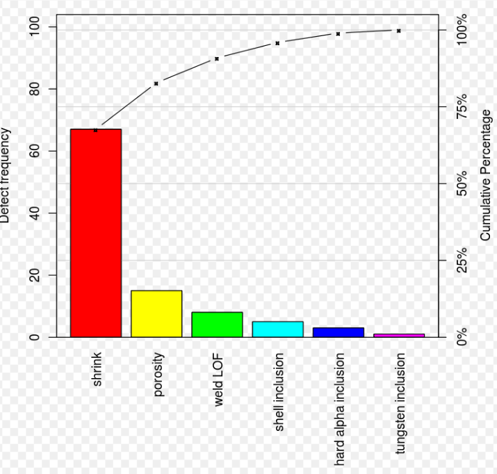
The purpose of the Pareto chart is to highlight the most important among a (typically large) set of factors. In quality control, Pareto charts are useful to find the defects to prioritize in order to observe the greatest overall improvement. it often represents the most common sources of defects, the highest occurring type of defect, or the most frequent reasons for customer complaints, and so on. Wilkinson (2006) devised an algorithm for producing statistically based acceptance limits (similar to confidence intervals) for each bar in the Pareto chart.
These charts can be generated by simple spreadsheet programs, specialized statistical software tools, and online quality charts generators.
The Pareto chart is one of the seven basic tools of quality control.
Use a pareto chart
- When analyzing data about the frequency of problems or causes in a process.
- When there are many problems or causes and you want to focus on the most significant.
- When analyzing broad causes by looking at their specific components.
- When communicating with others about your data.
Pareto Chart Procedure
- Decide what categories you will use to group items.
- Decide what measurement is appropriate. Common measurements are frequency, quantity, cost and time.
- Decide what period of time the Pareto chart will cover: One work cycle? One full day? A week?
- Collect the data, recording the category each time, or assemble data that already exist.
- Subtotal the measurements for each category.
- Determine the appropriate scale for the measurements you have collected. The maximum value will be the largest subtotal from step 5. (If you will do optional steps 8 and 9 below, the maximum value will be the sum of all subtotals from step 5.) Mark the scale on the left side of the chart.
- Construct and label bars for each category. Place the tallest at the far left, then the next tallest to its right, and so on. If there are many categories with small measurements, they can be grouped as “other.”
Note: Steps 8 and 9 are optional but are useful for analysis and communication.
- Calculate the percentage for each category: the subtotal for that category divided by the total for all categories. Draw a right vertical axis and label it with percentages. Be sure the two scales match. For example, the left measurement that corresponds to one-half should be exactly opposite 50% on the right scale.
- Calculate and draw cumulative sums: add the subtotals for the first and second categories, and place a dot above the second bar indicating that sum. To that sum add the subtotal for the third category, and place a dot above the third bar for that new sum. Continue the process for all the bars. Connect the dots, starting at the top of the first bar. The last dot should reach 100% on the right scale.
One thought on “Pareto Chart”