 by
by Pictograms
A pictogram, also called a pictogramme, pictograph, or simply picto, and in computer usage an icon, is a graphic symbol that conveys its meaning through its pictorial resemblance to a physical object. Pictographs are often used in writing and graphic systems in which the characters are to a considerable extent pictorial in appearance. A pictogram may also be used in subjects such as leisure, tourism, and geography.
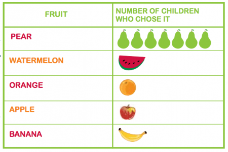
A pictogram is a chart that uses pictures to represent data. Pictograms are set out in the same way as bar charts, but instead of bars they use columns of pictures to show the numbers involved.
Pictography is a form of writing which uses representational, pictorial drawings, similarly to cuneiform and, to some extent, hieroglyphic writing, which also uses drawings as phonetic letters or determinative rhymes. Some pictograms, such as Hazards pictograms, are elements of formal languages.
Pictograph has a rather different meaning in the field of prehistoric art, including recent art by traditional societies and then means art painted on rock surfaces, as opposed to petroglyphs; the latters are carved or incised. Such images may or may not be considered pictograms in the general sense.
Standardization
Pictographs can often transcend languages in that they can communicate to speakers of a number of tongues and language families equally effectively, even if the languages and cultures are completely different. This is why road signs and similar pictographic material are often applied as global standards expected to be understood by nearly all.
A standard set of pictographs was defined in the international standard ISO 7001: Public Information Symbols. Other common sets of pictographs are the laundry symbols used on clothing tags and the chemical hazard symbols as standardized by the GHS system.
Pictograms have been popularized in use on the web and in software, better known as “icons” displayed on a computer screen in order to help user navigate a computer system or mobile device.
Pictograms are most commonly used in Key Stage 1 as a simple and engaging introduction to bar charts. Sometimes teachers will give children cut-out pictures to count out and stick onto a ready-made sheet. This physical activity makes the concept very clear for young children.
When compiling information for a pictogram, a teacher will usually encourage their class to collect data about other children: for example, children might be asked to find out about favourite crisps, cakes, animals or colours of the children in their class or another class. Often, they will record this information on a class list and then put it onto a tally chart (for the younger children, the teacher will probably collate a tally chart on the board for the class). This information is then converted into a pictogram.
Children continue to learn about pictograms in Year 3. More advanced pictograms might be used further up the school, where one image represents more than one of an object, so children need to think about how they are interpreting the number of images.
Cartograms
A cartogram (also called a value-area map or an anamorphic map, the latter common among German-speakers) is a thematic map of a set of features (countries, provinces, etc.), in which their geographic size is altered to be directly proportional to a selected ratio-level variable, such as travel time, population, or GNP. Geographic space itself is thus warped, sometimes extremely, in order to visualize the distribution of the variable. It is one of the most abstract types of map; in fact, some forms may more properly be called diagrams. They are primarily used to display emphasis and for analysis as nomographs.
Cartograms leverage the fact that size is the most intuitive visual variable for representing a total amount. In this, it is a strategy that is similar to proportional symbol maps, which scale point features, and many flow maps, which scale the weight of linear features. However, these two techniques only scale the map symbol, not space itself; a map that stretches the length of linear features is considered a linear cartogram (although additional flow map techniques may be added). Once constructed, cartograms are often used as a base for other thematic mapping techniques to visualize additional variables, such as choropleth mapping.

General principles
Since the early days of the academic study of cartograms, they have been compared to map projections in many ways, in that both methods transform (and thus distort) space itself. The goal of designing a cartogram or a map projection is therefore to represent one or more aspects of geographic phenomena as accurately as possible, while minimizing the collateral damage of distortion in other aspects. In the case of cartograms, by scaling features to have a size proportional to a variable other than their actual size, the danger is that the features will be distorted to the degree that they are no longer recognizable to map readers, making them less useful.
As with map projections, the tradeoffs inherent in cartograms have led to a wide variety of strategies, including manual methods and dozens of computer algorithms that produce very different results from the same source data. The quality of each type of cartogram is typically judged on how accurately it scales each feature, as well as on how (and how well) it attempts to preserve some form of recognizability in the features, usually in two aspects: shape and topological relationship (i.e., retained adjacency of neighboring features). It is likely impossible to preserve both of these, so some cartogram methods attempt to preserve one at the expense of the other, some attempt a compromise solution of balancing the distortion of both, and other methods do not attempt to preserve either one, sacrificing all recognizability to achieve another goal.
Several options are available for the geometric shapes:
- Circles (Dorling), typically brought together to be touching and arranged to retain some semblance of the overall shape of the original space.[26] These often look like proportional symbol maps, and some consider them to be a hybrid between the two types of thematic map.
- Squares (Levasseur/Demers), treated in much the same way as the circles, although they do not generally fit together as simply.
- Rectangles (Raisz), in which the height and width of each rectangular district is adjusted to fit within an overall shape. The result looks much like a treemap diagram, although the latter is generally sorted by size rather than geography. These are often contiguous, although the contiguity may be illusory because many of the districts that are adjacent in the map may not be the same as those that are adjacent in reality.
One thought on “Pictograms, Cartograms”