 by
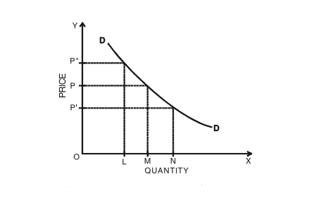
by The demand curve is a graphical representation of the relationship between the price of a good or service and the quantity demanded for a given period of time. In a typical representation, the price will appear on the left vertical axis, the quantity demanded on the horizontal axis.
Understanding the Demand Curve
The demand curve will move downward from the left to the right, which expresses the law of demand — as the price of a given commodity increases, the quantity demanded decreases, all else being equal.
Note that this formulation implies that price is the independent variable, and quantity the dependent variable. In most disciplines, the independent variable appears on the horizontal or x-axis, but economics is an exception to this rule.
For example, if the price of corn rises, consumers will have an incentive to buy less corn and substitute it for other foods, so the total quantity of corn consumers demand will fall.
Types of Demand Curves
Elastic demand is when a price decrease causes a significant increase in the quantities bought. Like a stretchy rubber band, the quantity demanded moves a lot with just a little change in prices. An example of this would be ground beef; if prices drop just 25%, you might buy three times as much as you usually would because you know you’ll use it eventually and can put the extras in the freezer. If demand is perfectly elastic, the curve looks like a horizontal flat line.
Inelastic demand is when a price decrease won’t increase the quantities purchased. An example of this is bananas. No matter how cheap they are, there’s only so many you can eat before they spoil. You won’t buy three bunches even if the price falls 25%. If demand is perfectly inelastic, the curve looks like a vertical straight line.
The reason you react more to a sale on ground beef than a sale on bananas is because of the marginal utility of each additional unit. Marginal utility refers to the usefulness (utility) of each additional unit the further out on the margin you go. Because you can freeze ground beef, the third package is just as good to you as the first. The marginal utility of ground beef is high. Bananas lose their consistency in the freezer, so their marginal utility is low.
Shifting the Curve
If any determinants of demand other than the price change, the demand curve shifts. If demand increases, the entire curve will move to the right. That means larger quantities will be demanded at every price. If the entire curve shifts to the left, it means total demand has dropped for all price levels. For instance, if you just lost your job, you might not buy that third package of ground beef, even if it is on sale. You might just buy one package and be glad it’s 25% off.
Aggregate or Market Demand Curve
The market demand curve describes the quantity demanded by the entire market for a category of goods or services, like gasoline prices. When the price of oil goes up, all gas stations must raise their prices to cover their costs. Oil prices comprise 71% of gas prices; even if the price drops 50%, drivers don’t generally stock up on extra gas. That’s why when the price skyrockets by $0.50–$1 per gallon, people get upset. They can’t cut back their driving to work, school, or the grocery store, and are forced to pay more for gas. That’s an inelastic aggregate demand curve.
High gas prices lower people’s incomes for things other than gas, and that means the demand curve for those other things will drop. This is called a demand shift, and in this case, the entire demand curve shifts to the left. Since buyers have less income, they will purchase a lower quantity of a product even if its price doesn’t rise.
Demand Schedule
In economics, a demand schedule is a table that shows the quantity demanded of a good or service at different price levels. A demand schedule can be graphed as a continuous demand curve on a chart where the Y-axis represents price and the X-axis represents quantity.
A demand schedule most commonly consists of two columns. The first column lists a price for a product in ascending or descending order. The second column lists the quantity of the product desired or demanded at that price. The price is determined based on research of the market.
When the data in the demand schedule is graphed to create the demand curve, it supplies a visual demonstration of the relationship between price and demand, allowing easy estimation of the demand for a product or service at any point along the curve.
Demand Schedules vs. Supply Schedules
A demand schedule is typically used in conjunction with a supply schedule, which shows the quantity of a good that would be supplied to the market by producers at given price levels. By graphing both schedules on a chart with the axes described above, it is possible to obtain a graphical representation of the supply and demand dynamics of a particular market.
In a typical supply and demand relationship, as the price of a good or service rises, the quantity demanded tends to fall. If all other factors are equal, the market reaches an equilibrium where the supply and demand schedules intersect. At this point, the corresponding price is the equilibrium market price, and the corresponding quantity is the equilibrium quantity exchanged in the market.